
38 KiB






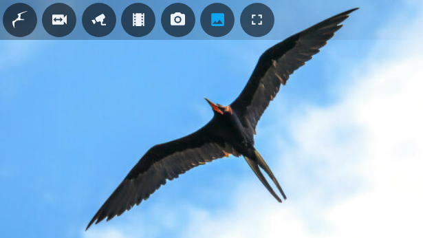
Frigate Lovelace Card
A full-featured Frigate Lovelace card:
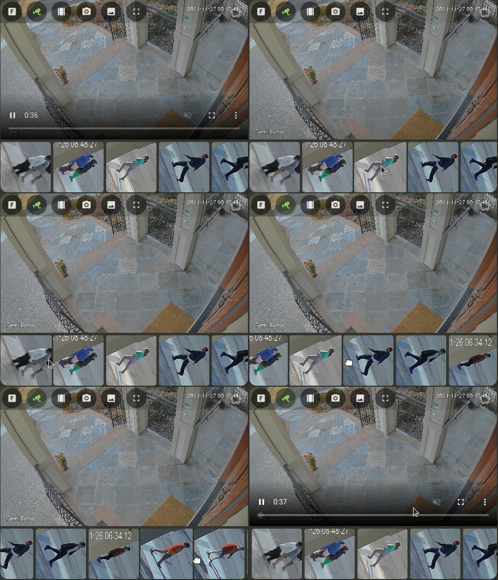
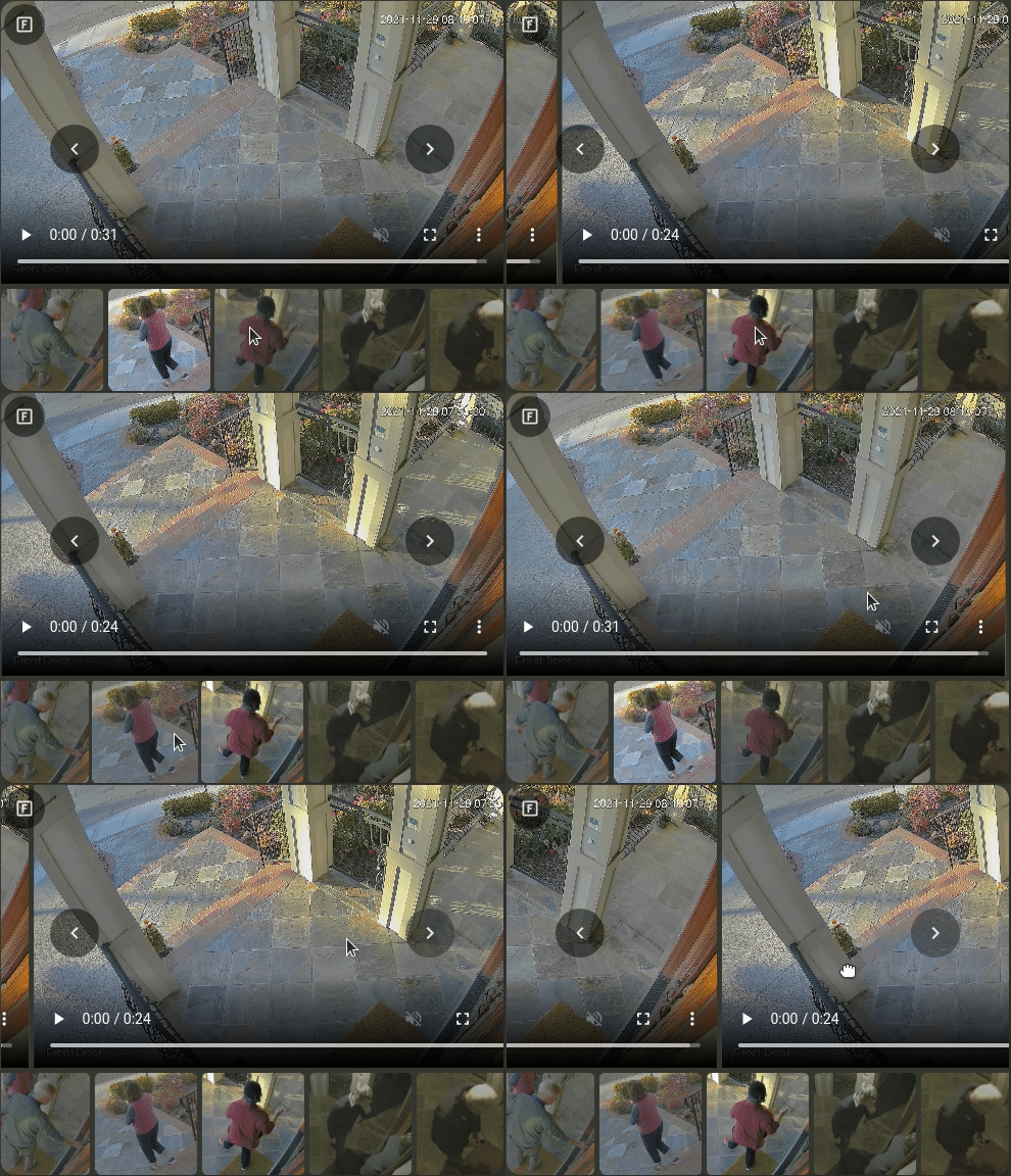
- Live viewing.
- Clips and snapshot browsing via mini-gallery.
- Automatic updating to continually show latest clip / snapshot.
- Support for filtering events by zone and label.
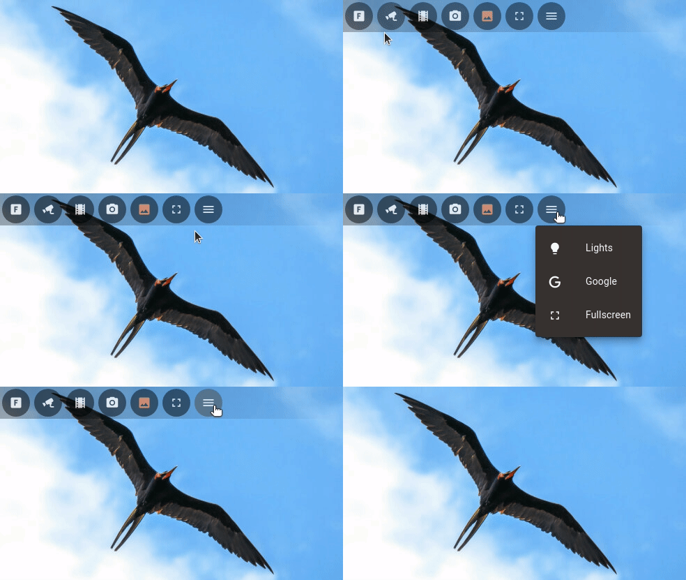
- Arbitrary entity access via menu (e.g. motion sensor access).
- Fullscreen mode.
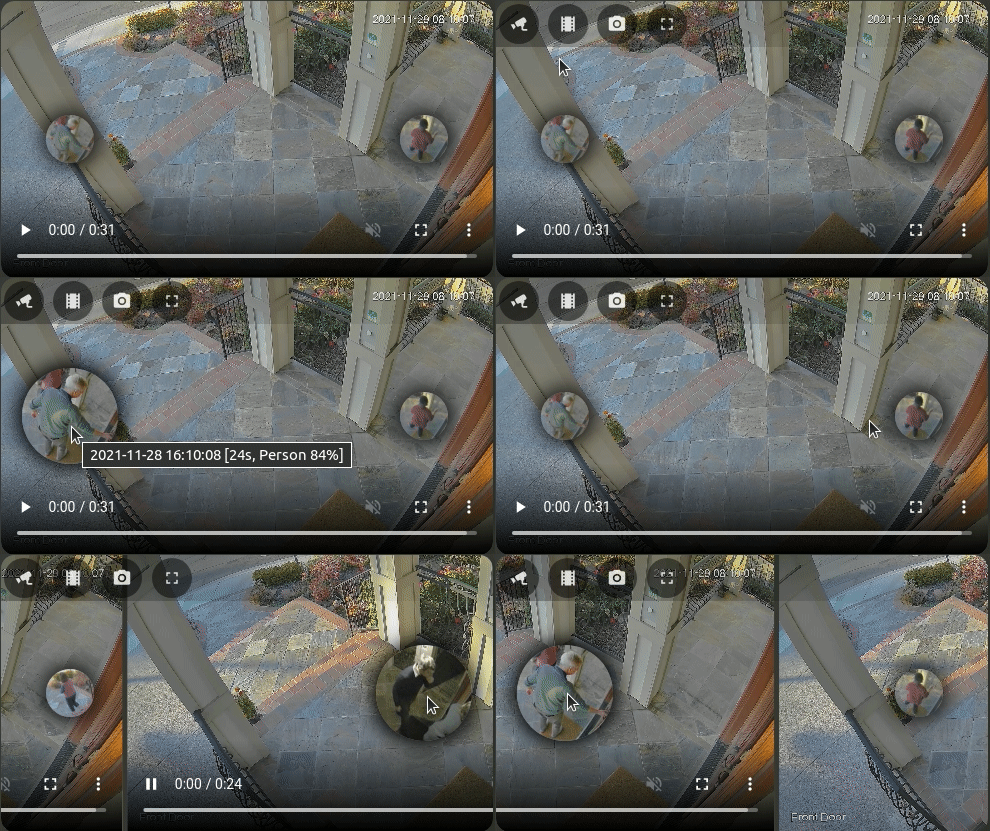
- Carousel/Swipeable media & thumbnails.
- Direct media downloads.
- Lovelace visual editing support.
- Full Picture Elements support.
- Theme friendly.
- Advanced: Support for WebRTC live viewing by embedding the WebRTC card.
Screenshots Below!
See more screenshots below.
Installation
- Use HACS to install the card:
Home Assistant > HACS > Frontend > "Explore & Add Integrations" > Frigate Card
- Add the following to
configuration.yaml(note that/hacsfiles/is just an optimized equivalent of/local/community/that HACS natively supports):
lovelace:
  resources:
    - url: /hacsfiles/frigate-hass-card/frigate-hass-card.js
      type: module
- Restart Home Assistant.
- Add the new card to the Lovelace configuration!
Advanced Users: Manual Installation
- Download the
frigate-hass-card.jsattachment of the desired release to a location accessible by Home Assistant. - Add the location as a Lovelace resource via the UI, or via YAML configuration) such as:
lovelace:
  mode: yaml
  resources:
   - url: /local/frigate-hass-card.js
     type: module
Options
Basic Options
| Option | Default | Description |
|---|---|---|
camera_entity |
The optional Frigate camera entity to use in the frigate live provider view. Also used to automatically detect the value of frigate.camera_name. |
Frigate Server Options
All configuration is under:
frigate:
| Option | Default | Description |
|---|---|---|
camera_name |
Autodetected from camera_entity if that is specified. |
The Frigate camera name to use when communicating with the Frigate server, e.g. for viewing clips/snapshots or the JSMPEG live view. To view the birdseye view set this to birdseye and use the frigate-jsmpeg live provider. |
url |
The URL of the frigate server. If set, this value will be (exclusively) used for a Frigate UI menu button. |
|
label |
A Frigate label / object filter used to filter events (clips & snapshots), e.g. 'person'. | |
zone |
A Frigate zone used to filter events (clips & snapshots), e.g. 'front_door'. | |
client_id |
frigate |
The Frigate client id to use. If this Home Assistant server has multiple Frigate server backends configured, this selects which server should be used. It should be set to the MQTT client id configured for this server, see Frigate Integration Multiple Instance Support. |
View Options
All configuration is under:
view:
| Option | Default | Description |
|---|---|---|
default |
live |
The view to show in the card by default. See views below. |
timeout |
A numbers of seconds of inactivity after which the card will reset to the default configured view. Inactivity is defined as lack of interaction with the Frigate menu. | |
actions |
Actions to use for all views, individual actions may be overriden by view-specific actions. See actions below. | |
update_force |
false |
Whether card updates/refreshes should ignore playing media and human interaction. See card updates below for behavior and usecases. |
update_entities |
YAML only: A list of entity ids that should cause the whole card to re-render. Entities used in picture elements / included in the menu do not need to be explicitly included here to be kept updated. See card updates below for behavior and usecases. |
Menu Options
All configuration is under:
menu:
| Option | Default | Description |
|---|---|---|
mode |
hidden-top |
The menu mode to show by default. See menu modes below. |
button_size |
40px |
The size of the menu buttons in CSS Units. |
buttons |
Whether to show or hide built-in buttons. See below. | |
conditions |
Condition(s) that must be met in order for the menu to be displayed. These conditions use the same format as the custom:frigate-card-conditional card (see Possible conditions below). If conditions are specified but not met, then the menu is not rendered. |
Menu Options: Buttons
All configuration is under:
menu:
  buttons:
| Option | Default | Description |
|---|---|---|
frigate |
true |
Whether to show the Frigate menu button: brings the user to the default configured view (view.default), or collapses/expands the menu if the menu.mode is hidden-* . |
live |
true |
Whether to show the live view menu button: brings the user to the live view. See views below. |
clips |
true |
Whether to show the clips view menu button: brings the user to the clips view on tap and the most-recent clip view on hold. See views below. |
snapshots |
true |
Whether to show the snapshots view menu button: brings the user to the clips view on tap and the most-recent snapshot view on hold. See views below. |
image |
false |
Whether to show the image view menu button: brings the user to the static image view. See views below. |
download |
true |
Whether to show the download menu button: allow direct download of the media being displayed. |
frigate_ui |
true |
Whether to show the frigate_ui menu button: brings the user to a context-appropriate page on the Frigate UI (e.g. the camera homepage). Will only appear if the frigate.url option is set. |
fullscreen |
true |
Whether to show the fullscreen menu button: expand the card to consume the fullscreen. |
Live Options
All configuration is under:
live:
| Option | Default | Description |
|---|---|---|
preload |
false |
Whether or not to preload the live view. Preloading causes the live view to render in the background so it's instantly available when requested. This consumes additional network/CPU resources continually. |
provider |
frigate |
The means through which the live camera view is displayed. See Live Provider below. |
actions |
Actions to use for the live view. See actions below. |
|
controls |
Configuration for the live view controls. See below. |
|
jsmpeg |
Configuration for the frigate-jsmpeg live provider. See below. |
|
webrtc |
Configuration for the webrtc live provider. See below. |
Available Live Providers
| Live Provider | Latency | Frame Rate | Installation | Description |
|---|---|---|---|---|
frigate |
High | High | Builtin | Use the built-in Home Assistant camera stream from Frigate (RTMP). The camera doesn't even need to be a Frigate camera! Latency may be lowered through the use of LL-HLS. |
frigate-jsmpeg |
Lower | Low | Builtin | Stream the JSMPEG stream from Frigate (proxied via the Frigate integration). See note below on the required integration version for this live provider to function. This is the only live provider that can view the Frigate birdseye view. |
webrtc |
Lowest | High | Separate installation required | Uses WebRTC to stream live feed, requires manual extra setup, see below. |
Live Provider: JSMPEG Configuration
All configuration is under:
live:
  jsmpeg:
| Option | Default | Description |
|---|---|---|
options |
Advanced users only: Control the underlying JSMPEG library options. Supports setting these JSMPEG options {audio, video, pauseWhenHidden, disableGl, disableWebAssembly, preserveDrawingBuffer, progressive, throttled, chunkSize, maxAudioLag, videoBufferSize, audioBufferSize}. This is not necessary for the vast majority of users: only set these flags if you know what you're doing, as you may entirely break video rendering in the card. |
Live Provider: WebRTC Configuration
All configuration is under:
live:
  webrtc:
| Option | Default | Description |
|---|---|---|
entity |
The RTSP entity to pass WebRTC. Specify this OR webrtc.url (above). |
|
url |
The RTSP url to pass to WebRTC. Specify this OR webrtc.entity (below). |
|
* |
Any other options in the webrtc: YAML dictionary are silently passed through to WebRTC. See WebRTC Configuration for full details this external card provides. |
Live Controls: Thumbnails
All configuration is under:
live:
  controls:
    thumbnails:
| Option | Default | Description |
|---|---|---|
mode |
none |
Whether to show the thumbnail carousel below the media, above the media or to hide it entirely (none). |
size |
100px |
The size of the thumbnails in the thumbnail carousel in CSS Units. |
media |
clips |
Whether to show clips or snapshots in the thumbnail carousel in the live view. |
Event Viewer Options
The event_viewer is used for viewing all clip and snapshot media, in a media carousel.
All configuration is under:
event_viewer:
| Option | Default | Description |
|---|---|---|
autoplay_clip |
false |
Whether or not to autoplay clips in the 'clip' view. Clips manually chosen in the clips gallery will still autoplay. |
lazy_load |
true |
Whether or not to lazily load media in the event viewer carousel. Setting this will false will fetch all media immediately which may make the carousel experience smoother at a cost of (potentially) a substantial number of simultaneous media fetches on load. |
draggable |
true |
Whether or not the event viewer carousel can be dragged left or right, via touch/swipe and mouse dragging. |
controls |
Configuration for the event viewer. See below. | |
actions |
Actions to use for all views that use the event_viewer (e.g. clip, snapshot). See actions below. |
Event Viewer Controls: Next / Previous
All configuration is under:
event_viewer:
  controls:
    next_previous:
| Option | Default | Description |
|---|---|---|
style |
thumbnails |
When viewing media, what kind of controls to show to move to the previous/next media item. Acceptable values: thumbnails, chevrons, none . |
size |
48px |
The size of the next/previous controls in CSS Units. |
Event Viewer Controls: Thumbnails
All configuration is under:
event_viewer:
  controls:
    thumbnails:
| Option | Default | Description |
|---|---|---|
mode |
none |
Whether to show the thumbnail carousel below the media, above the media or to hide it entirely (none). |
size |
100px |
The size of the thumbnails in the thumbnail carousel in CSS Units. |
Event Gallery Options
The event_gallery is used for providing an overview of all clips and snapshots in a thumbnail gallery.
All configuration is under:
event_gallery:
| Option | Default | Description |
|---|---|---|
actions |
Actions to use for all views that use the event_gallery (e.g. clips, snapshots). See actions below. |
Image Options
All configuration is under:
image:
| Option | Default | Description |
|---|---|---|
src |
embedded image | A static image URL for use with the image view. |
actions |
Actions to use for the image view. See actions below. |
Dimension Options
All configuration is under:
dimensions:
| Option | Default | Description |
|---|---|---|
aspect_ratio_mode |
dynamic |
The aspect ratio mode to use. Acceptable values: dynamic, static, unconstrained. See aspect ratios below. |
aspect_ratio |
16:9 |
The aspect ratio to use. Acceptable values: <W>:<H> or <W>/<H>. See aspect ratios below. |
dimensions.aspect_ratio_mode:
| Option | Description |
|---|---|
dynamic |
The aspect-ratio of the card will match the aspect-ratio of the last loaded media. |
static |
A fixed aspect-ratio (as defined by dimensions.aspect_ratio) will be applied to all views. |
unconstrained |
No aspect ratio is enforced in any view, the card will expand with the content (may be especially useful for a panel-mode dashboard). |
dimensions.aspect_ratio:
16 / 9or16:9: Default widescreen ratio.4 / 3or4:3: Default fullscreen ratio.<W>/<H>or<W>:<H>: Any arbitrary aspect-ratio.
Aspect Ratio
The card can show live cameras, stored events (clip or snapshot) and an event gallery (clips or snapshots). Of these views, the gallery views have no intrinsic aspect-ratio, whereas the other views have the aspect-ratio of the media.
The card aspect ratio can be changed with the dimensions.aspect_ratio_mode and
dimensions.aspect_ratio options described above.
If no aspect ratio is specified or available, but one is needed then 16:9 will
be used by default.
Using WebRTC
WebRTC support blends the use of the ultra-realtime WebRTC live view with convenient access to Frigate events/snapshots/UI. A perfect combination!
Note: WebRTC must be installed and configured separately (see details) before it can be used with this card.
Specifying The WebRTC Camera
WebRTC does not support use of Frigate-provided camera entities, as it requires an RTSP stream which Frigate does not provide. There are two ways to specify the WebRTC source camera:
- Manual setup of separate RTSP camera entities in Home Assistant (see
example).
These entities will then be available for selection in the GUI card editor for
the Frigate card under the WebRTC options, or can be manually specified with a
webrtc.entityoption in the YAML configuration for this card:
[rest of Frigate card configuration]
live:
  webrtc:
    entity: 'camera.front_door_rstp`
- OR manually entering the WebRTC camera URL parameter in the GUI card editor,
or configuring the
urlparameter as part of a manual Frigate card configuration, like the following example:
[rest of Frigate card configuration]
live:
  webrtc:
    url: 'rtsp://USERNAME:PASSWORD@CAMERA:554/RTSP_PATH'
See WebRTC configuration for full configuration options.
Picture Elements / Menu Customizations
This card supports the Picture Elements configuration
syntax to seamlessly
allow the user to add custom elements to the card, which may be configured to
perform a variety of actions on tap, double_tap and hold.
In the card YAML configuration, elements may be manually added under an
elements key.
See the action documentation for more information on the action options available.
Special Elements
This card supports all Picture Elements using the same syntax. The card also supports a handful of custom special elements to add special Frigate card functionality.
| Element name | Description |
|---|---|
custom:frigate-card-menu-icon |
Add an arbitrary icon to the Frigate Card menu. Configuration is ~identical to that of the Picture Elements Icon except with a type name of custom:frigate-card-menu-icon. |
custom:frigate-card-menu-state-icon |
Add a state icon to the Frigate Card menu that represents the state of a Home Assistant entity. Configuration is ~identical to that of the Picture Elements State Icon except with a type name of custom:frigate-card-menu-state-icon. |
custom:frigate-card-menu-submenu |
Add a configurable submenu dropdown. See configuration below. |
custom:frigate-card-conditional |
Restrict a set of elements to only render when the card is showing particular a particular view. See configuration below. |
custom:frigate-card-menu-submenu
Parameters for the custom:frigate-card-menu-submenu element are identical to the parameters of the stock Home Assistant Icon Element with the exception of these parameters which differ:
| Parameter | Description |
|---|---|
type |
Must be custom:frigate-card-menu-submenu. |
items |
A list of menu items, as described below. |
Submenu Items
| Parameter | Default | Description |
|---|---|---|
title |
An optional title to display. | |
icon |
An optional item icon to display. | |
entity |
An optional Home Assistant entity from which title, icon and style can be automatically computed. | |
state_color |
true |
Whether or not the title and icon should be stylized based on state. |
style |
Position and style the element using CSS. | |
tap_action, double_tap_action or hold_action |
Standard Home Assistant action configuration. |
See the Configuring a Submenu example.
custom:frigate-card-conditional
Parameters for the custom:frigate-card-conditional element:
| Parameter | Description |
|---|---|
type |
Must be custom:frigate-card-conditional. |
conditions |
A set of conditions that must evaluate to true in order for the elements to be rendered. See below. |
elements |
The elements to render. Can be any supported element, include additional condition or custom elements. |
Frigate Card Conditions
All variables listed are under a conditions: section.
| Condition | Description |
|---|---|
view |
A list of views in which these elements should be rendered. |
fullscreen |
If true the elements are only rendered if the card is in fullscreen mode. If false the elements are only rendered if the card is NOT in fullscreen mode. |
See the PTZ example below for a real-world example.
Special Actions
custom:frigate-card-action
| Action name | Description |
|---|---|
custom:frigate-card-action |
Call a Frigate Card action. Acceptable values are frigate, clip, clips, image, live, snapshot, snapshots, download, frigate_ui, fullscreen. |
| Value | Description |
|---|---|
frigate |
Show/hide the menu or trigger the default view. |
clip, clips, image, live, snapshot, snapshots |
Trigger the named view. |
download |
Download the displayed media. |
frigate_ui |
Open the Frigate UI at the configured URL. |
fullscreen |
Toggle fullscreen. |
Views
This card supports several different views:
| Key | Description |
|---|---|
live (default) |
Shows the live camera view, either the name Frigate view or WebRTC if configured. |
snapshots |
Shows an event gallery of snapshots for this camera/zone/label. |
snapshot |
Shows an event viewer for the most recent snapshot for this camera/zone/label. Can also be accessed by holding down the snapshots menu icon. |
clips |
Shows an event gallery of clips for this camera/zone/label. |
clip |
Shows an event viewer for the most recent clip for this camera/zone/label. Can also be accessed by holding down the clips menu icon. |
image |
Shows a static image specified by the image parameter, can be used as a discrete default view or a screensaver (via view_timeout). |
Navigating From A Snapshot To A Clip
Clicking on a snapshot will take the user to a clip that was taken at the ~same time as the snapshot (if any).
Card & View Actions
Actions may be attached to the card itself, to trigger action when the card
experiences a tap, double_tap or hold event. These actions can be
specified both for the overall card and for individual groups of view.
| Configuration path | Views to which it refers |
|---|---|
view.actions |
All (may be overriden by the below) |
event_viewer.actions |
clip, snapshot |
event_gallery.actions |
clips, snapshots |
live.actions |
live |
image.actions |
image |
If an action is configured for both the whole card (view.actions) and a more
specific view (e.g. live.actions) then the actions are merged, with the more
specific overriding the less specific (see example below).
The format for actions is the standard Home Assistant action format as well as the custom Frigate card action to trigger Frigate card changes.
Note: The card itself obviously relies on human interactions to function
(e.g. tap on the menu should activate that button, tap on a gallery thumbnail
should open that piece of media, etc). These internal actions are executed
also, which means that a card-wide tap action probably isn't that useful as
it may be disorienting to the user and will trigger on all kinds of basic
interaction on the card (e.g. tapping/clicking a menu button).
Menu Modes
This card supports several menu configurations.
| Key | Description | Screenshot |
|---|---|---|
hidden-{top,bottom,right,left} [default: hidden-top] |
Hide the menu by default, expandable upon clicking the 'F' button. | 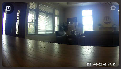 |
overlay-{top,bottom,right,left} |
Overlay the menu over the card contents. The 'F' button shows the default view. | 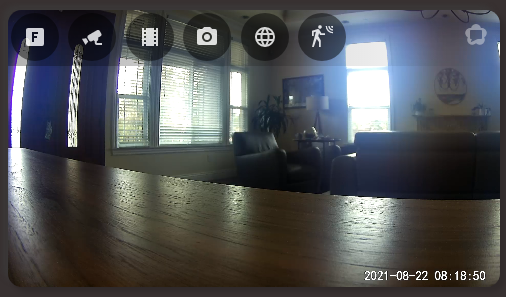 |
hover-{top,bottom,right,left} |
Overlay the menu over the card contents when the mouse is over the card / touch on the card, otherwise it is not shown. The 'F' button shows the default view. | |
above |
Render the menu above the card. The 'F' button shows the default view. | 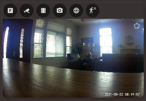 |
below |
Render the menu below the card. The 'F' button shows the default view. | 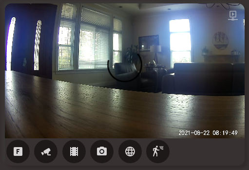 |
none |
No menu is shown. | 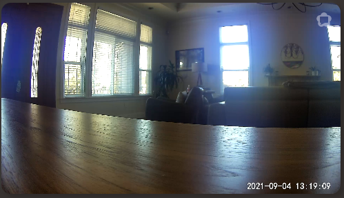 |
Screenshots
Full Viewing Of Events
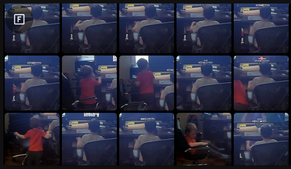
Live Viewing With Thumbnail Carousel
Clip Viewing With Thumbnail Carousel
Hover Menu / Thumbnail Next & Previous Controls
Card Editing
This card supports full editing via the Lovelace card editor. Additional arbitrary configuration for WebRTC may be specified in YAML mode.

Configurable Submenus
This card supports fully configurable submenus.
Examples
WebRTC
Expand: Basic WebRTC configuration
type: 'custom:frigate-card'
camera_entity: camera.front_door
live:
  provider: webrtc
  webrtc:
    entity: camera.front_door_rtsp
Static Aspect Ratios
You can set a static aspect ratio.
Expand: Static 4:3 aspect ratios
[...]
dimensions:
  aspect_ratio_mode: dynamic
  aspect_ratio: '4:3'
Adding Menu Icons
You can add custom icons to the menu with arbitrary actions.
Expand: Custom menu icon
This example adds an icon that navigates the browser to the releases page for this card:
[...]
elements:
  - type: custom:frigate-card-menu-icon
    icon: mdi:book
    tap_action:
      action: url
      url_path: https://github.com/dermotduffy/frigate-hass-card/releases
Adding Menu State Icons
You can add custom state icons to the menu to show the state of an entity and complete arbitrary actions.
Expand: Custom menu state icon
This example adds an icon that represents the state of the
light.office_main_lights entity, that toggles the light on double click.
[...]
elements:
  - type: custom:frigate-card-menu-state-icon
    entity: light.office_main_lights
    tap_action:
      action: toggle
Adding State Badges
You can add a state badge to the card showing arbitrary entity states.
Expand: State badge
This example adds a state badge showing the temperature and hides the label text:
[...]
elements:
  - type: state-badge
    entity: sensor.kitchen_temperature
    style:
      right: '-20px'
      top: 100px
      color: rgba(0,0,0,0)
      opacity: 0.5
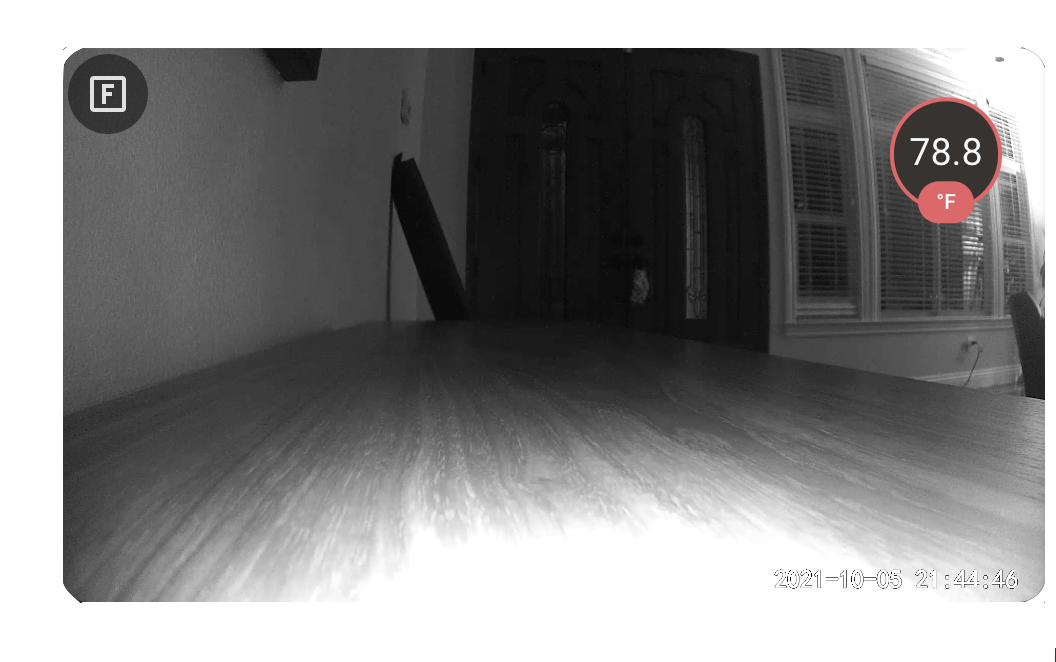
Adding State Badges
You can have icons conditionally added to the menu based on entity state.
Expand: Conditional menu icons
This example only adds the light entity to the menu if a light is on.
[...]
elements:
  - type: conditional
    conditions:
      - entity: light.kitchen
        state: 'on'
    elements:
      - type: custom:frigate-card-menu-state-icon
        entity: light.kitchen
        tap_action:
          action: toggle
Restricting Icons To Certain Views
You can restrict icons to only show for certain views using a
custom:frigate-card-conditional element (e.g. PTZ controls)
Expand: View-based conditions (e.g. PTZ controls)
This example shows PTZ icons that call a PTZ service, but only in the live view.
[...]
elements:
  - type: custom:frigate-card-conditional
    conditions:
      view:
        - live
    elements:
      - type: icon
        icon: mdi:arrow-up
        style:
          background: rgba(255, 255, 255, 0.25)
          border-radius: 5px
          right: 25px
          bottom: 50px
        tap_action:
          action: call-service
          service: amcrest.ptz_control
          service_data:
            entity_id: camera.kitchen
            movement: up
      - type: icon
        icon: mdi:arrow-down
        style:
          background: rgba(255, 255, 255, 0.25)
          border-radius: 5px
          right: 25px
          bottom: 0px
        tap_action:
          action: call-service
          service: amcrest.ptz_control
          service_data:
            entity_id: camera.kitchen
            movement: down
      - type: icon
        icon: mdi:arrow-left
        style:
          background: rgba(255, 255, 255, 0.25)
          border-radius: 5px
          right: 50px
          bottom: 25px
        tap_action:
          action: call-service
          service: amcrest.ptz_control
          service_data:
            entity_id: camera.kitchen
            movement: left
      - type: icon
        icon: mdi:arrow-right
        style:
          background: rgba(255, 255, 255, 0.25)
          border-radius: 5px
          right: 0px
          bottom: 25px
        tap_action:
          action: call-service
          service: amcrest.ptz_control
          service_data:
            entity_id: camera.kitchen
            movement: right
Triggering Card Actions
You can control the card itself with the custom:frigate-card-action action.
Expand: Custom fullscreen button
This example shows an icon that toggles the card fullscreen mode.
[...]
elements:
  - type: icon
    icon: mdi:fullscreen
    style:
      left: 40px
      top: 40px
    tap_action:
      action: custom:frigate-card-action
      frigate_card_action: fullscreen
Adding Card-wide Actions
You can add actions to the card to be trigger on tap, double_tap or hold. See actions above.
Expand: Adding a card-wide action
In this example double clicking the card in any view will cause the card to go
into fullscreen mode, except when the view is live in which case the
office lights are toggled.
[...]
view:
  actions:
    double_tap_action:
      action: custom:frigate-card-action
      frigate_card_action: fullscreen
live:
  provider: frigate-jsmpeg
  actions:
    entity: light.office_main_lights
    double_tap_action:
      action: toggle
Hiding The Menu In Certain Circumstances
You can add conditions to the menu, which will hide the menu unless met.
Expand: Hiding the menu
This example hides the menu unless the card is in fullscreen mode, and uses a card-wide action to enable fullscreen mode on double_tap:
[...]
view:
  actions:
    double_tap_action:
      action: custom:frigate-card-action
      frigate_card_action: fullscreen
menu:
  conditions:
    fullscreen: true
Configuring a submenu
You can add submenus to the menu -- buttons that when pressed reveal a dropdown submenu of configurable options.
Expand: Adding a submenu
This example shows a submenu that illustrates a variety of actions.
[...]
elements:
  - type: custom:frigate-card-menu-submenu
    icon: mdi:menu
    items:
      - title: Lights
        icon: mdi:lightbulb
        entity: light.office_main_lights
        tap_action:
          action: toggle
      - title: Google
        icon: mdi:google
        tap_action:
          action: url
          url_path: https://www.google.com
      - title: Fullscreen
        icon: mdi:fullscreen
        tap_action:
          action: custom:frigate-card-action
          frigate_card_action: fullscreen
Card Refreshes / Updates
Automated card refreshes / updates are minimized to avoid disruption to the user, in particular when media is playing. Three sets of flags govern when the card will automatically re-render in the absence of human interaction.
The following table describes the behavior these 3 flags have.
Card Update Truth Table
view.timeout |
view.update_force |
view.update_entities & camera_entity |
Behavior |
|---|---|---|---|
Unset or 0 |
(Any value) | Unset | Card will not automatically re-render. |
Unset or 0 |
false |
(Any entity) | Card will reload current view when entity state changes, unless media is playing. |
Unset or 0 |
true |
(Any entity) | Card will reload current view when entity state changes. |
X seconds |
false |
Unset | Card will reload default view X seconds after human interaction stops, unless media is playing. |
X seconds |
false |
(Any entity) | Card will reload default view X seconds after human interaction stops and reload the current view when entity state changes -- in both cases unless media is playing. |
X seconds |
true |
Unset | Card will reload default view every X seconds. |
X seconds |
true |
(Any entity) | Card will reload default view every X seconds and reload the current view when entity state changes. |
Usecases For Automated Refreshes
- Refreshing the
livethumbnails periodically.
view:
  default: live
  timeout: 30
  force: true
- Using
cliporsnapshotas the default view (for the most recent clip or snapshot respectively) and having the card automatically refresh (to fetch a newer clip/snapshot) when an entity state changes. A Frigatecamera_entityis generally not sufficient for this since the Home Assistant state for Frigate camera entities does not change often. Instead, use the Frigate binary_sensor for that camera (or any other entity at your discretion) to trigger the update:
view:
  update_entities:
    - binary_sensor.office_person_motion
Troubleshooting
JSMPEG Live Camera Only Shows A 'spinner'
You must be using a version of the Frigate integration >= 2.1.0
to use JSMPEG proxying. The frigate-jsmpeg live provider will not work with earlier
integration versions.
Fullscreen Button Does Not Appear On iPhone
Unfortunately, iOS does not support the Javascript fullscreen API. As a result, card-level fullscreen support for the iPhone is not currently possible.
Android Will Not Render >4 JSMPEG Live Views
Android Webview (as used by Android Chrome / Android Home Assistant Companion) appears to severely limit the number of simultaneous OpenGL contexts that can be opened. The JSMPEG player (that this card uses), consumes 1 OpenGL context per rendering.
This limitation may be worked around (at a performance penalty) by disabling OpenGL for JSMPEG live views:
live:
  jsmpeg:
    options:
      disableGl: true
This bug has some more discussion on this topic. New ideas to address this underlying limitation most welcome!
Development
Building
$ git clone https://github.com/dermotduffy/frigate-hass-card
$ cd frigate-hass-card
$ npm install
$ npm run build
Resultant build will be at dist/frigate-hass-card.js. This could be installed via the manual installation instructions above.
Releasing
- Merge a PR that contains only a
package.jsonandconst.tsversion number bump (see this example). - Go to the releases page.
- A release draft will automatically have been created, click 'Edit'.
- Use the same version number for the release title and tag.
- Choose 'This is a pre-release' for a beta version.
- Hit 'Publish release'.