[](https://github.com/dermotduffy/frigate-hass-card/releases)
[](https://github.com/dermotduffy/frigate-hass-card/actions/workflows/build.yml)
[](LICENSE)
[](https://hacs.xyz)
[](https://github.com/sponsors/dermotduffy)
# Frigate Lovelace Card
A full-featured Frigate Lovelace card:
* Live viewing of multiple cameras.
* Clips and snapshot browsing via mini-gallery.
* Automatic updating to continually show latest clip / snapshot.
* Support for filtering events by zone and label.
* Arbitrary entity access via menu (e.g. motion sensor access).
* Fullscreen mode.
* Carousel/Swipeable media, thumbnails and cameras.
* Direct media downloads.
* Lovelace visual editing support.
* Full [Picture Elements](https://www.home-assistant.io/lovelace/picture-elements/) support.
* Theme friendly.
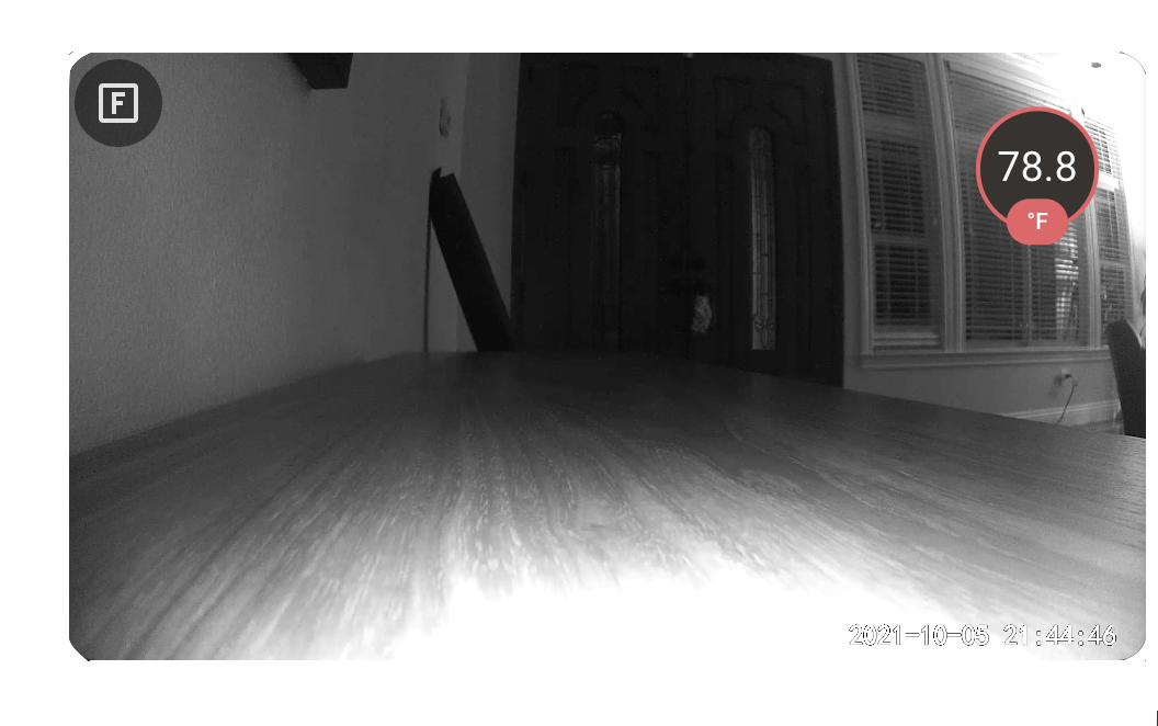
## Screenshots Below!
See more [screenshots](#screenshots) below.
## Supported Browsers
Modern Safari, Firefox and Chrome-based browsers are supported, as well as the Home Assistant App on Android and iOS. Other/older browsers may work, but are unsupported.
## Installation
* [HACS](https://hacs.xyz/) is **highly** recommended to install the card -- it works for all Home Assistant variants. If you don't have [HACS](https://hacs.xyz/) installed, start there -- then come back to these instructions.
* Find the card in HACS:
```
Home Assistant > HACS > Frontend > "Explore & Add Integrations" > Frigate Card
```
* Click `Download this repository with HACS`.
That's it!
### Manual Resource Management
For most users, HACS should automatically add the necessary resources. Should this auto-registration not work you will need to complete one additional step.
#### Lovelace in "Storage mode" (default)
* Navigate:
```
Three dots menu -> "Edit Dashboard" -> Three dots menu -> "Manage resources" -> "Add Resource"
```
* URL: `/hacsfiles/frigate-hass-card/frigate-hass-card.js`
* Resource type: `JavaScript Module`
#### Lovelace in "YAML mode" (rare)
You would see`mode: yaml` under `lovelace:` in your `configuration.yaml` if this applies to you.
* Add the following to `configuration.yaml`:
```yaml
lovelace:
resources:
- url: /hacsfiles/frigate-hass-card/frigate-hass-card.js
type: module
```
* Restart Home Assistant.
### Advanced Users: Manual Installation
**Note:** This is very rarely needed -- please consider HACS (above)!
* Download the `frigate-hass-card.zip` attachment of the desired [release](https://github.com/dermotduffy/frigate-hass-card/releases) to a location accessible by Home Assistant. Note that the release will have a series of `.js` files (for HACS users) **and** a `frigate-hass-card.zip` for the convenience of manual installers.
* Unzip the file and move the contents of the `dist/` folder to any subfolder name you'd like, e.g. `frigate-card` is used in the below example.
* Add the location as a Lovelace resource via the UI, or via [YAML configuration](https://www.home-assistant.io/lovelace/dashboards/#resources) such as:
```yaml
lovelace:
mode: yaml
resources:
- url: /local/frigate-card/frigate-hass-card.js
type: module
```
### Advanced Users: Installing Unreleased Versions
You can install any unreleased version of the card by leveraging the GitHub Actions artifacts that are generated on every revision. Here is a video walkthrough installing the latest revision of the `release-4.1.0` branch:
Click here to show
https://user-images.githubusercontent.com/29582865/228320074-6a2607f5-c637-48d5-b833-a553f8df8f4f.mp4
## Configuration
At least 1 camera must be configured in the `cameras` section, but otherwise all configuration parameters are optional.
### Camera Options
The `cameras` block configures a list of cameras the card should support. The first listed camera is the default. Camera configuration is under:
```yaml
cameras:
- [...camera 0 (default camera)...]
- [...camera 1...]
- [...camera 2...]
```
See the [fully expanded cameras configuration example](#config-expanded-cameras) for how these parameters are structured.
| Option | Default | Overridable | Description |
| - | - | - | - |
| `camera_entity` | | :white_check_mark: | The Home Assistant camera entity to use with the `frigate` live provider view. Also used to automatically detect the name of the underlying Frigate camera, and the title/icon of the camera. |
| `live_provider` | `auto` | :white_check_mark: | The choice of live stream provider. See [Live Providers](#live-providers) below.|
| `title` | Autodetected from `camera_entity` if that is specified. | :white_check_mark: | A friendly name for this camera to use in the card. |
| `icon` | Autodetected from `camera_entity` if that is specified. | :white_check_mark: | The icon to use for this camera in the camera menu and in the next & previous controls when using the `icon` style. |
| `id` | `camera_entity`, `webrtc_card.entity` or `frigate.camera_name` if set (in that preference order). | :white_check_mark: | An optional identifier to use throughout the card configuration to refer unambiguously to this camera. See [camera IDs](#camera-ids). |
| `engine` | `auto` | :white_check_mark: | Which camera engine to use for this camera. If `auto` the card will attempt to choose the correct engine from the specified options. See [engines](#engines) below for valid options.|
| `frigate` | | :white_check_mark: | Options for a Frigate camera. See [Frigate configuration](#camera-frigate-configuration) below. |
| `dependencies` | | :white_check_mark: | Other cameras that this camera should depend upon. See [camera dependencies](#camera-dependencies-configuration) below. |
| `triggers` | | :white_check_mark: | Define what should cause this camera to update/trigger. See [camera triggers](#camera-trigger-configuration) below. |
| `webrtc_card` | | :white_check_mark: | The WebRTC entity/URL to use for this camera with the `webrtc-card` live provider. See below. |
| `cast` | | :white_check_mark: | Configuration that controls how this camera is "casted" / sent to media players. See below. |
| `dimensions` | | :white_check_mark: | Controls the dimensions and layout for media from this camera. See below. |
| `capabilities` | | :white_check_mark: | Allows selective disabling of camera capabilities. See below. |
#### Available Live Providers
|Live Provider|Latency|Frame Rate|Loading Time|Installation|Description|
| -- | -- | -- | -- | -- | -- |
|`ha` (default HA configuration)|Poor|High|Better|Builtin|Use the built-in Home Assistant camera stream. The camera doesn't even need to be a Frigate camera! |
|`ha` (when configured with LL-HLS)|Better|High|Better|Builtin|Use the built-in Home Assistant camera streams -- can be configured to use an [LL-HLS](https://www.home-assistant.io/integrations/stream/#ll-hls) feed for lower latency.|
|`ha` (Native WebRTC)|Best|High|Better|Builtin|Use the built-in Home Assistant camera streams -- can be configured to use [native WebRTC](https://www.home-assistant.io/integrations/rtsp_to_webrtc/) offering a very low-latency feed direct to your browser.|
|`image`|Poor|Poor|Best|Builtin|Use refreshing snapshots of the built-in Home Assistant camera streams.|
|`jsmpeg`|Better|Low|Poor|Builtin|Use a the JSMPEG stream.|
|`go2rtc`|Best|High|Better|Builtin|Uses [go2rtc](https://github.com/AlexxIT/go2rtc) to stream live feeds. This is supported by Frigate >= `0.12`.|
|`webrtc-card`|Best|High|Better|Separate installation required|Embed's [AlexxIT's WebRTC Card](https://github.com/AlexxIT/WebRTC) to stream live feed, requires manual extra setup, see [below](#webrtc). Not to be confused with native Home Assistant WebRTC (use `ha` provider above).|
#### Available Camera Engines
##### Engine Capabilities
|Engine|Live|Supports clips|Supports Snapshots|Supports Recordings|Supports Timeline|Supports PTZ out of the box|Supports manually configured PTZ|Favorite events|Favorite recordings|Detect new events|Detect new snapshots|Detect new clips|
| - | - | - | - | - | - | - | - | - | - | - | - | - |
|`frigate`| :white_check_mark: | :white_check_mark: | :white_check_mark: | :white_check_mark: | :white_check_mark: | :white_check_mark: | :white_check_mark: | :white_check_mark: | :heavy_multiplication_x: | :white_check_mark: | :white_check_mark: | :white_check_mark: |
|`generic`| :white_check_mark: | :heavy_multiplication_x: | :heavy_multiplication_x: | :heavy_multiplication_x: | :heavy_multiplication_x: | :heavy_multiplication_x: | :white_check_mark: | :heavy_multiplication_x: | :heavy_multiplication_x: | :heavy_multiplication_x: | :heavy_multiplication_x: | :heavy_multiplication_x: |
|`motioneye`| :white_check_mark: | :white_check_mark: | :white_check_mark: | :heavy_multiplication_x: | :white_check_mark: | :heavy_multiplication_x: | :white_check_mark: | :heavy_multiplication_x: | :heavy_multiplication_x: | :heavy_multiplication_x: | :heavy_multiplication_x: | :heavy_multiplication_x: |
##### Live providers supported per Engine
|Engine / Live Provider|`ha`|`image`|`jsmpeg`|`go2rtc`|`webrtc-card`|
| - | - | - | - | - | - |
|`frigate`| :white_check_mark: | :white_check_mark: | :white_check_mark: | :white_check_mark: | :white_check_mark: |
|`generic`| :white_check_mark: | :white_check_mark: | :heavy_multiplication_x: | :white_check_mark: | :white_check_mark: |
|`motioneye`| :white_check_mark: | :white_check_mark: | :heavy_multiplication_x: | :white_check_mark: | :heavy_multiplication_x: |
#### Camera Frigate configuration
The `frigate` block configures options for a Frigate camera. This configuration is included as part of a camera entry in the `cameras` list.
```yaml
cameras:
- frigate:
```
| Option | Default | Overridable | Description |
| - | - | - | - |
| `camera_name` | Autodetected from `camera_entity` if that is specified. | :white_check_mark: | The Frigate camera name to use when communicating with the Frigate server, e.g. for viewing clips/snapshots or the JSMPEG live view.|
| `url` | | :white_check_mark: | The URL of the frigate server. If set, this value will be (exclusively) used for a `Camera UI` menu button. All other communication with Frigate goes via Home Assistant. |
| `labels` | | :white_check_mark: | A list of Frigate labels used to filter events (clips & snapshots), e.g. [`person`, `car`].|
| `zones` | | :white_check_mark: | A list of Frigates zones used to filter events (clips & snapshots), e.g. [`front_door`, `front_steps`].|
| `client_id` | `frigate` | :white_check_mark: | The Frigate client id to use. If this Home Assistant server has multiple Frigate server backends configured, this selects which server should be used. It should be set to the MQTT client id configured for this server, see [Frigate Integration Multiple Instance Support](https://docs.frigate.video/integrations/home-assistant/#multiple-instance-support).|
#### Camera MotionEye configuration
The `motioneye` block configures options for a MotionEye camera. This configuration is included as part of a camera entry in the `cameras` list.
```yaml
cameras:
- motioneye:
```
| Option | Default | Overridable | Description |
| - | - | - | - |
| `url` | | :white_check_mark: | The URL of the MotionEye server. If set, this value will be (exclusively) used for a `Camera UI` menu button. |
| `images` | | :white_check_mark: | Configure how MotionEye images are consumed. See below. |
| `movies` | | :white_check_mark: | Configure how MotionEye movies are consumed. See below. |
#### Camera MotionEye images and movies configuration
The `images` and `movies` block configures options for a MotionEye camera. All
options for `images` and `movies` are under their respective blocks. The options
for both are the same.
```yaml
cameras:
- motioneye:
images:
```
```yaml
cameras:
- motioneye:
movies:
```
| Option | Default | Overridable | Description |
| - | - | - | - |
| `directory_pattern` | `%Y-%m-%d` | :white_check_mark: | The directory that motionEye is configured to store media into. May contain multiple sub-directories separated by `/`. Path must encode the date of the media using MotionEye patterns such as `%Y`, `%m`, `%d`, `%H`, `%M`, `%S` (at least one pattern is required). Consult MotionEye help text for information on these substitutions. |
| `file_pattern` | `%H-%M-%S` | :white_check_mark: | Within a directory (as matched by `directory_pattern`) the media items must exist and match this pattern. `file_pattern` must encode the time of the media using MotionEye patterns such as `%Y`, `%m`, `%d`, `%H`, `%M`, `%S` (at least one pattern is required). Consult MotionEye help text for information on these substitutions. |
#### Live Provider: Camera go2rtc configuration
The `go2rtc` block configures use of the `go2rtc` live provider. This configuration is included as part of a camera entry in the `cameras` list.
```yaml
cameras:
- go2rtc:
```
| Option | Default | Overridable | Description |
| - | - | - | - |
| `modes` | `[webrtc, mse, mp4, mjpeg]` | :white_check_mark: | An ordered list of `go2rtc` modes to use. Valid values are `webrtc`, `mse`, `mp4` or `mjpeg` values. |
| `stream` | Determined by camera engine (e.g. `frigate` camera name). | :white_check_mark: | A valid `go2rtc` stream name. |
| `url` | Determined by camera engine (e.g. the `frigate` engine will automatically generate a URL for the go2rtc backend that runs in the Frigate container). | :white_check_mark: | The root `go2rtc` URL the card should stream the video from. This is only needed for non-Frigate usecases, or advanced Frigate usecases. Example: `http://my-custom-go2rtc:1984` |
#### Live Provider: Camera WebRTC Card configuration
Configures the `webrtc_card` live provider:
```yaml
cameras:
- webrtc_card:
```
| Option | Default | Overridable | Description |
| - | - | - | - |
| `entity` | | :white_check_mark: | The RTSP entity to pass to the WebRTC Card for this camera. |
| `url` | Depends on the camera engine (e.g. Frigate will use the camera name by default since this is the [recommended setup](https://deploy-preview-4055--frigate-docs.netlify.app/guides/configuring_go2rtc/))| :white_check_mark: | The RTSP url to pass to the WebRTC Card. |
| `*`| | :white_check_mark: | Any options specified in the `webrtc_card:` YAML dictionary are silently passed through to the AlexxIT's WebRTC Card. See [WebRTC Configuration](https://github.com/AlexxIT/WebRTC#configuration) for full details this external card provides. |
See [Using the WebRTC Card](#webrtc) below for more details on how to use the WebRTC Card live provider.
#### Live Provider: Image Configuration
All configuration is under:
```yaml
cameras:
- image:
```
| Option | Default | Overridable | Description |
| - | - | - | - |
| `refresh_seconds` | 1 | :white_check_mark: | The image will be refreshed at least every `refresh_seconds`. `0` implies no refreshing. |
| `url` | | :white_check_mark: | **Advanced**: A static image URL to be fetched in lieu of the Home Assistant image for the given camera. This may be useful for advanced configurations where the camera image is being provided by some non-Home Assistant system. This will also set the temporary loading image used when `show_image_during_load` is set to true under the `live` configuration. |
#### Live Provider: JSMPEG Configuration
All configuration is under:
```yaml
cameras:
- jsmpeg:
```
| Option | Default | Overridable | Description |
| - | - | - | - |
| `options` | | :white_check_mark: | **Advanced users only**: Control the underlying [JSMPEG library options](https://github.com/phoboslab/jsmpeg#usage). Supports setting these JSMPEG options `{audio, video, pauseWhenHidden, disableGl, disableWebAssembly, preserveDrawingBuffer, progressive, throttled, chunkSize, maxAudioLag, videoBufferSize, audioBufferSize}`. This is not necessary for the vast majority of users: only set these flags if you know what you're doing, as you may entirely break video rendering in the card.|
#### Camera Dependency Configuration
The `dependencies` block configures other cameras as dependents of this camera. Dependent cameras have their media fetched and merged with this camera by default, and offer their respective live views as 'substreams' of the main (depended upon) camera. Configuration is under:
```yaml
cameras:
- dependencies:
```
| Option | Default | Overridable | Description |
| - | - | - | - |
| `cameras` | | :white_check_mark: | An optional list of other camera identifiers (see [camera IDs](#camera-ids)). If specified the card will fetch media for this camera and *also* recursively for the named cameras by default. Live views for the involved cameras will be available as 'substreams' of the main (depended upon) camera. All dependent cameras must themselves be a configured camera in the card. This can be useful to group events for cameras that are close together, to show multiple related live views, to always have clips/snapshots show fully merged events across all cameras or to show events for the `birdseye` camera that otherwise would not have events itself.|
| `all_cameras` | `false` | :white_check_mark: | Shortcut to specify all other cameras as dependent cameras.|
#### Camera Trigger Configuration
The `triggers` block configures what triggers a camera. Triggering can be used to activate an action (e.g. view a camera in live, reset the card to the default view). See [`view.triggers`](#view.triggers) to control what happens when a camera is triggered.
```yaml
cameras:
- triggers:
```
| Option | Default | Overridable | Description |
| - | - | - | - |
| `events` | `[events, clips, snapshots]` | :white_check_mark: | Whether to trigger the camera when `events` occur (whether or not media is available) or whenever updated `clips` or `snapshots` are detected. Detection support varies by camera engine, see [engine capabilities](#engines). |
| `motion` | `false` | :white_check_mark: | Whether to not to trigger the camera by automatically detecting and using the motion `binary_sensor` for this camera. This autodetection only works for Frigate cameras, and only when the motion `binary_sensor` entity has been enabled in Home Assistant.|
| `occupancy` | `false` | :white_check_mark: | Whether to not to trigger the camera by automatically detecting and using the occupancy `binary_sensor` for this camera and its configured zones and labels. This autodetection only works for Frigate cameras, and only when the occupancy `binary_sensor` entity has been enabled in Home Assistant. If this camera has configured zones, only occupancy sensors for those zones are used -- if the overall _camera_ occupancy sensor is also required, it can be manually added to `entities`. If this camera has configured labels, only occupancy sensors for those labels are used. |
| `entities` | | :white_check_mark: | Whether to not to trigger the camera when the state of any Home Assistant entity becomes active (i.e. state becomes `on` or `open`). This works for Frigate or non-Frigate cameras.|
#### Camera Cast Configuration
The `cast` block configures what how a camera is cast / sent to media players.
```yaml
cameras:
- cast:
```
| Option | Default | Overridable | Description |
| - | - | - | - |
| `method` | `standard` | :white_check_mark: | Whether to use `standard` media casting to send the live view to your media player, or to instead cast a `dashboard` you have manually setup. Casting a dashboard supports a much wider variety of video media, including low latency video providers (e.g. `go2rtc`). This setting has no effect on casting non-live media. |
| `dashboard` | | :white_check_mark: | Configuration for the dashboard to cast. See below. |
See the [dashboard method cast example](#cast-dashboard-example).
#### Camera Cast Dashboard Configuration
```yaml
cameras:
- cast:
dashboard:
```
| Option | Default | Overridable | Description |
| - | - | - | - |
| `dashboard_path` | | :white_check_mark: | A required field that specifies the name of the dashboard to cast. You can see this name in your HA URL when you visit the dashboard. |
| `view_path` | | :white_check_mark: | A required field that specifies view/"tab" on that dashboard to cast. This is the value you have specified in the `url` field of the view configuration on the dashboard. |
### Camera Dimensions Configuration
The `dimensions` block configures the dimensions and layout of media from a given camera.
```yaml
cameras:
- dimensions:
```
| Option | Default | Overridable | Description |
| - | - | - | - |
| `aspect_ratio` | | :white_check_mark: | An optional aspect ratio for media from this camera which will be used in `live` or media viewer related views (e.g. `clip`, `snapshot` and `recording`). Format is the same as the parameter of the same name under the [dimensions block](#dimensions) (which controls dimensions for the whole card), e.g. `16 / 9`. |
| `layout` | | :white_check_mark: | How the media should be laid out *within* the camera dimensions. See below. |
### Camera Dimensions Layout Configuration
The `layout` block configures the dimensions and layout of media from a given camera.
```yaml
cameras:
- dimensions:
layout:
```
This block is used to control the fit and position of the media _within_ the camera dimensions (in order to control the dimensions for the whole card see [the card dimensions parameter](#dimensions) ). As the default behavior is to always expand to fit the media precisely, these options only make sense if the camera `dimensions.aspect_ratio` is set to a static value that forces a particular aspect ratio that does not match the camera media.
| Option | Default | Overridable | Description |
| - | - | - | - |
| `fit` | `contain` | :white_check_mark: | If `contain`, the media is contained within the card and letterboxed if necessary. If `cover`, the media is expanded proportionally (i.e. maintaining the media aspect ratio) until the card is fully covered. If `fill`, the media is stretched to fill the card (i.e. ignoring the media aspect ratio). See [CSS object-fit](https://developer.mozilla.org/en-US/docs/Web/CSS/object-fit) for technical details and a visualization. |
| `position` | | :white_check_mark: | A dictionary that contains an `x` and `y` percentage (`0` - `100`) to control the position of the media when the fit is `cover`. This can be effectively used to "pan" the media around. At any given time, only one of `x` and `y` will have an effect, depending on whether media width is larger than the card width (in which case `x` controls the position) or the media height is larger than the card height (in which case `y` controls the position). A value of `0` means maximally to the left or top of the media, a value of `100` means maximally to the right or bottom of the media. See [CSS object-position](https://developer.mozilla.org/en-US/docs/Web/CSS/object-position) for technical details and a visualization. |
See [media layout examples](#media-layout-examples).
### Camera Capabilities
The `capabilities` block allows selected disabling of auto-detected camera capabilities. This is rarely used, with substreams being a notable exception.
```yaml
cameras:
- capabilities:
```
| Option | Default | Overridable | Description |
| - | - | - | - |
| `disable` | | :white_check_mark: | A list of camera capabilities to disable. By default all capabilities supported by the camera are enabled. |
| `disable_except` | | :white_check_mark: | A list of camera capabilities to leave enabled if supported. Everything else will be disabled. |
#### Capabilities
| Capability | Purpose |
| - | - |
| `clips` | Clips can be fetched from the camera. |
| `favorite-events` | Events can be favorited. |
| `favorite-recordings` | Recordings can be favorited. |
| `live` | Live video can be received from the camera. |
| `menu` | The camera should show up in the card camera menu. |
| `ptz` | The camera can be PTZ controlled. |
| `recordings` | Recordings can be fetched from the camera. |
| `seek` | Clips can be seeked / scrubbed by the timeline. |
| `snapshots` | Snapshots can be fetched from the camera. |
| `substream` | The camera can be used as a substream on another camera. |
#### Camera IDs: Referring to cameras in card configuration
Each camera configured in the card has a single identifier (`id`). For a given camera, this will be one of the camera {`id`, `camera_entity`, `webrtc_card.entity` or `frigate.camera_name`} parameters for that camera -- in that order of precedence. These ids may be used in conditions, dependencies or custom actions to refer to a given camera unambiguously.
#### Example
See [the basic cameras configuration example](#basic-cameras-configuration) below.
### Camera Global Options
**Advanced:** The optional `cameras_global` block configures global options that
apply to all cameras from the `cameras` section. For large configs, this can
avoid significant repetition across cameras. The configuration is under:
```yaml
cameras_global:
```
The configuration options are identical to a single [camera entry](#camera-options).
### View Options
All configuration is under:
```yaml
view:
```
See the [fully expanded view configuration example](#config-expanded-view) for how these parameters are structured.
| Option | Default | Overridable | Description |
| - | - | - | - |
| `default` | `live` | :white_check_mark: | The view to show in the card by default. The default camera is the first one listed. See [views](#views) below.|
| `camera_select` | `current` | :white_check_mark: | The view to show when a new camera is selected (e.g. in the camera menu). If `current` the view is unchanged when a new camera is selected. Other acceptable values may be seen at [views](#views) below.|
| `dark_mode` | `off` | :white_check_mark: | Whether or not to turn dark mode `on`, `off` or `auto` to automatically turn on if the card `interaction_seconds` has expired (i.e. card has been left unattended for that period of time) or if dark mode is enabled in the HA profile theme setting. Dark mode dims the brightness by `25%`.|
| `interaction_seconds` | `300` | :white_check_mark: | After a mouse/touch interaction with the Frigate card, it will be considered "interacted with" until this number of seconds elapses without further interaction. May be used in conditions with the `interaction` parameter of a [Frigate card condition](#frigate-card-condition) or with `reset_after_interaction` (below). `0` means no interactions are reported / acted upon. |
| `reset_after_interaction` | `true` | :white_check_mark: | If `true` the card will reset to the default configured view (i.e. 'screensaver' functionality) after `interaction_seconds` has elapsed after user interaction. |
| `update_seconds` | `0` | :white_check_mark: | A number of seconds after which to automatically update/refresh the default view. If the default view occurs sooner (e.g. manually) the timer will start over. `0` disables this functionality.|
| `update_force` | `false` | :white_check_mark: | Whether automated card updates should ignore user interaction. |
| `update_entities` | | :white_check_mark: | **YAML only**: A card-wide list of entities that should cause the view to reset to the default (if the entity only pertains to a particular camera use `triggers` for the selected camera instead, see [Trigger Configuration](#camera-triggers-configuration)). |
| `update_cycle_camera` | `false` | :white_check_mark: | When set to `true` the selected camera is cycled on each default view change. |
| `render_entities` | | :white_check_mark: | **YAML only**: A list of entity ids that should cause the card to re-render 'in-place'. The view/camera is not changed. `update_*` flags do not pertain/relate to the behavior of this flag. This should **very** rarely be needed, but could be useful if the card is both setting and changing HA state of the same object as could be the case for some complex `card_mod` scenarios ([example](https://github.com/dermotduffy/frigate-hass-card/issues/343)). |
| `triggers` | | :white_check_mark: | How to react when a camera is [triggered](#view.triggers). |
| `actions` | | :white_check_mark: | Actions to use for all views, individual actions may be overriden by view-specific actions. See [actions](#actions) below.|
#### View: Triggers configuration
All configuration is under:
```yaml
view:
triggers:
```
The `view.triggers` block controls how the card reacts when a camera is triggered (note that _what_ triggers the camera is controlled by the `triggers` block within the config for a given camera). This can be used for a variety of purposes, such as allowing the card to automatically "follow the action" (i.e. change to `live` for a camera that triggers).
When a camera untriggers (e.g. an entity state returning to something other than `on` or `open`), an action can also be taken, with an optional number of seconds to wait prior to the acting (see `untrigger_seconds`).
By default, triggering is only allowed when there is no ongoing human
interaction with the card. This behavior can be controlled by the
`interaction_mode` parameter.
Triggers based on Home Assistant entities require state *changes* -- when the card is first started, it takes an active change in state to trigger (i.e. an already occupied room will not trigger, but a newly occupied room will).
| Option | Default | Overridable | Description |
| - | - | - | - |
| `filter_selected_camera` | `false` | :white_check_mark: | If set to `true` will only trigger on the currently selected camera.|
| `show_trigger_status` | `false` | :white_check_mark: | Whether or not the `live` view should show a visual indication that it is triggered (a pulsing border around the camera edge). |
| `untrigger_seconds` | `0` | :white_check_mark: | The number of seconds to wait after a camera untriggers before considering the card untriggered and taking the `untrigger` action. |
| `actions` | | :white_check_mark: | The actions to take when a camera is triggered (see below). |
#### View: Triggers Action configuration
| Option | Default | Overridable | Description |
| - | - | - | - |
| `trigger` | `default` | :white_check_mark | If set to `default` the default view of the card will be reloaded. If set to `live` the triggered camera will be selected in `live` view. If set to `media` the appropriate media view (e.g. `clip` or `snapshot`) will be chosen to match a newly available media item (please note that only some camera engines support new media detection, e.g. `frigate`, see [engines](#engines)). If set to `none` no action is taken. |
| `untrigger` | `none` | :white_check_mark | If set to `default` the the default view of the card will be reloaded. If set to `none` no action will be taken. |
| `interaction_mode` | `inactive` | :white_check_mark: | Whether actions should be taken when the card is being interacted with. If `all`, actions will always left be taken regardless. If `inactive` actions will only be taken if the card has *not* had human interaction recently (as defined by `view.interaction_seconds`). If `active` actions will only be taken if the card *has* had human interaction recently. This does not stop triggering itself (i.e. border will still pulse if `show_trigger_status` is true) but rather just prevents the actions being performed. |
### Menu Options
All configuration is under:
```yaml
menu:
```
See the [fully expanded menu configuration example](#config-expanded-menu) for how these parameters are structured.
| Option | Default | Overridable | Description |
| - | - | - | - |
| `style` | `hidden` | :white_check_mark: | The menu style to show by default, one of `none`, `hidden`, `hover`, `hover-card`, `overlay`, or `outside`. See [menu styles](#menu-styles) below.|
| `position` | `top` | :white_check_mark: | Whether to show the menu on the `left`, `right`, `top` or `bottom` side of the card. Note that for the `outside` style only the `top` and `bottom` positions have an effect.|
| `alignment` | `left` | :white_check_mark: | Whether to align the menu buttons to the `left`, `right`, `top` or `bottom` of the menu. Some selections may have no effect depending on the value of `position` (e.g. it doesn't make sense to `left` align icons on a menu with `position` to the `left`).|
| `button_size` | 40 | :white_check_mark: | The size of the menu buttons in pixels. Must be >= `20`.|
| `buttons` | | :white_check_mark: | Whether to show or hide built-in buttons. See below. |
#### Menu Options: Buttons
All configuration is under:
```yaml
menu:
buttons:
[button]:
```
##### Buttons
| Option | Overridable | Description |
| - | - | - |
| `frigate` | :white_check_mark: | The `Frigate` menu button: brings the user to the default configured view (`view.default`), or collapses/expands the menu if the `menu.style` is `hidden` . |
| `cameras` | :white_check_mark: | The camera selection submenu. Will only appear if multiple cameras are configured. |
| `live` | :white_check_mark: | The `live` view menu button: brings the user to the `live` view. See [views](#views) below.|
| `clips` | :white_check_mark: | The `clips` view menu button: brings the user to the `clips` view on tap and the most-recent `clip` view on hold. See [views](#views) below. This button will never be shown if the `frigate.camera_name` for the selected camera is not auto-detected/specified (e.g. non-Frigate cameras), or if the `frigate.camera_name` is `birdseye`.|
| `snapshots` | :white_check_mark: | The `snapshots` view menu button: brings the user to the `clips` view on tap and the most-recent `snapshot` view on hold. See [views](#views) below. This button will never be shown if the `frigate.camera_name` for the selected camera is not auto-detected/specified (e.g. non-Frigate cameras), or if the `frigate.camera_name` is `birdseye`.|
| `recordings` | :white_check_mark: | The `recordings` view menu button: brings the user to the `recordings` view on tap and the most-recent `recording` view on hold. See [views](#views) below. This button will never be shown if the `frigate.camera_name` for the selected camera is not auto-detected/specified (e.g. non-Frigate cameras), or if the `frigate.camera_name` is `birdseye`.|
| `image` | :white_check_mark: | The `image` view menu button: brings the user to the static `image` view. See [views](#views) below.|
| `download` | :white_check_mark: | The `download` menu button: allow direct download of the media being displayed.|
| `camera_ui` | :white_check_mark: | The `camera_ui` menu button: brings the user to a context-appropriate page on the UI of their camera engine (e.g. the Frigate camera homepage). Will only appear if the camera engine supports a camera UI (e.g. if `frigate.url` option is set for `frigate` engine users).|
| `fullscreen` | :white_check_mark: | The `fullscreen` menu button: expand the card to consume the fullscreen. |
| `expand` | :white_check_mark: | The `expand` menu button: expand the card into a popup/dialog. |
| `screenshot` | :white_check_mark: | The `screenshot` menu button: take a screenshot of the loaded media (e.g. a still from a video). |
| `timeline` | :white_check_mark: | The `timeline` menu button: show the event timeline. |
| `media_player` | :white_check_mark: | The `media_player` menu button: sends the visible media to a remote media player. Supports Frigate clips, snapshots and live camera (only for cameras that specify a `camera_entity` and only using the default HA stream (equivalent to the `ha` live provider). `jsmpeg` or `webrtc-card` are not supported, although live can still be played as long as `camera_entity` is specified. In the player list, a `tap` will send the media to the player, a `hold` will stop the media on the player. |
| `microphone` | :white_check_mark: | The `microphone` button allows usage of 2-way audio in certain configurations. See [Using 2-way audio](#using-2-way-audio). |
| `show_ptz` | :white_check_mark: | The `show_ptz` button shows or hide the PTZ controls. |
##### Configuration on each button
| Option | Default | Overridable | Description |
| - | - | - | - |
| `enabled` | `true` for all buttons except `image` | :white_check_mark: | Whether or not to show the button. |
| `priority` | `50` | :white_check_mark: | The button priority. Higher priority buttons are ordered closer to the start of the menu alignment (i.e. a button with priority `70` will order further to the left than a button with priority `60`, when the menu alignment is `left`). Minimum `0`, maximum `100`.|
| `icon` | | :white_check_mark: | An icon to overriding the default for that button, e.g. `mdi:camera-front`. |
| `alignment` | `matching` | :white_check_mark: | Whether this button should have an alignment that is `matching` the menu alignment or `opposing` the menu. Can be used to create two separate groups of buttons on the menu. `priority` orders buttons within a given `alignment`. |
### Live Options
All configuration is under:
```yaml
live:
```
See the [fully expanded live configuration example](#config-expanded-live) for how these parameters are structured.
| Option | Default | Overridable | Description |
| - | - | - | - |
| `preload` | `false` | :heavy_multiplication_x: | Whether or not to preload the live view. Preloading causes the live view to render in the background regardless of what view is actually shown, so it's instantly available when requested. This consumes additional network/CPU resources continually. |
| `auto_play` | `[selected, visible]` | :heavy_multiplication_x: | A list of conditions in which live camera feeds are automatically played.`selected` will automatically play when a camera is selected in the carousel and `visible` will automatically play when the browser/tab becomes visible. Use an empty list (`[]`) to never automatically play. Some live providers (e.g. `webrtc-card`, `jsmpeg`) do not support the prevention of automatic play on initial load, but should still respect the value of this flag on play-after-pause.|
| `auto_pause` | `[]` | :heavy_multiplication_x: | A list of conditions in which live camera feeds are automatically paused. `unselected` will automatically pause when a camera is unselected in the carousel and `hidden` will automatically pause when the browser/tab becomes hidden. Use an empty list (`[]`) to never automatically pause. **Caution**: Some live providers (e.g. `jsmpeg`) may not offer human-accessible means to resume play if it is paused, unless the `auto_play` option (above) is used.|
| `auto_mute` | `[unselected, hidden, microphone]` | :heavy_multiplication_x: | A list of conditions in which live camera feeds are muted. `unselected` will automatically mute when a camera is unselected in the carousel, `hidden` will automatically mute when the browser/tab becomes hidden or `microphone` will automatically mute after the microphone is muted as long as the camera stays selected (see the `live.microphone.mute_after_microphone_mute_seconds` to control how long after). Use an empty list (`[]`) to never automatically mute. Note that if `auto_play` is enabled, the stream may mute itself automatically in order to honor the `auto_play` setting, as some browsers will not auto play media that is unmuted -- that is to say, where necessary, the `auto_play` parameter will take priority over the `auto_mute` parameter.|
| `auto_unmute` | `[microphone]` | :heavy_multiplication_x: | A list of conditions in which live camera feeds are unmuted. `selected` will automatically unmute when a camera is unselected in the carousel, `visible` will automatically unmute when the browser/tab becomes visible or `microphone` will automatically unmute after the microphone is unmuted. Use an empty list (`[]`) to never automatically unmute.|
| `lazy_load` | `true` | :heavy_multiplication_x: | Whether or not to lazily load cameras in the camera carousel. Setting this will `false` will cause all cameras to load simultaneously when the `live` carousel is opened (or cause all cameras to load continually if both `lazy_load` and `preload` are `true`). This will result in a smoother carousel experience at a cost of (potentially) a substantial amount of continually streamed data. |
| `lazy_unload` | `[]` | :heavy_multiplication_x: | A list of conditions in which live camera feeds are unloaded. `unselected` will lazy-unload a camera when it is unselected in the carousel and `hidden` will lazy-unload all cameras when the browser/tab becomes hidden. Use an empty list (`[]`) to never automatically unload. This will cause a reloading delay on revisiting that camera in the carousel but will save the streaming network resources that are otherwise consumed. This option has no effect if `lazy_load` is false. Some live providers (e.g. `webrtc-card`) implement their own lazy unloading independently which may occur regardless of the value of this setting.|
| `draggable` | `true` | :heavy_multiplication_x: | Whether or not the live carousel can be dragged left or right, via touch/swipe and mouse dragging. |
| `zoomable` | `true` | :white_check_mark: | Whether or not the live carousel can be zoomed and panned, via touch/pinch and mouse scroll wheel with `ctrl` held. |
| `transition_effect` | `slide` | :heavy_multiplication_x: | Effect to apply as a transition between live cameras. Accepted values: `slide` or `none`. |
| `show_image_during_load` | `true` | :white_check_mark: | If `true`, during the initial stream load, the `image` live provider will be shown instead of the loading video stream. This still image will auto-refresh and is replaced with the live stream once loaded. |
| `actions` | | :white_check_mark: | Actions to use for the `live` view. See [actions](#actions) below.|
| `controls` | | :white_check_mark: | Configuration for the `live` view controls. See below. |
| `microphone` | | :white_check_mark: | See [microphone](#microphone) below.|
| `display` | | :white_check_mark: | See [display](#live-display) below.|
#### Live Controls
All configuration is under:
```yaml
live:
controls:
```
| Option | Default | Overridable | Description |
| - | - | - | - |
| `builtin` | `true` | :white_check_mark: | Whether to show the built in (browser) video controls on live video. |
#### Live Controls: Thumbnails
All configuration is under:
```yaml
live:
controls:
thumbnails:
```
| Option | Default | Overridable | Description |
| - | - | - | - |
| `mode` | `none` | :white_check_mark: | Whether to show the thumbnail carousel `below` the media, `above` the media, in a drawer to the `left` or `right` of the media or to hide it entirely (`none`).|
| `size` | 100 | :white_check_mark: | The size of the thumbnails in the thumbnail carousel in pixels. Must be >= `75` and <= `175`. |
| `show_details` | `false` | :white_check_mark: | Whether to show event details (e.g. duration, start time, object detected, etc) alongside the thumbnail.|
| `show_download_control` | `true` | :white_check_mark: | Whether to show the download control on each thumbnail.|
| `show_favorite_control` | `true` | :white_check_mark: | Whether to show the favorite ('star') control on each thumbnail.|
| `show_timeline_control` | `true` | :white_check_mark: | Whether to show the timeline ('target') control on each thumbnail.|
| `media_type` | `events` | :white_check_mark: | Whether to load `events` or `recordings` media.|
| `events_media_type` | `all` | :white_check_mark: | Whether to show `clips`, `snapshots` or `all` in the thumbnail carousel in the `live` view. This setting is only relevant when the `media_type` parameter (above) is set to `events`.|
#### Live Controls: Next / Previous
All configuration is under:
```yaml
live:
controls:
next_previous:
```
| Option | Default | Overridable | Description |
| - | - | - | - |
| `style` | `chevrons` | :white_check_mark: | When viewing live cameras, what kind of controls to show to move to the previous/next camera. Acceptable values: `chevrons`, `icons`, `none` . |
| `size` | 48 | :white_check_mark: | The size of the next/previous controls in pixels. Must be >= `20`. |
#### Live Controls: Mini Timeline
All configuration is under:
```yaml
live:
controls:
timeline:
```
| Option | Default | Overridable | Description |
| - | - | - | - |
| `mode` | `none` | :white_check_mark: | Whether to show the thumbnail carousel `below` the media, `above` the media, in a drawer to the `left` or `right` of the media or to hide it entirely (`none`).|
| `pan_mode` | `pan`| :white_check_mark: | If set to `pan` then dragging the timeline will have no effect on the media. If set to `seek` will open media for that time and seek to that position . If set to `seek-in-media` will seek within the opened media only. If set to `seek-in-camera` will seek within the selected camera only. |
| `style` | `ribbon` | :white_check_mark: | Whether the timeline should show events as a single flat `ribbon` or a `stack` of events that are clustered using the `clustering_threshold` (below). |
| `window_seconds` | `3600` | :white_check_mark: | The length of the default timeline in seconds. By default, 1 hour (`3600` seconds) is shown in the timeline. |
| `clustering_threshold` | `3` | :white_check_mark: | The minimum number of overlapping events to allow prior to clustering/grouping them. Higher numbers cause clustering to happen less frequently. Depending on the timescale/zoom of the timeline, the underlying timeline library may still allow overlaps for low values of this parameter -- for a fully "flat" timeline use the `ribbon` style. `0` disables clustering entirely. Only used in the `stack` style of timeline. |
| `events_media_type` | `all` | :white_check_mark: | Whether to show only events with `clips`, events with `snapshots` or `all` events. When `all` is used, `clips` are favored for events that have both a clip and a snapshot.|
| `show_recordings` | `true` | :white_check_mark: | Whether to show recordings on the timeline (specifically: which hours have any recorded content).|
**Caution**: 🚩 For optimal UX, keep the settings for the mini-timeline in the `live` and `media_viewer` identical. Dragging the timeline may cause the card to change between the `live` view and `media_viewer` based views as the user pans between the past and present -- if the settings are different the timeline must "reset".
#### Live Controls: Title
All configuration is under:
```yaml
live:
controls:
title:
```
| Option | Default | Overridable | Description |
| - | - | - | - |
| `mode` | `popup-bottom-right` | :white_check_mark: | How to display the live camera title. Acceptable values: `none`, `popup-top-left`, `popup-top-right`, `popup-bottom-left`, `popup-bottom-right` . |
| `duration_seconds` | `2` | :white_check_mark: | The number of seconds to display the title popup. `0` implies forever.|
#### Live: Microphone
All configuration is under:
```yaml
live:
microphone:
```
| Option | Default | Overridable | Description |
| - | - | - | - |
| `always_connected` | `false` | :white_check_mark: | Whether or not to keep the microphone stream continually connected while the card is running, or only when microphone is used (default). In the latter case there'll be a connection reset when the microphone is first used -- using this option can avoid that reset.|
| `disconnect_seconds` | `90` | :white_check_mark: | The number of seconds after microphone usage to disconnect the microphone from the stream. `0` implies never. Not relevant if `always_connected` is `true`.|
| `mute_after_microphone_mute_seconds` | `60` | :white_check_mark: | The number of seconds after the microphone mutes to automatically mute the inbound audio when `live.auto_mute` includes `microphone`.|
See [Using 2-way audio](#using-2-way-audio) for more information about the very particular requirements that must be followed for 2-way audio to work.
#### Live: PTZ
Controls a PTZ (Pan Tilt Zoom) controller overlay. All configuration is under:
```yaml
live:
ptz:
```
| Option | Default | Overridable | Description |
| - | - | - | - |
| `mode` | `on` | :white_check_mark: | When `on` will show a PTZ control if so configured (manually, or by the camera engine), if `off` will not show any control. |
| `position` | `bottom-right` | :white_check_mark: | Whether to position the control on the `top-left`, `top-right`, `bottom-left` or `bottom-right`. This may be overridden by using the `style` parameter to precisely control placement. |
| `actions_left`, `actions_right`, `actions_up`, `actions_down`, `actions_zoom_in`, `actions_zoom_out`, `actions_home` | Default is set by camera engine of the selected camera | :white_check_mark: | The [Home Assistant actions](https://www.home-assistant.io/dashboards/actions/) to call when this icon is interacted with. |
| `orientation` | `horizontal` | :white_check_mark: | Whether to show a `vertical` or `horizontal` PTZ control. |
| `hide_pan_tilt` | `false` | :white_check_mark: | When `true` the Pan & Tilt buttons of the control is hidden |
| `hide_zoom` | `false` | :white_check_mark: | When `true` the Zoom button of the control is hidden |
| `hide_home` | `false` | :white_check_mark: | When `true` the Home button of the control is hidden |
| `data_left`, `data_right`, `data_up`, `data_down`, `data_zoom_in`, `data_zoom_out`, `data_home` | | :white_check_mark: | Shorthand for a `tap_action` that calls the `service` with the data provided in this argument. Internally, this is just translated into the longer-form `actions_[button]`. If both `actions_X` and `data_X` are specified, `actions_X` takes priority. This is compatible with [AlexxIT's WebRTC Card PTZ configuration](https://github.com/AlexxIT/WebRTC/wiki/PTZ-Config-Examples). |
| `service` | | :white_check_mark: | An optional Home Assistant service to call when the `data_` parameters are used. |
| `style` | | :white_check_mark: | Optionally position and style the element using CSS. Similar to [Picture Element styling](https://www.home-assistant.io/dashboards/picture-elements/#how-to-use-the-style-object), except without any default, e.g. `left: 42%` |
#### Live: Display
All configuration is under:
```yaml
live:
display:
```
| Option | Default | Overridable | Description |
| - | - | - | - |
| `mode` | `single` | :white_check_mark: | Whether to display a `single` media item at a time, or a media item for all cameras in a `grid` configuration.|
| `grid_selected_width_factor` | `2` | :white_check_mark: | How much to scale up the selected media item in a grid. A value of `1` will not scale the selected item at all, the default value of `2` will scale the media item width to twice what it would otherwise be, etc. |
| `grid_columns` | | :white_check_mark: | If specified the grid will always have exactly this number of columns.|
| `grid_max_columns` | `4` | :white_check_mark: | If specified, and `grid_columns` is not specified, the grid will not render more than this number of columns. The precise number will be calculated based on the [grid layout algorithm](#grid-layout-algorith). |
##### Grid Layout Algorithm
The grid will lay out cameras roughly in the order they are specified in the config (items may be moved to optimize grid 'density'). The following algorithm is used to calculate the number of columns. This attempts to offers a balance between configurability, reasonable display in a typical Lovelace card width and reasonable display in a typical fullscreen display.
* Use `grid_columns` if specified.
* Otherwise, use the largest number of columns in the range `[2 - grid_max_columns]` that will fit at least a `600px` column width.
* Otherwise, use the largest number of columns in the range `[2 - grid_max_columns]` that will fit at least a `190px` column width.
* Otherwise, there will be `1` column only.
### Media Viewer Options
The `media_viewer` is used for viewing all `clip`, `snapshot` or recording media, in a media carousel.
All configuration is under:
```yaml
media_viewer:
```
See the [fully expanded Media viewer configuration example](#config-expanded-media-viewer) for how these parameters are structured.
| Option | Default | Overridable | Description |
| - | - | - | - |
| `auto_play` | `[selected, visible]` | :heavy_multiplication_x: | A list of conditions in which media items are automatically played.`selected` will automatically play when a media item is selected in the carousel and `visible` will automatically play when the browser/tab becomes visible. Use an empty list (`[]`) to never automatically play.|
| `auto_pause` | `[unselected, hidden]` | :heavy_multiplication_x: | A list of conditions in which media items are automatically paused. `unselected` will automatically pause when a media item is unselected in the carousel and `hidden` will automatically pause when the browser/tab becomes hidden. Use an empty list (`[]`) to never automatically pause.|
| `auto_mute` | `[unselected, hidden]` | :heavy_multiplication_x: | A list of conditions in which media items are muted. `unselected` will automatically mute when a media item is unselected in the carousel and `hidden` will automatically mute when the browser/tab becomes hidden. Use an empty list (`[]`) to never automatically mute.|
| `auto_unmute` | `[]` | :heavy_multiplication_x: | A list of conditions in which media items are unmuted. `selected` will automatically unmute when a media item is unselected in the carousel and `visible` will automatically unmute when the browser/tab becomes visible. Use an empty list (`[]`) to never automatically unmute. Note that some browsers will not allow automated unmute until the user has interacted with the page in some way -- if the user has not then the browser may pause the media instead.|
| `lazy_load` | `true` | :heavy_multiplication_x: | Whether or not to lazily load media in the Media viewer carousel. Setting this will false will fetch all media immediately which may make the carousel experience smoother at a cost of (potentially) a substantial number of simultaneous media fetches on load. |
| `draggable` | `true` | :heavy_multiplication_x: | Whether or not the Media viewer carousel can be dragged left or right, via touch/swipe and mouse dragging. |
| `zoomable` | `true` | :heavy_multiplication_x: | Whether or not the Media Viewer can be zoomed and panned, via touch/pinch and mouse scroll wheel with `ctrl` held. |
| `snapshot_click_plays_clip` | `true` | :heavy_multiplication_x: | Whether clicking on a snapshot in the media viewer should play a related clip. |
| `transition_effect` | `slide` | :heavy_multiplication_x: | Effect to apply as a transition between event media. Accepted values: `slide` or `none`. |
| `controls` | | :heavy_multiplication_x: | Configuration for the Media viewer controls. See below. |
| `actions` | | :heavy_multiplication_x: | Actions to use for all views that use the `media_viewer` (e.g. `clip`, `snapshot`). See [actions](#actions) below.|
#### Media Viewer Controls
All configuration is under:
```yaml
media_viewer:
controls:
```
| Option | Default | Overridable | Description |
| - | - | - | - |
| `builtin` | `true` | :white_check_mark: | Whether to show the built in (browser) video controls on media viewer video. |
#### Media Viewer Controls: Next / Previous
All configuration is under:
```yaml
media_viewer:
controls:
next_previous:
```
| Option | Default | Overridable | Description |
| - | - | - | - |
| `style` | `thumbnails` | :heavy_multiplication_x: | When viewing media, what kind of controls to show to move to the previous/next media item. Acceptable values: `thumbnails`, `chevrons`, `none` . |
| `size` | 48 | :heavy_multiplication_x: | The size of the next/previous controls in pixels. Must be >= `20`.|
#### Media Viewer Controls: Thumbnails
All configuration is under:
```yaml
media_viewer:
controls:
thumbnails:
```
| Option | Default | Overridable | Description |
| - | - | - | - |
| `mode` | `none` | :heavy_multiplication_x: | Whether to show the thumbnail carousel `below` the media, `above` the media, in a drawer to the `left` or `right` of the media or to hide it entirely (`none`).|
| `size` | 100 | :heavy_multiplication_x: | The size of the thumbnails in the thumbnail carousel pixels. Must be >= `75` and <= `175`.|
| `show_details` | `false` | :heavy_multiplication_x: | Whether to show event details (e.g. duration, start time, object detected, etc) alongside the thumbnail.|
| `show_download_control` | `true` | :heavy_multiplication_x: | Whether to show the download control on each thumbnail.|
| `show_favorite_control` | `true` | :heavy_multiplication_x: | Whether to show the favorite ('star') control on each thumbnail.|
| `show_timeline_control` | `true` | :heavy_multiplication_x: | Whether to show the timeline ('target') control on each thumbnail.|
#### Media Viewer Controls: Mini Timeline
All configuration is under:
```yaml
media_viewer:
controls:
timeline:
```
| Option | Default | Overridable | Description |
| - | - | - | - |
| `mode` | `none` | :heavy_multiplication_x: | Whether to show the thumbnail carousel `below` the media, `above` the media, in a drawer to the
`left` or `right` of the media or to hide it entirely (`none`).|
| `pan_mode` | `pan`| :white_check_mark: | If set to `pan` then dragging the timeline will have no effect on the media. If set to `seek` will open media for that time and seek to that position . If set to `seek-in-media` will seek within the opened media only. If set to `seek-in-camera` will seek within the selected camera only. |
| `style` | `ribbon` | :heavy_multiplication_x: | Whether the timeline should show events as a single flat `ribbon` or a `stack` of events that are clustered using the `clustering_threshold` (below). |
| `window_seconds` | `3600` | :heavy_multiplication_x: | The length of the default timeline in seconds. By default, 1 hour (`3600` seconds) is shown in the timeline. |
| `clustering_threshold` | `3` | :heavy_multiplication_x: | The minimum number of overlapping events to allow prior to clustering/grouping them. Higher numbers cause clustering to happen less frequently. Depending on the timescale/zoom of the timeline, the underlying timeline library may still allow overlaps for low values of this parameter -- for a fully "flat" timeline use the `ribbon` style. `0` disables clustering entirely. Only used in the `stack` style of timeline. |
| `events_media_type` | `all` | :heavy_multiplication_x: | Whether to show only events with `clips`, events with `snapshots` or `all` events. When `all` is used, `clips` are favored for events that have both a clip and a snapshot. |
| `show_recordings` | `true` | :heavy_multiplication_x: | Whether to show recordings on the timeline (specifically: which hours have any recorded content).|
**Caution**: 🚩 For optimal UX, keep the settings for the mini-timeline in the `live` and `media_viewer` identical. Dragging the timeline may cause the card to change between the `live` view and `media_viewer` based views as the user pans between the past and present -- if the settings are different the timeline must "reset".
#### Media Viewer Controls: Title
All configuration is under:
```yaml
media_viewer:
controls:
title:
```
| Option | Default | Overridable | Description |
| - | - | - | - |
| `mode` | `popup-bottom-right` | :heavy_multiplication_x: | How to display the Media viewer media title. Acceptable values: `none`, `popup-top-left`, `popup-top-right`, `popup-bottom-left`, `popup-bottom-right` . |
| `duration_seconds` | `2` | :heavy_multiplication_x: | The number of seconds to display the title popup. `0` implies forever.|
#### Media Viewer: Display
All configuration is under:
```yaml
media_viewer:
display:
```
| Option | Default | Overridable | Description |
| - | - | - | - |
| `mode` | `single` | :white_check_mark: | Whether to display a `single` media item at a time, or a media item for all cameras in a `grid` configuration.|
| `grid_selected_width_factor` | `2` | :white_check_mark: | How much to scale up the selected media item in a grid. A value of `1` will not scale the selected item at all, the default value of `2` will scale the media item width to twice what it would otherwise be, etc. |
| `grid_columns` | | :white_check_mark: | If specified the grid will always have exactly this number of columns.|
| `grid_max_columns` | `4` | :white_check_mark: | If specified, and `grid_columns` is not specified, the grid will not render more than this number of columns. The precise number will be calculated based on the [grid layout algorithm](#grid-layout-algorith). |
### Media Gallery Options
The `media_gallery` is used for providing an overview of all `clips`, `snapshots` and `recordings` in a thumbnail gallery.
All configuration is under:
```yaml
media_gallery:
```
See the [fully expanded media gallery configuration example](#config-expanded-media-gallery) for how these parameters are structured.
| Option | Default | Overridable | Description |
| - | - | - | - |
| `controls` | | :heavy_multiplication_x: | Configuration for the Media viewer controls. See below. |
| `actions` | | :heavy_multiplication_x: | Actions to use for all views that use the `media_gallery` (e.g. `clips`, `snapshots`, `recordings`). See [actions](#actions) below.|
#### Media Gallery Controls: Filter
All configuration is under:
```yaml
media_gallery:
controls:
filter:
```
| Option | Default | Overridable | Description |
| - | - | - | - |
| `mode` | `right` | :heavy_multiplication_x: | Whether to show the gallery media filter to the `left`, to the `right` or `none` for no media filter. |
#### Media Gallery Controls: Thumbnails
All configuration is under:
```yaml
media_gallery:
controls:
thumbnails:
```
| Option | Default | Overridable | Description |
| - | - | - | - |
| `size` | 100 | :heavy_multiplication_x: | The size of the thumbnails in the gallery. Must be >= `75` and <= `175`.|
| `show_details` | `false` | :heavy_multiplication_x: | Whether to show media details (e.g. duration, start time, object detected, etc) alongside the thumbnail.|
| `show_download_control` | `true` | :heavy_multiplication_x: | Whether to show the download control on each thumbnail.|
| `show_favorite_control` | `true` | :heavy_multiplication_x: | Whether to show the favorite ('star') control on each thumbnail.|
| `show_timeline_control` | `true` | :heavy_multiplication_x: | Whether to show the timeline ('target') control on each thumbnail.|
### Image Options
All configuration is under:
```yaml
image:
```
See the [fully expanded image configuration example](#config-expanded-image) for how these parameters are structured.
| Option | Default | Overridable | Description |
| - | - | - | - |
| `mode` | `url` | :white_check_mark: | Mode of the the `image` [view](#views). Value must be one of `url` (to fetch an arbitrary image URL), `camera` (to show a still of the currently selected camera using either `camera_entity` or `webrtc_card.entity` in that order of precedence), or `screensaver` (to show an [embedded stock Frigate card logo](https://github.com/dermotduffy/frigate-hass-card/blob/main/src/images/frigate-bird-in-sky.jpg)). In either `url` or `camera` mode, the `screensaver` content is used as a fallback if a URL is not specified or cannot be derived. |
| `url` | | :white_check_mark: | A static image URL to be used when the `mode` is set to `url` or when a temporary image is required (e.g. may appear momentarily prior to load of a camera snapshot in the `camera` mode). Note that a `_t=[timestsamp]` query parameter will be automatically added to all URLs such that the image will not be cached by the browser.|
| `refresh_seconds` | 0 | :white_check_mark: | The image will be refreshed at least every `refresh_seconds` (it may refresh more frequently, e.g. whenever Home Assistant updates its camera security token). `0` implies no refreshing. |
| `zoomable` | `true` | :white_check_mark: | Whether or not the image can be zoomed and panned, via touch/pinch and mouse scroll wheel with `ctrl` held. |
| `actions` | | :white_check_mark: | Actions to use for the `image` view. See [actions](#actions) below.|
**Note**: When `mode` is set to `camera` this is effectively providing the same image as the `image` live provider would show in the live camera carousel.
### Timeline Options
The `timeline` is used to show the timing sequence of events and recordings across cameras. You can interact with the timeline in a number of ways:
* Clicking on an event will take you to the media viewer for that event.
* Clicking on the "background", or a camera title, will take you to the recordings for that camera (seeking to the clicked time).
* Clicking on the time axis will take you to recordings for all cameras (seeking to the clicked time).
All configuration is under:
```yaml
timeline:
```
See the [fully expanded timeline configuration example](#config-expanded-timeline) for how these parameters are structured.
| Option | Default | Overridable | Description |
| - | - | - | - |
| `style` | `stack` | :heavy_multiplication_x: | Whether the timeline should show events as a single flat `ribbon` or a `stack` of events that are clustered using the `clustering_threshold` (below). |
| `window_seconds` | `3600` | :heavy_multiplication_x: | The length of the default timeline in seconds. By default, 1 hour (`3600` seconds) is shown in the timeline. |
| `clustering_threshold` | `3` | :heavy_multiplication_x: | The minimum number of overlapping events to allow prior to clustering/grouping them. Higher numbers cause clustering to happen less frequently. Depending on the timescale/zoom of the timeline, the underlying timeline library may still allow overlaps for low values of this parameter -- for a fully "flat" timeline use the `ribbon` style. `0` disables clustering entirely. Only used in the `stack` style of timeline. |
| `events_media_type` | `all` | :heavy_multiplication_x: | Whether to show only events with `clips`, events with `snapshots` or `all` events. When `all` is used, `clips` are favored for events that have both a clip and a snapshot.|
| `show_recordings` | `true` | :heavy_multiplication_x: | Whether to show recordings on the timeline (specifically: which hours have any recorded content).|
| `controls` | | :heavy_multiplication_x: | Configuration for the timeline controls. See below.|
#### Timeline Controls: Thumbnails
All configuration is under:
```yaml
timeline:
controls:
thumbnails:
```
| Option | Default | Overridable | Description |
| - | - | - | - |
| `mode` | `none` | :heavy_multiplication_x: | Whether to show the thumbnail carousel `below` the media, `above` the media, in a drawer to the `left` or `right` of the media or to hide it entirely (`none`).|
| `size` | 100 | :heavy_multiplication_x: | The size of the thumbnails in the thumbnail carousel in pixels. Must be >= `75` and <= `175`.|
| `show_details` | `false` | :heavy_multiplication_x: | Whether to show event details (e.g. duration, start time, object detected, etc) alongside the thumbnail.|
| `show_download_control` | `true` | :heavy_multiplication_x: | Whether to show the download control on each thumbnail.|
| `show_favorite_control` | `true` | :heavy_multiplication_x: | Whether to show the favorite ('star') control on each thumbnail.|
| `show_timeline_control` | `true` | :heavy_multiplication_x: | Whether to show the timeline ('target') control on each thumbnail.|
#### Timeline Seek Behavior
The behavior of the timeline during seeking/dragging can be controlled by means of the icon on the bottom-right of the timeline.
| Option | Behavior |
| - | - |
| | Dragging the timeline will seek / select across all available media from all cameras, selecting the media item with the longest duration whilst favoring (but not limited to) the currently selected camera. |
| | Dragging the timeline will seek within the selected media item only. |
| | Dragging the timeline will seek / select across all available media from the selected camera only, selecting the media item with the longest duration. |
| | Dragging the timeline will pan only without selected or seeking any media. |
### Dimensions Options
These options control the aspect-ratio of the entire card to make placement in
Home Assistant dashboards more stable. Aspect ratio configuration applies once
to the entire card (including the menu, thumbnails, etc), not just to displayed
media. This only applies to the card in normal render mode -- when in
fullscreen, or when in expanded (popup/dialog mode) the aspect ratio is chosen
dynamically to maximize the amount of content shown.
All configuration is under:
```yaml
dimensions:
```
See the [fully expanded dimensions configuration example](#config-expanded-dimensions) for how these parameters are structured.
| Option | Default | Overridable | Description |
| - | - | - | - |
| `aspect_ratio_mode` | `dynamic` | :white_check_mark: | The aspect ratio mode to use. Acceptable values: `dynamic`, `static`, `unconstrained`. See [aspect ratios](#aspect-ratios) below.|
| `aspect_ratio` | `16:9` | :white_check_mark: | The aspect ratio to use. Acceptable values: `:` or `/`. See [aspect ratios](#aspect-ratios) below.|
| `max_height` | `100vh` | :white_check_mark: | The maximum allowable height for the card. Specified in [CSS units](https://developer.mozilla.org/en-US/docs/Learn/CSS/Building_blocks/Values_and_units). Generally users should not need to change this setting unless they have set an `unconstrained` aspect ratio. |
| `min_height` | `100px` | :white_check_mark: | The minimum allowable height for the card. Specified in [CSS units](https://developer.mozilla.org/en-US/docs/Learn/CSS/Building_blocks/Values_and_units). Generally users should not need to change this setting. |
#### `dimensions.aspect_ratio_mode`:
| Option | Description |
| ------------- | --------------------------------------------- |
| `dynamic` | The aspect-ratio of the card will match the aspect-ratio of the last loaded media. |
| `static` | A fixed aspect-ratio (as defined by `dimensions.aspect_ratio`) will be applied to all views. |
| `unconstrained` | No aspect ratio is enforced in any view, the card will expand with the content (may be especially useful for a panel-mode dashboard). |
#### `dimensions.aspect_ratio`:
* `16 / 9` or `16:9`: Default widescreen ratio.
* `4 / 3` or `4:3`: Default fullscreen ratio.
* `/` or `:`: Any arbitrary aspect-ratio.
#### Aspect Ratio
The card can show live cameras, stored events (clip or snapshot) and an event
gallery (clips or snapshots). Of these [views](#views), the gallery views have
no intrinsic aspect-ratio, whereas the other views have the aspect-ratio of the
media.
The card aspect ratio can be changed with the `dimensions.aspect_ratio_mode` and
`dimensions.aspect_ratio` options described above.
If no aspect ratio is specified or available, but one is needed then `16:9` will
be used by default.
### Performance Options
These options control the card performance settings to enable the card to run
(more) smoothly on lower end devices.
All configuration is under:
```yaml
performance:
```
| Option | Default | Overridable | Description |
| - | - | - | - |
| `profile` | `high` | :heavy_multiplication_x: | Whether the card is configured in full `high` performance mode, or `low` performance defaults for lower end devices. See [low performance profile](#performance-profile-low) below.|
#### Feature Options
Controls card-wide central functionality that may impact performance but which is not configurable elsewhere.
All configuration is under:
```yaml
performance:
features:
```
| Option | Default | Overridable | Description |
| - | - | - | - |
| `animated_progress_indicator` | `true` | :heavy_multiplication_x: | Will show the animated progress indicator 'spinner' when `true` or a simple loading icon when `false`.|
| `media_chunk_size` | `50` | :heavy_multiplication_x: | How many media items to fetch and render at a time (e.g. thumbnails under a live view, or number of snapshots to load in the media viewer). This may only make partial sense in some contexts (e.g. the 'infinite gallery' is still infinite, just loads thumbnails this many items at a time) or not at all (e.g. the timeline will show the number of events dictated by the time span the user navigates to).|
#### Style Options
Style performance options request the card minimize certain expensive CSS
stylings. This does not necessarily disable these stylings _entirely_ since that
may break the basic expected visuals of the card (e.g. menu icons need curves),
but rather avoids use of them in high item-count situations (e.g. avoiding
shadows on timeline items, or curves in the media gallery items).
All configuration is under:
```yaml
performance:
style:
```
| Option | Default | Overridable | Description |
| - | - | - | - |
| `border_radius` | `true` | :heavy_multiplication_x: | If `false` minimizes the usage of rounded corners.|
| `box_shadow` | `true` | :heavy_multiplication_x: | If `false` minimizes the usage of shadows.|
#### Performance Profile `low`
In the `low` performance profile, the card attempts to lower the CPU and network
consumption of the card by setting default option values when they have not been explicitly set by the user.
Principles used in the selection of options set by `low` profile mode:
* Get 'out of the box' performance similar to the basic "Home Assistant Picture Glance" card.
* Only change behavior that the user can case-by-case 'reset' by explicitly setting an option elsewhere.
* Do not break the visual aesthetic of the card.
**Note:**: Since the performance profile changes the _default_ value of options,
setting the `low` profile on a pre-existing card could have no effect if there are
considerable options already set by the user.
Please see the source code for an exhaustive list of options set by `low` profile mode. Summary:
* The default live provider (`auto`) will resolve to the `image` live provider for cameras with a `camera_entity` specified. It will have a refresh period of 10 seconds (same as the stock Home Assistant Picture Glance card).
* No event thumbnails fetched.
* No recordings shown.
* No automated actions (e.g. mute, play, pause) except playing in live view.
* Always lazily unload anything that can be unloaded.
* Carousels are not draggable and have no 'slide' effects.
* Live image is not shown during stream loads.
* No title popups.
* Menu rendered outside the main body of the card, with reduced menu buttons.
* All optional performace features and performance styles (described above) disabled.
### Overrides Options
All configuration is a list under:
```yaml
overrides:
```
See the [fully expanded overrides configuration example](#config-expanded-overrides) for how these parameters are structured.
Various parts of this configuration may conditionally (see [Frigate Card
Conditions](#frigate-card-conditions)) be overridden, for example to use custom
WebRTC parameters for a particular camera or to hide the menu in fullscreen mode.
Not all configuration parameters are overriddable (only those with check marks
in this documentation) -- some because it doesn't make sense for that parameter
to vary, and many because of the extra complexity of supporting overriding given
the lack of compelling usecases ([please request new overridable parameters
here!](https://github.com/dermotduffy/frigate-hass-card/issues/new/choose)).
Each entry under the top-level `overrides` configuration block should be a list
item, that has both of the following parameters set:
| Option | Default | Overridable | Description |
| - | - | - | - |
| `conditions` | | :heavy_multiplication_x: | A list of conditions that must evaluate to `true` in order for the overrides to be applied. See [Frigate Card Conditions](#frigate-card-conditions). |
| `overrides` | | :heavy_multiplication_x: |Configuration overrides to be applied. Any configuration parameter described in this documentation as 'Overridable' is supported. |
### Automation Options
All configuration is a list under:
```yaml
automations:
- [conditions:]
[actions:]
[actions_not:]
```
| Option | Default | Overridable | Description |
| - | - | - | - |
| `conditions` | | :heavy_multiplication_x: | A list of conditions that must evaluate to `true` in order to trigger the automation. See [Frigate Card Conditions](#frigate-card-conditions). |
| `actions` | | :heavy_multiplication_x: | An optional list of actions that will be run when the conditions evaluate `true`. Actions can be [stock Home Assistant actions](https://www.home-assistant.io/dashboards/actions/) or [Frigate card actions](#frigate-card-actions).|
| `actions_not` | | :heavy_multiplication_x: | An optional list of actions that will be run when the conditions evaluate `false`. Actions can be [stock Home Assistant actions](https://www.home-assistant.io/dashboards/actions/) or [Frigate card actions](#frigate-card-actions).|
### Other Options
All listed configuration options are under the top level, e.g.:
```yaml
type: custom:frigate-card
...
```
| Option | Default | Overridable | Description |
| - | - | - | - |
| `card_id` | | :heavy_multiplication_x: | **Advanced users only**: An optional ID to uniquely identify this card. For use when actions are being sent to card(s) via the [query string](#query-string-actions). Must exclusively consist of these characters: `[a-zA-Z0-9_]`.|
### Using AlexxIT's WebRTC Card
WebRTC Card support blends the use of the ultra-realtime [WebRTC card live
view](https://github.com/AlexxIT/WebRTC) with convenient access to Frigate
events/snapshots/UI. A perfect combination!
**Note**: AlexxIT's WebRTC Integration/Card must be installed and configured separately (see [details](https://github.com/AlexxIT/WebRTC)) before it can be used with this card.
#### Specifying The WebRTC Card Camera
##### Frigate v0.12 and onwards
If you have used the [recommended go2rtc setup](https://deploy-preview-4055--frigate-docs.netlify.app/guides/configuring_go2rtc/) for Frigate, no additional `webrtc_card` configuration is necessary.
##### Frigate v0.11 and earlier
The WebRTC Card live provider does **not** support use of Frigate-provided
camera entities, as it requires an RTSP stream which Frigate does not currently
provide. There are two ways to specify the WebRTC Card source camera:
* Manual setup of separate RTSP camera entities in Home Assistant ([see
example](https://www.home-assistant.io/integrations/generic/#live-stream)).
These entities will then be available for selection in the GUI card editor for
the camera, or can be manually specified with a `webrtc_card.entity` option under
that particular cameras configuration:
```yaml
cameras:
- webrtc_card:
entity: 'camera.front_door_rstp`
```
* OR manually entering the WebRTC Card camera URL parameter in the GUI card
editor, or configuring the `url` parameter as part of a manual Frigate card
configuration, as illustrated in the following example:
```yaml
cameras:
- webrtc_card:
url: 'rtsp://USERNAME:PASSWORD@CAMERA:554/RTSP_PATH'
```
Other WebRTC Card options may be specified under the `webrtc_card` section, like so:
```yaml
cameras:
- webrtc_card:
ui: true
```
See [the WebRTC Card live configuration](#webrtc-live-configuration) above, and the
[external WebRTC Card configuration
documentation](https://github.com/AlexxIT/WebRTC#configuration) for full
configuration options that can be used here.
## Using 2-Way Audio
This card supports 2-way audio (e.g. transmitting audio from a microphone to a suitably equipped camera). Requirements for 2-way audio to work:
Environmental requirements:
* Must have a camera that supports audio out (otherwise what's the point!)
* Camera must be supported by `go2rtc` for 2-way audio (see [supported cameras](https://github.com/AlexxIT/go2rtc#two-way-audio)).
* Must be accessing your Home Assistant instance over `https`. The browser will enforce this.
Card requirements:
* Only Frigate cameras are supported.
* Only the `go2rtc` live provider is supported.
* Only the `webrtc` mode supports 2-way audio:
```yaml
cameras:
- camera_entity: camera.front_door
live_provider: go2rtc
go2rtc:
modes:
- webrtc
```
* Must have microphone menu button enabled:
```yaml
menu:
buttons:
microphone:
enabled: true
```
Usage:
* The camera will always load without the microphone connected.
* To speak, hold-down the microphone menu button.
* On first press, this will reset the `webrtc` connection to include 2-way audio (unless the `always_connected` microphone option is set to `true`).
* Thereafter hold the microphone button down to unmute/speak, let go to mute.
* The video will automatically reset to remove the microphone after the number of seconds specified by `disconnect_seconds` in the `microphone` configuration have elapsed since the last mute/unmute press.
## Frigate Card Conditions
Conditions are used to apply certain configuration depending on runtime evaluations. Conditions may be used in `elements` configuration (as part of a `custom:frigate-card-conditional` element), or in `overrides` and `automations`.
See the [example below](#frigate-card-conditional-example) for a real-world example of how these conditions can be used.
Conditions is a list of conditions objects following the below schema:
### View Condition
| Parameter | Description |
| - | - |
| `condition` | Must be `view`. |
| `views` | A list of [views](#views) in which this condition is satified (e.g. `clips`). |
### Camera Condition
| Parameter | Description |
| - | - |
| `condition` | Must be `camera`. |
| `cameras` | A list of camera IDs in which this condition is satisfied. See [camera IDs](#camera-ids). |
### Fullscreen Condition
| Parameter | Description |
| - | - |
| `condition` | Must be `fullscreen`. |
| `fullscreen` | If `true` the condition is satisfied if the card is in fullscreen mode. If `false` the condition is satisfied if the card is **NOT** in fullscreen mode. |
### Expand Condition
| Parameter | Description |
| - | - |
| `condition` | Must be `expand`. |
| `fullscreen` | If `true` the condition is satisfied if the card is in expanded mode (in a dialog/popup). If `false` the condition is satisfied if the card is **NOT** in expanded mode (in a dialog/popup). |
### Media Loaded Condition
| Parameter | Description |
| - | - |
| `condition` | Must be `media_loaded`. |
| `media_loaded` | If `true` the condition is satisfied if there is media load**ED** (not load**ING**) in the card (e.g. a clip, snapshot or live view). This may be used to hide controls during media loading or when a message (not media) is being displayed. Note that if `true` this
### Screen Condition
| Parameter | Description |
| - | - |
| `condition` | Must be `screen`. |
| `media_query` | Any valid [media query](https://developer.mozilla.org/en-US/docs/Web/CSS/Media_Queries/Using_media_queries) string. Media queries must start and end with parentheses. This may be used to alter card configuration based on device/media properties (e.g. viewport width, orientation). Please note that `width` and `height` refer to the entire viewport not just the card. See the [media query example](#media-query-example). |
### Interaction Condition
| Parameter | Description |
| - | - |
| `condition` | Must be `screen`. |
| `interaction` | If `true` the condition is satisfied if the card has had human interaction within `view.interaction_seconds` elapsed seconds. If `false` the condition is satisfied if the card has **NOT** had human interaction in that time. |
### Triggered Condition
| Parameter | Description |
| - | - |
| `condition` | Must be `screen`. |
| `triggered` | A list of camera IDs which, if [triggered](#camera-triggers-configuration), satisfy the condition. |
### Microphone Conditions
| Parameter | Description |
| - | - |
| `muted` | Optional: If `true` or `false` the condition is satisfied if the microphone is muted or unmuted respectively. |
| `connected` | Optional: If `true` or `false` the condition is satisfied if the microphone is connected or disconnected respectively. |
### Stock Home Assistant Conditions
The stock `state`, `numeric_state` and `user` condition from Home Assistant can also be used. See [their documentation](https://www.home-assistant.io/dashboards/conditional/#card-conditions).
## Picture Elements / Menu Customizations
This card supports the [Picture Elements configuration
syntax](https://www.home-assistant.io/lovelace/picture-elements/) to seamlessly
allow the user to add custom elements to the card, which may be configured to
perform a variety of actions on interaction (see [actions](#actions) below). The configuration is fairly versatile and can be simple, or very complex depending on the desires of the user.
All configuration is under:
```yaml
elements:
```
See the [fully expanded elements configuration example](#config-expanded-elements) for how these parameters are structured.
**Note**: The Frigate Card allows either a single action (as in stock Home
Assistant) or list of actions to be defined for each class of user interaction
(e.g. `tap`, `double_tap`, `hold`, etc). See [an example of multiple actions](#example-multiple-actions).
### Special Elements
This card supports all [Picture
Elements](https://www.home-assistant.io/lovelace/picture-elements/#icon-element)
using compatible syntax. The card also supports a handful of custom special
elements to add special Frigate card functionality.
| Element name | Description |
| ------------- | --------------------------------------------- |
| `custom:frigate-card-menu-icon` | Add an arbitrary icon to the Frigate Card menu. Configuration is ~identical to that of the [Picture Elements Icon](https://www.home-assistant.io/lovelace/picture-elements/#icon-element) except with a type name of `custom:frigate-card-menu-icon`.|
| `custom:frigate-card-menu-state-icon` | Add a state icon to the Frigate Card menu that represents the state of a Home Assistant entity. Configuration is ~identical to that of the [Picture Elements State Icon](https://www.home-assistant.io/lovelace/picture-elements/#state-icon) except with a type name of `custom:frigate-card-menu-state-icon`.|
| `custom:frigate-card-menu-submenu` | Add a configurable submenu dropdown. See [configuration below](#frigate-card-menu-submenu).|
| `custom:frigate-card-menu-submenu-select` | Add a submenu based on a `select` or `input_select`. See [configuration below](#frigate-card-submenu-select).|
| `custom:frigate-card-conditional` | Restrict a set of elements to only render when the card is showing particular a particular [view](#views). See [configuration below](#frigate-card-conditional).|
**Note**: ℹ️ Manual positioning of custom menu icons or submenus via the `style`
parameter is not supported as the menu buttons displayed are context sensitive
so manual positioning by the user is not feasible.
#### `custom:frigate-card-menu-submenu`
Parameters for the `custom:frigate-card-menu-submenu` element are identical to the parameters of the [stock Home Assistant Icon Element](https://www.home-assistant.io/lovelace/picture-elements/#icon-element) with the exception of these parameters which differ:
| Parameter | Description |
| - | - |
| `type` | Must be `custom:frigate-card-menu-submenu`. |
| `items` | A list of menu items, as described below. |
##### Submenu Items
| Parameter | Default | Description |
| - | - | - |
| `title` | | An optional title to display. |
| `icon` | | An optional item icon to display, e.g. `mdi:car` |
| `entity` | | An optional Home Assistant entity from which title, icon and style can be automatically computed. |
| `state_color` | `true` | Whether or not the title and icon should be stylized based on state. |
| `selected` | `false` | Whether or not to show this item as selected. |
| `enabled` | `true` | Whether or not to show this item as enabled / selectable. |
| `style` | | Position and style the element using CSS. |
| `tap_action`, `double_tap_action`, `hold_action`, `start_tap`, `end_tap` | | [Home Assistant action configuration](https://www.home-assistant.io/lovelace/actions) including the extended functionality described under [actions](#actions). |
See the [Configuring a Submenu example](#configuring-a-submenu-example).
#### `custom:frigate-card-menu-submenu-select`
This element allows you to easily convert a [Home Assistant Select Entity](https://www.home-assistant.io/integrations/select/) or [Home Assistant Input Select Entity](https://www.home-assistant.io/integrations/input_select/) (an entity either starting with `select` or `input_select`) into an overridable submenu. This *could* be done by hand using a regular submenu (above) -- this element is a convenience.
Parameters for the `custom:frigate-card-menu-submenu-select` element are identical to the parameters of the [stock Home Assistant State Icon Element](https://www.home-assistant.io/dashboards/picture-elements/#state-icon) with the exception of these parameters which differ:
| Parameter | Description |
| - | - |
| `type` | Must be `custom:frigate-card-menu-submenu-select`. |
| `options` | An optional dictionary of overrides keyed by the option name that the given select entity supports. These options can be used to set or override submenu item parameters on a per-option basis. The format is as described in [Submenu Items](#frigate-card-submenu-items) above.|
See the [Configuring a Select Submenu example](#configuring-a-select-submenu-example).
#### `custom:frigate-card-conditional`
Parameters for the `custom:frigate-card-conditional` element:
| Parameter | Description |
| ------------- | --------------------------------------------- |
| `type` | Must be `custom:frigate-card-conditional`. |
`elements` | The elements to render. Can be any supported element, include additional condition or custom elements. |
| `conditions` | A list of conditions that must evaluate to true in order for the elements to be rendered. See [Frigate Card Conditions](#frigate-card-conditions). |
### Special Actions
#### `custom:frigate-card-action`
| Parameter | Description |
| - | - |
| `action` | Must be `custom:frigate-card-action`. |
| `frigate_card_action` | Call a Frigate Card action. Acceptable values are `default`, `clip`, `clips`, `image`, `live`, `recording`, `recordings`, `snapshot`, `snapshots`, `download`, `timeline`, `camera_ui`, `fullscreen`, `camera_select`, `menu_toggle`, `media_player`, `live_substream_on`, `live_substream_off`, `live_substream_select`, `expand`, `microphone_mute`, `microphone_unmute`, `mute`, `unmute`, `play`, `pause`, `screenshot`, `show_ptz`, `ptz`|
##### Action descriptions
| Value | Description |
| - | - |
| `default` | Trigger the default view. |
| `clip`, `clips`, `image`, `live`, `recording`, `recordings`, `snapshot`, `snapshots` | Trigger the named [view](#views).|
|`download`|Download the displayed media.|
|`camera_ui`|Open the Frigate UI at the configured URL.|
|`fullscreen`|Toggle fullscreen.|
|`camera_select`|Select a given camera. Takes an additional `camera` parameter with the [camera ID](#camera-ids) of the camera to select. Respects the value of `view.camera_select` to choose the appropriate view on the new camera. If a `triggered` parameter is set to `true` instead of `camera` being specified then a triggered camera (if any) is selected instead. |
|`menu_toggle` | Show/hide the menu (for the `hidden` mode style). |
|`media_player`| Perform a media player action. Takes a `media_player` parameter with the entity ID of the media_player on which to perform the action, and a `media_player_action` parameter which should be either `play` or `stop` to play or stop the media in question. |
|`live_substream_select`| Perform a media player action. Takes a `camera` parameter with the [camera ID](#camera-ids) of the substream camera. |
|`expand`| Expand the card into a dialog/popup. |
|`microphone_mute`, `microphone_unmute`| Mute or unmute the microphone. See [Using 2-way audio](#using-2-way-audio). |
|`mute`, `unmute`| Mute or unmute the loaded media. |
|`play`, `pause`| Play or pause the loaded media. |
|`screenshot`| Take a screenshot of the loaded media (e.g. a still from a video). |
|`show_ptz`| Show or hide the PTZ controls. Takes a `show_ptz` boolean parameter to indicate whether the controls show be shown or not. |
|`ptz`| Execute a native PTZ action (only for native out-of-the-box PTZ camera engines, e.g. Frigate). Takes a required `ptz_action` parameter that is one of `left`, `right`, `up`, `down`, `zoom_in`, `zoom_out` or `preset`. Takes an optional `ptz_phase` parameter that is one of `start` or `stop` to start or stop the movement discretely. Takes an optional `ptz_preset` parameter as the preset to execute when the `ptz_action` parameter is `preset`. |
## Views
This card supports several different views:
| Key | Description |
| ------------- | --------------------------------------------- |
|`live` (default)| Shows the live camera view with the configured live provider.|
|`snapshots`|Shows a gallery of snapshots for this camera.|
|`snapshot`|Shows a viewer for the most recent snapshot for this camera. Can also be accessed by holding down the `snapshots` menu icon.|
|`clips`|Shows a gallery of clips for this camera.|
|`clip`|Shows a viewer for the most recent clip for this camera. Can also be accessed by holding down the `clips` menu icon.|
|`recordings`|Shows a gallery of recent (last day) recordings for this camera and its dependents.|
|`recording`|Shows a viewer for the most recent recording for this camera. Can also be accessed by holding down the `recordings` menu icon.|
|`image`|Shows a static image specified by the `image` parameter, can be used as a discrete default view or a screensaver (via `view.interaction_seconds`).|
|`timeline`|Shows an event timeline.|
### Navigating From A Snapshot To A Clip
Clicking on a snapshot will take the user to a clip that was taken at the ~same
time as the snapshot (if any).
## Actions
### Introduction to Actions
Actions are pre-configured activities that can be triggered in response to a
variety of circumstances (e.g. tapping on a menu icon, double tapping on a
[picture element](#frigate-card-elements) or holding the mouse/tap down on a
particular [view](#views)).
### Configuring Actions
The format for actions is the standard Home Assistant [action
format](https://www.home-assistant.io/lovelace/actions/#tap-action), with the
exception of differences called out below.
### Differences in actions between Frigate Card and Home Assistant
Both the Home Assistant frontend and the Frigate card cooperate to provide
action functionality. In general, the Frigate Card functionality is a superset
of that offered by stock Home Assistant.
Stock action functionality is used for Stock [Home Assistant picture
elements](https://www.home-assistant.io/lovelace/picture-elements/). Extended
Frigate card behavior covers all other interactions on the Frigate card (e.g.
menu icon elements, submenus and actions on the card or views).
#### Custom action types: `start_tap` and `end_tap`
The card has partial support for two special action types `start_tap` and
`end_tap` which occur when a tap is started (e.g. mouse is pressed down /
touch begins), and ended (e.g. mouse released / touch ends) respectively. This
might be useful for PTZ cameras cameras to start/stop movement on touch. Network
latency may introduce unavoidable imprecision between `end_tap` and action
actually occurring.
#### Multiple actions
Extended Frigate card behavior supports a list of actions which will be handled,
in addition to using a singular action. See [an example of multiple
actions](#example-multiple-actions) below.
### Card & View Actions
Actions may be attached to the card itself, to trigger action when the card
experiences a `tap`, `double_tap`, `hold`, `start_tap` or `end_tap` event. These
actions can be specified both for the overall card and for individual groups of
view.
| Configuration path | Views to which it refers |
| - | - |
| `view.actions` | All (may be overriden by the below) |
| `media_gallery.actions` | `clips`, `snapshots`, `recordings` |
| `media_viewer.actions` | `clip`, `snapshot`, `recording` |
| `live.actions` | `live` |
| `image.actions` | `image` |
If an action is configured for both the whole card (`view.actions`) and a more
specific view (e.g. `live.actions`) then the actions are merged, with the more
specific overriding the less specific (see example below).
**Note:** The card itself relies on user interactions to function (e.g. `tap` on
the menu should activate that button, `tap` on a gallery thumbnail should open
that piece of media, etc). Efforts are taken to de-duplicate interactions (e.g.
card-wide actions will not be activated through interaction with menu buttons,
next/previous controls, thumbnails, etc), but in some cases this is not possible
(e.g. embedded WebRTC card controls) -- in these cases duplicate actions may
occur with certain configurations (e.g. `tap`).
**Note:** Card-wide actions are not supported on the timeline view, nor when a
info/error message is being displayed.
## Menu Styles
This card supports several menu styles.
| Key | Description | Screenshot |
| ------------- | --------------------------------------------- | - |
|`hidden`| Hide the menu by default, expandable upon clicking the Frigate button. | |
|`overlay`| Overlay the menu over the card contents. The Frigate button shows the default view. | |
|`hover`| Overlay the menu over the card contents when the mouse is over the **menu**, otherwise it is not shown. The Frigate button shows the default view. | |
|`hover-card`| Overlay the menu over the card contents when the mouse is over the **card**, otherwise it is not shown. The Frigate button shows the default view. | |
|`outside`| Render the menu outside the card (i.e. above it if `position` is `top`, or below it if `position` is `bottom`). The Frigate button shows the default view. | |
|`none`| No menu is shown. | |
## Screenshots
### Live Viewing of Multiple Cameras
Scroll through your live cameras, or choose from a menu. Seamlessly supports
cameras of different dimensions, and custom submenus per camera.
### Full Viewing Of Events
### Live Viewing With Thumbnail Carousel
### Clip Viewing With Thumbnail Carousel
### Hover Menu / Thumbnail Next & Previous Controls
### Card Editing
This card supports full editing via the Lovelace card editor. Additional arbitrary configuration for WebRTC Card may be specified in YAML mode.
### Configurable Submenus
This card supports fully configurable submenus.
### Select Entity Submenus
Automatically generate submenus from `select` entities.
### Cast media from the card
Cast media from the card to a local player.
### Triggered!
Automatically choose the camera with the action!
### Thumbnail Drawers
View thumbnails in side-drawers.
### Event Timeline
View events in the timeline.
### Single Camera Recordings
View recordings for a camera across time:
### Multiple Camera Recordings
View recordings for multiple cameras at a given time:
### Dark Mode
Dim the card when not used.
### Card Casting
A dashboard with the card can be cast onto a suitable device (such as the Nest Hub shown below).
### Event starring
Retain interesting Frigate events forever:
### PTZ Control
Control a PTZ camera:
### Media Layout
Pan around a large camera view to only show part of the video feed in the card at a different aspect ratio:
#### Before
#### After
### Video Scrubbing
### Media filtering
### Seamless integration of different camera sources/engines
### Expanded mode
### Substream Support
### Timeline Date Picking
### Low performance mode
### Ribbon timeline
### In-menu media / mute control
### 2-way Audio Support
### Zoom Support
### Taking card actions via the URL
### Interacting with a camera grid
## Examples
### Illustrative Expanded Configuration Reference
**Caution**: 🚩 Just copying this full reference into your configuration will cause you a significant maintenance burden. Don't do it! Please only specify what you need as defaults can / do change continually as this card develops. Almost all the values shown here are the defaults (except in cases where is no default, parameters are added here for illustrative purposes).
Expand: Cameras section
Reference: [Camera Options](#camera-options).
```yaml
cameras:
- camera_entity: camera.front_Door
live_provider: ha
engine: auto
frigate:
url: http://my.frigate.local
client_id: frigate
camera_name: front_door
labels:
- person
zones:
- steps
# Show events for camera-2 when this camera is viewed.
dependencies:
all_cameras: false
cameras:
- camera-2
triggers:
motion: false
occupancy: true
entities:
- binary_sensor.front_door_sensor
cast:
method: standard
dimensions:
aspect_ratio: 16:9
layout:
fit: contain
position:
x: 50
y: 50
- camera_entity: camera.entrance
live_provider: webrtc-card
engine: auto
frigate:
url: http://my-other.frigate.local
client_id: frigate-other
camera_name: entrance
labels:
- car
zones:
- driveway
icon: 'mdi:car'
title: 'Front entrance'
# Custom identifier for the camera to refer to it above.
id: 'camera-2'
webrtc_card:
entity: camera.entrance_rtsp
url: 'rtsp://username:password@camera:554/av_stream/ch0'
triggers:
motion: false
occupancy: true
entities:
- binary_sensor.entrance_sensor
dependencies:
all_cameras: false
- camera_entity: camera.sitting_room
live_provider: go2rtc
go2rtc:
modes:
- webrtc
- mse
- mp4
- mjpeg
stream: sitting_room
url: 'https://my.custom.go2rtc.backend'
cast:
method: dashboard
dashboard:
dashboard_path: cast
view_path: front-door
- camera_entity: camera.sitting_room_webrtc_card
live_provider: webrtc_card
webrtc_card:
# Arbitrary WebRTC Card options, see https://github.com/AlexxIT/WebRTC#configuration .
entity: camera.sitting_room_rtsp
ui: true
- camera_entity: camera.kitchen
live_provider: jsmpeg
jsmpeg:
options:
audio: false
video: true
pauseWhenHidden: false
disableGl: false
disableWebAssembly: false
preserveDrawingBuffer: false
progressive: true
throttled: true
chunkSize: 1048576
maxAudioLag: 10
videoBufferSize: 524288
audioBufferSize: 131072
- camera_entity: camera.back_yard
live_provider: image
image:
refresh_seconds: 1
- camera_entity: camera.office_motioneye
motioneye:
images:
directory_pattern: '%Y-%m-%d'
file_pattern: '%H-%M-%S'
movies:
directory_pattern: '%Y-%m-%d'
file_pattern: '%H-%M-%S'
```
Expand: Cameras Global section
Reference: [Cameras Global Options](#camera-global-options).
```yaml
cameras_global:
live_provider: ha
engine: auto
frigate:
url: http://my.frigate.local
client_id: frigate
camera_name: front_door
labels:
- person
zones:
- steps
dependencies:
all_cameras: false
cameras:
- camera-2
triggers:
motion: false
occupancy: true
entities:
- binary_sensor.front_door_sensor
go2rtc:
modes:
- webrtc
- mse
- mp4
- mjpeg
stream: sitting_room
url: 'https://my.custom.go2rtc.backend'
webrtc_card:
# Arbitrary WebRTC Card options, see https://github.com/AlexxIT/WebRTC#configuration .
entity: camera.sitting_room_rtsp
ui: true
jsmpeg:
options:
audio: false
video: true
pauseWhenHidden: false
disableGl: false
disableWebAssembly: false
preserveDrawingBuffer: false
progressive: true
throttled: true
chunkSize: 1048576
maxAudioLag: 10
videoBufferSize: 524288
audioBufferSize: 131072
image:
refresh_seconds: 1
```
Expand: View section
Reference: [View Options](#view-options).
```yaml
view:
default: live
camera_select: current
interaction_seconds: 300
update_seconds: 0
update_force: false
update_cycle_camera: false
update_entities:
- binary_sensor.my_motion_sensor
render_entities:
- switch.render_card
dark_mode: 'off'
triggers:
show_trigger_status: false
filter_selected_camera: true
untrigger_seconds: 0
actions:
interaction_mode: inactive
trigger: default
untrigger: none
actions:
entity: light.office_main_lights
tap_action:
action: none
hold_action:
action: none
double_tap_action:
action: none
start_tap_action:
action: none
end_tap_action:
action: none
```
Expand: Menu section
Reference: [Menu Options](#menu-options).
```yaml
menu:
style: hidden
position: top
alignment: left
buttons:
frigate:
priority: 50
enabled: true
alignment: matching
# Default icon is an internal coded Frigate icon. Note
# absence of 'mdi' here (mdi has no Frigate icon).
icon: frigate
cameras:
priority: 50
enabled: true
alignment: matching
icon: mdi:video-switch
substreams:
priority: 50
enabled: true
icon: mdi:video-input-component
live:
priority: 50
enabled: true
alignment: matching
icon: mdi:cctv
clips:
priority: 50
enabled: true
alignment: matching
icon: mdi:filmstrip
snapshots:
priority: 50
enabled: true
alignment: matching
icon: mdi:camera
image:
priority: 50
enabled: false
alignment: matching
icon: mdi:image
timeline:
priority: 50
enabled: true
alignment: matching
icon: mdi:chart-gantt
download:
priority: 50
enabled: true
alignment: matching
icon: mdi:download
camera_ui:
priority: 50
enabled: true
alignment: matching
icon: mdi:web
fullscreen:
priority: 50
enabled: true
alignment: matching
icon: mdi:fullscreen
expand:
priority: 50
enabled: true
alignment: matching
icon: mdi:arrow-expand-all
media_player:
priority: 50
enabled: false
alignment: matching
icon: mdi:cast
microphone:
priority: 50
enabled: false
alignment: matching
icon: mdi:microphone
type: momentary
mute:
priority: 50
enabled: false
alignment: matching
icon: mdi:volume-off
play:
priority: 50
enabled: false
alignment: matching
icon: mdi:play
show_ptz:
priority: 50
enabled: false
alignment: matching
icon: mdi:pan
button_size: 40
```
Expand: Live section
Reference: [Live Options](#live-options).
```yaml
live:
auto_play:
- selected
- visible
auto_pause: []
auto_mute:
- unselected
- hidden
auto_unmute:
- microphone
preload: false
lazy_load: true
lazy_unload: []
draggable: true
zoomable: true
transition_effect: slide
controls:
builtin: true
next_previous:
style: chevrons
size: 48
thumbnails:
media_type: events
events_media_type: all
size: 100
show_details: false
show_download_control: true
show_favorite_control: true
show_timeline_control: true
mode: none
timeline:
style: ribbon
mode: none
pan_mode: pan
clustering_threshold: 3
events_media_type: all
show_recordings: true
window_seconds: 3600
title:
mode: popup-bottom-right
duration_seconds: 2
microphone:
always_connected: false
disconnect_seconds: 90
mute_after_microphone_mute_seconds: 60
ptz:
mode: on
position: bottom-right
orientation: horizontal
hide_pan_tilt: false
hide_zoom: false
hide_home: false
style:
# Optionally override the default style.
right: 5%
# Manually specifying actions.
actions_left:
tap_action:
action: call-service
service: sonoff.send_command
service_data:
device: '048123'
cmd: left
# Equivalent short form PTZ actions (only right button shown)
service: sonoff.send_command
data_right:
device: '048123'
cmd: right
display:
mode: single
grid_selected_width_factor: 2
grid_max_columns: 4
actions:
entity: light.office_main_lights
tap_action:
action: none
hold_action:
action: none
double_tap_action:
action: none
start_tap_action:
action: none
end_tap_action:
action: none
```
Expand: Media Viewer section
Reference: [Media Viewer Options](#event-viewer-options).
```yaml
media_viewer:
auto_play:
- selected
- visible
auto_pause:
- unselected
- hidden
auto_mute:
- unselected
- hidden
auto_unmute: []
lazy_load: true
draggable: true
zoomable: true
snapshot_click_plays_clip: true
transition_effect: slide
controls:
builtin: true
next_previous:
size: 48
style: thumbnails
thumbnails:
size: 100
mode: none
show_details: false
show_download_control: true
show_favorite_control: true
show_timeline_control: true
timeline:
style: ribbon
mode: none
pan_mode: pan
clustering_threshold: 3
events_media_type: all
show_recordings: true
window_seconds: 3600
title:
mode: popup-bottom-right
duration_seconds: 2
display:
mode: single
grid_selected_width_factor: 2
grid_max_columns: 4
actions:
entity: light.office_main_lights
tap_action:
action: none
hold_action:
action: none
double_tap_action:
action: none
start_tap_action:
action: none
end_tap_action:
action: none
```
Expand: Media Gallery section
Reference: [Media Gallery Options](#media-gallery-options).
```yaml
media_gallery:
controls:
filter:
mode: 'right'
thumbnails:
size: 100
show_details: false
show_download_control: true
show_favorite_control: true
show_timeline_control: true
actions:
entity: light.office_main_lights
tap_action:
action: none
hold_action:
action: none
double_tap_action:
action: none
start_tap_action:
action: none
end_tap_action:
action: none
```
Expand: Image section
Reference: [Image Options](#image-options).
```yaml
image:
mode: url
refresh_seconds: 0
zoomable: true
actions:
entity: light.office_main_lights
tap_action:
action: none
hold_action:
action: none
double_tap_action:
action: none
start_tap_action:
action: none
end_tap_action:
action: none
```
Expand: Elements section (stock Home Assistant elements)
Reference: [Home Assistant Picture Elements](https://www.home-assistant.io/dashboards/picture-elements/)
Actions are omitted for simplicity, see the next section for action examples.
```yaml
elements:
- type: state-badge
entity: sensor.kitchen_dining_multisensor_air_temperature
style:
left: 100px
top: 50px
title: "Temperature"
- type: state-icon
entity: light.office_main_lights
icon: mdi:lamp
state_color: true
style:
left: 100px
top: 100px
- type: state-label
entity: sensor.kitchen_motion_sensor_battery
attribute: battery_voltage
prefix: Volts
title: Battery Voltage
style:
left: 100px
top: 150px
- type: state-label
entity: sensor.kitchen_motion_sensor_battery
attribute: battery_voltage
prefix: 'Volts: '
title: Battery Voltage
style:
background-color: black
left: 100px
top: 200px
- type: service-button
title: Light on
service: homeassistant.turn_on
service_data:
entity: light.office_main_lights
style:
left: 100px
top: 250px
- type: icon
icon: mdi:cow
title: Moo
style:
left: 100px
top: 300px
- type: image
entity: light.office_main_lights
title: Image
state_image:
on: "https://picsum.photos/id/1003/1181/1772"
off: "https://picsum.photos/id/102/4320/3240"
state_filter:
"on": brightness(110%) saturate(1.2)
"off": brightness(50%) hue-rotate(45deg)
style:
left: 100px
top: 350px
height: 50px
width: 100px
- type: conditional
conditions:
- condition: state
entity: light.office_main_lights
state: on
state_not: off
- condition: numeric_state
entity: sensor.light_level
above: 20
below: 100
- condition: user
users:
- 581fca7fdc014b8b894519cc531f9a04
elements:
- type: icon
icon: mdi:dog
title: Woof
style:
left: 100px
top: 400px
```
Expand: Elements section (stock Home Assistant actions)
Reference: [Home Assistant Actions](https://www.home-assistant.io/dashboards/actions/), [Frigate Card Actions](#actions).
```yaml
elements:
- type: icon
icon: mdi:numeric-1-box
title: More info action
style:
left: 200px
top: 50px
entity: light.office_main_lights
tap_action:
action: more-info
- type: icon
icon: mdi:numeric-2-box
title: Toggle action
style:
left: 200px
top: 100px
entity: light.office_main_lights
tap_action:
action: toggle
- type: icon
icon: mdi:numeric-3-box
title: Call Service action
style:
left: 200px
top: 150px
tap_action:
action: call-service
service: homeassistant.toggle
service_data:
entity_id: light.office_main_lights
- type: icon
icon: mdi:numeric-4-box
title: Navigate action
style:
left: 200px
top: 200px
tap_action:
action: navigate
navigation_path: /lovelace/2
- type: icon
icon: mdi:numeric-5-box
title: URL action
style:
left: 200px
top: 250px
tap_action:
action: url
url_path: https://www.home-assistant.io/
- type: icon
icon: mdi:numeric-6-box
title: None action
style:
left: 200px
top: 300px
tap_action:
action: none
- type: icon
icon: mdi:numeric-7-box
title: Custom action
style:
left: 200px
top: 350px
tap_action:
action: fire-dom-event
key: value
```
Expand: Elements section (custom elements)
Reference: [Custom Frigate Card Elements](#special-elements)
```yaml
elements:
- type: custom:frigate-card-menu-icon
icon: mdi:car
title: Vroom
- type: custom:frigate-card-menu-state-icon
entity: light.office_main_lights
title: Office lights
icon: mdi:chair-rolling
state_color: true
- type: custom:frigate-card-menu-submenu
icon: mdi:menu
items:
- title: Lights
icon: mdi:lightbulb
entity: light.office_main_lights
tap_action:
action: toggle
- title: Google
icon: mdi:google
enabled: false
tap_action:
action: url
url_path: https://www.google.com
- type: custom:frigate-card-menu-submenu-select
icon: mdi:lamps
entity: input_select.kitchen_scene
options:
scene.kitchen_cooking_scene:
icon: mdi:chef-hat
title: Cooking time!
scene.kitchen_tv_scene:
icon: mdi:television
title: TV!
# Show a pig icon if a variety of conditions are met.
- type: custom:frigate-card-conditional
elements:
- type: icon
icon: mdi:pig
title: Oink
style:
left: 300px
top: 100px
conditions:
- condition: view
views:
- live
- condition: fullscreen
fullscreen: true
- condition: expand
expand: true
- condition: camera
cameras: camera.front_door
- condition: media_loaded
media_loaded: true
- condition: display_mode
display_mode: single
- condition: triggered
triggered:
- camera.front_door
- condition: interaction
interaction: true
- condition: microphone
muted: true
connected: true
- condition: state
entity: light.office_main_lights
state: on
state_not: off
- condition: numeric_state
entity: sensor.light_level
above: 20
below: 100
- condition: user
users:
- 581fca7fdc014b8b894519cc531f9a04
```
Expand: Elements section (custom actions)
Reference: [Custom Frigate Card Actions](#special-actions)
```yaml
elements:
- type: custom:frigate-card-menu-icon
icon: mdi:alpha-a-circle
title: Show default view
tap_action:
action: custom:frigate-card-action
frigate_card_action: default
- type: custom:frigate-card-menu-icon
icon: mdi:alpha-b-circle
title: Show most recent clip
tap_action:
action: custom:frigate-card-action
frigate_card_action: clip
- type: custom:frigate-card-menu-icon
icon: mdi:alpha-c-circle
title: Show clips
tap_action:
action: custom:frigate-card-action
frigate_card_action: clips
- type: custom:frigate-card-menu-icon
icon: mdi:alpha-d-circle
title: Show image view
tap_action:
action: custom:frigate-card-action
frigate_card_action: image
- type: custom:frigate-card-menu-icon
icon: mdi:alpha-e-circle
title: Show live view
tap_action:
action: custom:frigate-card-action
frigate_card_action: live
- type: custom:frigate-card-menu-icon
icon: mdi:alpha-f-circle
title: Show most recent snapshot
tap_action:
action: custom:frigate-card-action
frigate_card_action: snapshot
- type: custom:frigate-card-menu-icon
icon: mdi:alpha-g-circle
title: Show snapshots
tap_action:
action: custom:frigate-card-action
frigate_card_action: snapshots
- type: custom:frigate-card-menu-icon
icon: mdi:alpha-h-circle
title: Download media
tap_action:
action: custom:frigate-card-action
frigate_card_action: download
- type: custom:frigate-card-menu-icon
icon: mdi:alpha-i-circle
title: Open Frigate UI
tap_action:
action: custom:frigate-card-action
frigate_card_action: camera_ui
- type: custom:frigate-card-menu-icon
icon: mdi:alpha-j-circle
title: Change to fullscreen
tap_action:
action: custom:frigate-card-action
frigate_card_action: fullscreen
- type: custom:frigate-card-menu-icon
icon: mdi:alpha-k-circle
title: Toggle hidden menu
tap_action:
action: custom:frigate-card-action
frigate_card_action: menu_toggle
- type: custom:frigate-card-menu-icon
icon: mdi:alpha-l-circle
title: Select Front Door
tap_action:
action: custom:frigate-card-action
frigate_card_action: camera_select
camera: camera.front_door
- type: custom:frigate-card-menu-icon
icon: mdi:alpha-m-circle
title: Media player play
tap_action:
action: custom:frigate-card-action
frigate_card_action: media_player
media_player: media_player.nesthub50be
media_player_action: play
- type: custom:frigate-card-menu-icon
icon: mdi:alpha-n-circle
title: Media player stop
tap_action:
action: custom:frigate-card-action
frigate_card_action: media_player
media_player: media_player.nesthub
media_player_action: stop
- type: custom:frigate-card-menu-icon
icon: mdi:alpha-o-circle
title: Screenshot
tap_action:
action: custom:frigate-card-action
frigate_card_action: screenshot
- type: custom:frigate-card-menu-icon
icon: mdi:alpha-p-circle
title: Show PTZ
tap_action:
action: custom:frigate-card-action
frigate_card_action: show_ptz
show_ptz: true
- type: custom:frigate-card-menu-icon
icon: mdi:alpha-q-circle
title: Native PTZ Preset
tap_action:
action: custom:frigate-card-action
frigate_card_action: ptz
ptz_action: preset
ptz_preset: 'doorway
```
Expand: Dimensions section
Reference: [Dimension Options](#dimensions-options).
```yaml
dimensions:
aspect_ratio_mode: dynamic
aspect_ratio: 16:9
max_height: 100vh
min_height: 100px
```
Expand: Timeline section
Reference: [Timeline Options](#timeline-options).
```yaml
timeline:
style: stack
clustering_threshold: 3
events_media_type: all
show_recordings: true
window_seconds: 3600
controls:
thumbnails:
mode: left
size: 100
show_details: true
show_download_control: true
show_favorite_control: true
show_timeline_control: true
```
Expand: Overrides section
Reference: [Override Options](#overrides-options).
Overrides allow overriding certain (many) configuration parameters when a given
list of conditions are met. The below is a fully expanded set of those
overridable parameters. This is really just repeating the above expansions of
the relevant sections, rather than indicating new or different parameters, i.e.
this repetition is included for illustrative purposes of what is overridable.
```yaml
overrides:
- conditions:
- condition: view
views:
- live
overrides:
cameras:
# As this is a list, we need to carefully ensure we are
# overridding the correct index. We do this by specifying
# earlier indicies as being overridden with an empty object
# (in YAML this is `{}`). In this example, overriddes will
# only apply to the 2nd camera:
- {} # No overrides for camera index 0.
- live_provider: 'ha' # Overrides for camera index 1.
engine: auto
frigate:
url: http://my.frigate.local
client_id: frigate
camera_name: front_door
labels:
- person
zones:
- steps
dependencies:
all_cameras: false
cameras:
- camera-2
triggers:
motion: false
occupancy: true
entities:
- binary_sensor.front_door_sensor
go2rtc:
modes:
- webrtc
- mse
- mp4
- mjpeg
stream: sitting_room
webrtc_card:
# Arbitrary WebRTC Card options, see https://github.com/AlexxIT/WebRTC#configuration .
entity: camera.sitting_room_rtsp
ui: true
jsmpeg:
options:
audio: false
video: true
pauseWhenHidden: false
disableGl: false
disableWebAssembly: false
preserveDrawingBuffer: false
progressive: true
throttled: true
chunkSize: 1048576
maxAudioLag: 10
videoBufferSize: 524288
audioBufferSize: 131072
image:
refresh_seconds: 1
live:
webrtc_card:
ui: true
jsmpeg:
options:
audio: false
video: true
pauseWhenHidden: false
disableGl: false
disableWebAssembly: false
preserveDrawingBuffer: false
progressive: true
throttled: true
chunkSize: 1048576
maxAudioLag: 10
videoBufferSize: 524288
audioBufferSize: 131072
controls:
next_previous:
style: chevrons
size: 48
thumbnails:
media_type: events
events_media_type: all
size: 100
show_details: false
show_download_control: true
show_favorite_control: true
show_timeline_control: true
mode: none
title:
mode: popup-bottom-right
duration_seconds: 2
actions:
entity: light.office_main_lights
tap_action:
action: none
hold_action:
action: none
double_tap_action:
action: none
start_tap_action:
action: none
end_tap_action:
action: none
menu:
style: hidden
position: top
alignment: left
buttons:
frigate:
priority: 50
enabled: true
alignment: matching
# Default icon is an internal coded Frigate icon. Note
# absence of 'mdi' here (mdi has no Frigate icon).
icon: frigate
cameras:
priority: 50
enabled: true
alignment: matching
icon: mdi:video-switch
live:
priority: 50
enabled: true
alignment: matching
icon: mdi:cctv
clips:
priority: 50
enabled: true
alignment: matching
icon: mdi:filmstrip
snapshots:
priority: 50
enabled: true
alignment: matching
icon: mdi:camera
recordings:
priority: 50
enabled: false
alignment: matching
icon: mdi:album
image:
priority: 50
# Disable the image button.
enabled: false
alignment: matching
icon: mdi:image
timeline:
# Ensure the timeline button is ordered earlier.
priority: 100
enabled: true
alignment: matching
icon: mdi:chart-gantt
download:
priority: 50
enabled: true
alignment: matching
icon: mdi:download
camera_ui:
priority: 50
enabled: true
alignment: matching
icon: mdi:web
fullscreen:
priority: 50
enabled: true
alignment: matching
icon: mdi:fullscreen
media_player:
priority: 50
enabled: false
alignment: matching
icon: mdi:cast
button_size: 40
image:
mode: url
refresh_seconds: 0
actions:
entity: light.office_main_lights
tap_action:
action: none
hold_action:
action: none
double_tap_action:
action: none
start_tap_action:
action: none
end_tap_action:
action: none
view:
default: live
camera_select: current
interaction_seconds: 300
update_seconds: 0
update_force: false
update_cycle_camera: false
update_entities:
- binary_sensor.my_motion_sensor
render_entities:
- switch.render_card
dark_mode: 'off'
actions:
entity: light.office_main_lights
tap_action:
action: none
hold_action:
action: toggle
double_tap_action:
action: none
start_tap_action:
action: none
end_tap_action:
action: none
```
Expand: Performance section
Reference: [Performance Options](#performance-options).
```yaml
performance:
profile: high
features:
animated_progress_indicator: true
media_chunk_size: 50
style:
border_radius: true
box_shadow: true
```
Expand: Automation section
Reference: [Automation Options](#automation-options).
```yaml
automations:
- conditions:
- condition: fullscreen
fullscreen: true
actions:
- action: custom:frigate-card-action
frigate_card_action: live_substream_on
actions_not:
- action: custom:frigate-card-action
frigate_card_action: live_substream_off
```
Expand: Other options
Reference: [Other Options](#other-options).
```yaml
card_id: main
```
### Basic cameras configuration
Expand: Basic cameras configuration
```yaml
type: custom:frigate-card
cameras:
- camera_entity: camera.sitting_room
- camera_entity: camera.front_door
```
Expand: Different providers for a single camera
Cameras can be repeated with different providers (note the required use of `id`
to provide a separate unambiguous way of referring to that camera, since the
`camera_entity` is shared between the two cameras).
```yaml
type: custom:frigate-card
cameras:
- camera_entity: camera.front_door
live_provider: jsmpeg
title: Front Door (JSMPEG)
- camera_entity: camera.front_door
live_provider: webrtc-card
title: Front Door (WebRTC)
webrtc_card:
entity: camera.front_door_rtsp
id: front-door-webrtc
```
### WebRTC Card Provider
Expand: Basic WebRTC Card configuration with UI enabled
```yaml
type: custom:frigate-card
cameras:
- camera_entity: camera.front_door
live_provider: webrtc-card
title: Front Door
webrtc_card:
entity: camera.front_door_rtsp
live:
webrtc_card:
ui: true
```
### Static Aspect Ratios
You can set a static aspect ratio.
Expand: Static 4:3 aspect ratios
```yaml
[...]
dimensions:
aspect_ratio_mode: static
aspect_ratio: '4:3'
```
### Adding Menu Icons
You can add custom icons to the menu with arbitrary actions.
Expand: Custom menu icon
This example adds an icon that navigates the browser to the releases page for this
card:
```yaml
[...]
elements:
- type: custom:frigate-card-menu-icon
icon: mdi:book
tap_action:
action: url
url_path: https://github.com/dermotduffy/frigate-hass-card/releases
```
### Adding Menu State Icons
You can add custom state icons to the menu to show the state of an entity and complete arbitrary actions.
Expand: Custom menu state icon
This example adds an icon that represents the state of the
`light.office_main_lights` entity, that toggles the light on double click.
```yaml
[...]
elements:
- type: custom:frigate-card-menu-state-icon
entity: light.office_main_lights
tap_action:
action: toggle
```
### Adding State Badges
You can add a state badge to the card showing arbitrary entity states.
Expand: State badge
This example adds a state badge showing the temperature and hides the label text:
```yaml
[...]
elements:
- type: state-badge
entity: sensor.kitchen_temperature
style:
right: '-20px'
top: 100px
color: rgba(0,0,0,0)
opacity: 0.5
```
### Adding State Badges
You can have icons conditionally added to the menu based on entity state.
Expand: Conditional menu icons
This example only adds the light entity to the menu if a light is on.
```yaml
[...]
elements:
- type: conditional
conditions:
- condition: state
entity: light.kitchen
state: on
elements:
- type: custom:frigate-card-menu-state-icon
entity: light.kitchen
tap_action:
action: toggle
```
### Restricting Icons To Certain Views
You can restrict icons to only show for certain [views](#views) using a
`custom:frigate-card-conditional` element
Expand: View-based conditions
This example shows a car icon that calls a service but only in the `live` view.
```yaml
[...]
elements:
- type: custom:frigate-card-conditional
conditions:
- condition: view
views:
- live
elements:
- type: icon
icon: mdi:car
style:
background: rgba(255, 255, 255, 0.25)
border-radius: 5px
right: 25px
bottom: 50px
tap_action:
action: call-service
service: amcrest.ptz_control
service_data:
entity_id: camera.kitchen
movement: up
```
### Triggering Card Actions
You can control the card itself with the `custom:frigate-card-action` action.
Expand: Custom fullscreen button
This example shows an icon that toggles the card fullscreen mode.
```yaml
[...]
elements:
- type: icon
icon: mdi:fullscreen
style:
left: 40px
top: 40px
tap_action:
action: custom:frigate-card-action
frigate_card_action: fullscreen
```
### Adding Card-wide Actions
You can add actions to the card to be trigger on `tap`, `double_tap`, `hold`, `start_tap` or `end_tap`. See [actions](#actions) above.
Expand: Adding a card-wide action
In this example double clicking the card in any view will cause the card to go
into fullscreen mode, **except** when the view is `live` in which case the
office lights are toggled.
```yaml
[...]
view:
actions:
double_tap_action:
action: custom:frigate-card-action
frigate_card_action: fullscreen
live:
actions:
entity: light.office_main_lights
double_tap_action:
action: toggle
```
### Configuring a submenu
You can add submenus to the menu -- buttons that when pressed reveal a dropdown submenu of configurable options.
Expand: Adding a submenu
This example shows a submenu that illustrates a variety of actions.
```yaml
[...]
elements:
- type: custom:frigate-card-menu-submenu
icon: mdi:menu
items:
- title: Lights
icon: mdi:lightbulb
entity: light.office_main_lights
tap_action:
action: toggle
- title: Google
icon: mdi:google
tap_action:
action: url
url_path: https://www.google.com
- title: Fullscreen
icon: mdi:fullscreen
tap_action:
action: custom:frigate-card-action
frigate_card_action: fullscreen
```
Expand: Custom submenus per camera
This example shows submenus conditional on the camera selected.
```yaml
[...]
elements:
- type: custom:frigate-card-conditional
conditions:
- condition: camera
cameras:
- camera.front_door
elements:
- type: custom:frigate-card-menu-submenu
icon: mdi:door
items:
- title: Front Door Lights
icon: mdi:lightbulb
entity: light.front_door_lights
tap_action:
action: toggle
- type: custom:frigate-card-conditional
conditions:
- condition: camera
cameras:
- camera.living_room
elements:
- type: custom:frigate-card-menu-submenu
icon: mdi:sofa
items:
- title: Living Room Lights
icon: mdi:lightbulb
entity: light.living_room_lights
tap_action:
action: toggle
- title: Living Room Lamp
icon: mdi:lightbulb
entity: light.living_room_lamp
tap_action:
action: toggle
```
### Configuring a `select` submenu
You can easily add a submenu to the menu based on a `select` or `input_select` entity.
Expand: Adding a select submenu
This example imagines the user has an `input_select` entity configured in their Home Assistant configuration like so:
```yaml
input_select:
kitchen_scene:
name: Kitchen Scene Select
options:
- scene.kitchen_cooking_scene
- scene.kitchen_tv_scene
icon: mdi:lightbulb
```
The following will convert this entity into a submenu:
```yaml
[...]
elements:
- type: custom:frigate-card-menu-submenu-select
entity: input_select.kitchen_scene
```
To override 1 or more individual options (e.g. to set custom icons and titles)
```yaml
[...]
elements:
- type: custom:frigate-card-menu-submenu-select
icon: mdi:lamps
entity: input_select.kitchen_scene
options:
scene.kitchen_cooking_scene:
icon: mdi:chef-hat
title: Cooking time!
scene.kitchen_tv_scene:
icon: mdi:television
title: TV!
```
### Overriding card behavior
You can override card configuration when certain [conditions](#frigate-card-conditions) are met.
Expand: Hiding the menu in fullscreen mode
This example disables the menu unless the card is in fullscreen mode, and uses a
card-wide action to enable fullscreen mode on `double_tap`:
```yaml
view:
actions:
double_tap_action:
action: custom:frigate-card-action
frigate_card_action: fullscreen
overrides:
- conditions:
- condition: fullscreen
fullscreen: true
overrides:
menu:
style: none
```
Expand: Enable WebRTC Card UI only for a selected camera
This example enables WebRTC Card UI mode for a particular camera.
```yaml
cameras:
- camera_entity: camera.office
live_provider: webrtc-card
- camera_entity: camera.a-different-camera
[...]
overrides:
- conditions:
- condition: camera
cameras:
- camera.office
overrides:
live:
webrtc_card:
ui: true
```
Expand: Change the menu position based on HA state
```yaml
overrides:
- conditions:
- condition: state
entity: light.office_lights
state: 'on'
overrides:
menu:
position: bottom
```
Expand: Change the default view based on HA state
This example changes the default card view from `live` to `image` depending on
the value of the `binary_sensor.alarm_armed` sensor. Note that the override
alone will only change the _default_ when the card next is requested to change
to the default view. By also including the `update_entities` parameter, we ask
the card to trigger a card update based on that entity -- which causes it to use
the new overriden default immediately. Alternatives to trigger the card to
change view but without `update_entities` would just be having an
`update_seconds` parameter which reloads the default view that many seconds
after user interaction stops or through the use of the `triggers` option for a
given camera (see [Trigger Configuration](#camera-triggers-configuration)).
```yaml
view:
default: live
update_entities:
- binary_sensor.alarm_armed
overrides:
- conditions:
- condition: state
entity: binary_sensor.alarm_armed
state: 'off'
overrides:
view:
default: image
```
Expand: Change the menu style in expanded mode
This example changes the menu style to `overlay` in expanded mode in order to take
advantage of the extra horizontal space of the dialog/popup.
```yaml
menu:
style: hidden
overrides:
- conditions:
- condition: expand
expand: true
overrides:
menu:
style: overlay
```
### Refreshing a static image
Expand: Auto-refreshing a static image
This example fetches a static image every 10 seconds (in this case the latest image saved on the Frigate server for a given camera).
```yaml
[...]
view:
default: image
image:
src: https://my-friage-server/api/living_room/latest.jpg
refresh_seconds: 10
```
### Defining multiple actions for Elements
Expand: Changing camera and view simultaneously
This example shows how to configure multiple actions for a single Frigate card user interaction, in this case both selecting a different camera and changing the view on `tap`. Note that multiple actions are not supported on stock Picture Elements, see [actions](#actions) for more information.
```yaml
[...]
elements:
- type: custom:frigate-card-menu-icon
icon: mdi:chair-rolling
tap_action:
- action: custom:frigate-card-action
frigate_card_action: camera_select
camera: camera.office
- action: custom:frigate-card-action
frigate_card_action: live
```
### Using a PTZ control
The card supports using PTZ controls to conveniently control pan, tilt and zoom for cameras.
Expand: Using the PTZ controls
This example shows the PTZ controls of the `live` view. Note that if your camera engine supports it (e.g. `frigate`) this will just work out of the box with no configuration at all.
```yaml
[...]
live:
ptz:
orientation: horizontal
service: sonoff.send_command
data_left:
device: '048123'
cmd: left
data_right:
device: '048123'
cmd: right
data_up:
device: '048123'
cmd: up
data_down:
device: '048123'
cmd: down
```
### Using live substreams
The card supports configuring 'substreams' to show up for a given live camera through the use of [camera dependencies](#camera-dependencies-configuration).
Expand: Having an SD and HD substream
This example shows two substreams for a single live camera, and uses the 'HD' icon.
```yaml
[...]
cameras:
- camera_entity: camera.sitting_room
live_provider: image
dependencies:
cameras:
- sitting_room_hd
- camera_entity: camera.sitting_room
title: Sitting Room HD
live_provider: go2rtc
id: sitting_room_hd
# This camera serves only as a substream.
capabilities:
disable_except:
- substream
menu:
buttons:
substreams:
icon: mdi:high-definition
```
Expand: Having a substream menu with different live providers
This example shows a substream menu for three different live providers for a given camera.
```yaml
[...]
cameras:
- camera_entity: camera.sitting_room
live_provider: image
dependencies:
cameras:
- sitting_room_go2rtc
- sitting_room_ha
icon: mdi:image
- camera_entity: camera.sitting_room
live_provider: go2rtc
id: sitting_room_go2rtc
capabilities:
disable_except:
- substream
title: Sitting Room go2rtc
icon: mdi:alpha-g
- camera_entity: camera.sitting_room
live_provider: ha
id: sitting_room_ha
capabilities:
disable_except:
- substream
title: Sitting Room HA
icon: mdi:home
```
### Using `card-mod` to style the card
This card allows the use of
[card-mod](https://github.com/thomasloven/lovelace-card-mod) to style arbitrary
card contents. `card-mod` can be complex to use and relies on the underlying
internal DOM structure to style elements -- as such, while its use is possible
it's not officially supported and no attempt is made to preserve backwards
compatability of the internal DOM between any versions. It'll look good, but you're on your own!
Expand: Use card-mod to style a Picture elements label
This example changes the color and removes the padding around a [Picture
Elements state
label](https://www.home-assistant.io/lovelace/picture-elements/#state-label).
```yaml
[...]
card_mod:
style:
frigate-card-elements $:
hui-state-label-element $: |
div {
padding: 0px !important;
color: blue;
}
```
### Overriding default menu behavior
Expand: Overriding default menu behavior
This example moves the fullscreen button into its own group aligned to the `left`, enables the `image` button and orders it furthest to the `right`.
```yaml
[...]
menu:
alignment: right
buttons:
image:
enabled: true
priority: 100
fullscreen:
alignment: opposing
```
### Using a dependent camera
`dependencies.cameras` allows events/recordings for other cameras to be shown along with the currently selected camera. For example, this can be used to show events with the `birdseye` camera (since it will not have events of its own).
Expand: Using dependent cameras with birdseye
This example shows events for two other cameras when `birdseye` is selected.
```yaml
[...]
cameras:
- camera_entity: camera.kitchen
- camera_entity: camera.sitting_room
- camera_name: birdseye
dependencies:
cameras:
- camera.kitchen
- camera.sitting_room
```
Expand: Using all dependent cameras with birdseye
This example shows events for all other cameras when `birdseye` is selected. This is just a shortcut for naming all other cameras.
```yaml
[...]
cameras:
- camera_entity: camera.kitchen
- camera_entity: camera.sitting_room
- frigate:
camera_name: birdseye
dependencies:
all_cameras: true
```
### Taking action when a camera is triggered!
Have your card follow the action when a camera is triggered.
Expand: Changing to `live` when a camera is triggered
```yaml
type: custom:frigate-card
cameras:
# This is a Frigate camera which will automatically be triggered when events occur.
- camera_entity: camera.back_yard
# This is a Frigate camera which will only be triggered by motion entity changes or a door being opened.
- camera_entity: camera.front_door
triggers:
occupancy: false
motion: true
entities:
- binary_sensor.door_opened
events: []
view:
triggers:
show_trigger_status: true
filter_selected_camera: false
actions:
trigger: live
untrigger: default
```
Expand: Showing an alarm menu button when a camera is triggered
This example adds a menu button to optionally activate a siren when the camera is triggered.
```yaml
type: custom:frigate-card
cameras:
- camera_entity: camera.office
elements:
- type: custom:frigate-card-conditional
elements:
- type: custom:frigate-card-menu-icon
icon: mdi:alarm-bell
title: Activate alarm
style:
color: red
tap_action:
action: call-service
service: homeassistant.toggle
data:
entity_id: siren.siren
conditions:
- condition: triggered
triggered:
- camera.office
```
### Changing the Media Layout
Change how the media fits and is positioned within the card dimensions.
Expand: Stretching an image
Stretch a camera into a 4:4 square.
```yaml
type: custom:frigate-card
cameras:
- camera_entity: camera.landing
dimensions:
aspect_ratio: '4:4'
layout:
fit: fill
```
Expand: Convert a landscape camera to a portrait live view
Take the left-hand side (position with x == `0` and use that as the basis of a `9:16` (i.e. portrait) live view.
```yaml
type: custom:frigate-card
cameras:
- camera_entity: camera.landing
dimensions:
aspect_ratio: '9:16'
layout:
fit: cover
position:
x: 0
```
### Using `screen` / Media Query conditions
Alter the card configuration based on device or viewport properties.
Expand: Hide menu & controls when viewport width <= 300 (e.g. PIP mode)
```yaml
type: custom:frigate-card
cameras:
- camera_entity: camera.back_yard
- camera_entity: camera.sitting_room
overrides:
- conditions:
- condition: screen
media_query: '(max-width: 300px)'
overrides:
menu:
style: none
live:
controls:
next_previous:
style: none
thumbnails:
mode: none
```
Expand: Change menu position when orientation changes
```yaml
type: custom:frigate-card
cameras:
- camera_entity: camera.back_yard
- camera_entity: camera.sitting_room
menu:
style: overlay
overrides:
- conditions:
- condition: screen
media_query: '(orientation: landscape)'
overrides:
menu:
position: left
```
### Using menu-based video controls instead of browser builtin controls
Expand: Using menu-based video controls
Disable the stock video controls and add menu button equivalents.
```yaml
type: custom:frigate-card
cameras:
- camera_entity: camera.back_yard
live:
controls:
builtin: false
media_viewer:
controls:
builtin: false
menu:
buttons:
play:
enabled: true
mute:
enabled: true
```
### Automatically trigger "fullscreen" mode
The card cannot automatically natively trigger fullscreen mode without the user
clicking, since Javascript (understandbly) prevents random websites from
triggering fullscreen mode without the user having activated it.
There is a potential workaround:
Expand: Use "browser_mod" to show a popup with a Frigate Card
This workaround uses
[hass-browser_mod](https://github.com/thomasloven/hass-browser_mod) with an
automation to trigger a popup. Thanks to
[conorlap@](https://github.com/conorlap) for the following example:
```yaml
alias: >-
Doorbell Pressed OR Human Detected - Firefox browser full screen video feed
for 15 seconds
description: ""
trigger:
- platform: state
from: "off"
to: "on"
entity_id:
- binary_sensor.frontdoor_person_occupancy
- platform: state
entity_id:
- binary_sensor.front_door_dahua_button_pressed
to: "on"
condition: []
action:
- service: browser_mod.popup
data:
size: wide
timeout: 15000
content:
type: custom:frigate-card
aspect_ratio: 55%
cameras:
- camera_entity: camera.frontdoor
live_provider: ha
menu:
style: none
live:
controls:
title:
mode: none
target:
device_id:
- d0e93101edfg44y3yt35y5y45y54y
mode: single
```
### Passing the card actions from the URL
The card can respond to actions in the query string (see [below](#query-string-actions)).
Expand: Selecting the kitchen camera and opening the expanded view
This example assumes the dashboard URL is `https://ha.mydomain.org/lovelace-test/0`.
```
https://ha.mydomain.org/lovelace-test/0?frigate-card-action.camera_select=kitchen&frigate-card-action.expand
```
Expand: Choosing the clips view on a named card
This example assumes the dashboard URL is `https://ha.mydomain.org/lovelace-test/0`.
It assumes that one card (of potentially multiple Frigate Cards on the dashboard) is configured with a `card_id` parameter:
```yaml
type: custom:frigate-card
card_id: main
cameras:
[...]
```
```
https://ha.mydomain.org/lovelace-test/0?frigate-card-action.main.clips
```
Expand: Choosing the camera from a separate picture elements card
In this example, the card will select a given camera when the user navigates from a *separate* Picture Elements card:
Frigate Card configuration:
```yaml
type: custom:frigate-card
cameras:
- camera_entity: camera.living_room
- camera_entity: camera.landing
```
Picture Elements configuration (assumes the dashboard is `/lovelace-frigate/map`):
```yaml
type: picture-elements
image: https://demo.home-assistant.io/stub_config/floorplan.png
elements:
- type: icon
icon: mdi:cctv
style:
top: 22%
left: 30%
tap_action:
action: navigate
navigation_path: /lovelace-frigate/map?frigate-card-action.camera_select=camera.living_room
- type: icon
icon: mdi:cctv
style:
top: 71%
left: 42%
tap_action:
action: navigate
navigation_path: /lovelace-frigate/map?frigate-card-action.camera_select=camera.landing
```
### Automation actions
The card can automatically execute actions when certain conditions are met.
Expand: Automatically selecting a high-definition substream in fullscreen mode
This example will automatically turn on the first configured substream when the
card is put in fullscreen mode, and turn off the substream when exiting
fullscreen mode.
```yaml
automations:
- conditions:
- condition: fullscreen
fullscreen: true
actions:
- action: custom:frigate-card-action
frigate_card_action: live_substream_on
actions_not:
- action: custom:frigate-card-action
frigate_card_action: live_substream_off
```
### Grid display overrides
Expand: Change the grid layout configuration in fullscreen mode
This example will always render 5 columns in fullscreen mode in both the live
and media viewer views, and will not enlarge the selected item. The normal
auto-layout behavior will be used outside of fullscreen mode.
```yaml
overrides:
- conditions:
- condition: fullscreen
fullscreen: true
- condition: display_mode
display_mode: grid
overrides:
live:
display:
grid_columns: 5
grid_selected_width_factor: 1
media_viewer:
display:
grid_columns: 5
grid_selected_width_factor: 1
```
### `dashboard` cast method
Expand: Using the `dashboard` cast method to cast a low latency live provider
This example will configure a Frigate card that can cast a dashboard view to a media player, which has a second Frigate card in panel mode with a low-latency live provider.
#### Source card
```yaml
type: custom:frigate-card
cameras:
- camera_entity: camera.front_door
cast:
method: dashboard
dashboard:
dashboard_path: cast
view_path: front-door
```
#### Dashboard configuration
This dashboard is configured at the path `/cast/` (path referred to in `dashboard_path` above).
```yaml
title: Frigate Card Casting
views:
- title: Casting
# This path is referred to in `view_path` above.
path: front-door
# Ensure the video is "maximized"
type: panel
cards:
- type: custom:frigate-card
cameras:
- camera_entity: camera.front_door
live_provider: go2rtc
```
### Interaction conditions
The card can automatically execute actions when the card is interacted with (mouse or touch).
Expand: Automatically show a high-bandwidth stream on interaction
This example will automatically use a HD live substream when the mouse cursor interacts with the card.
```yaml
type: custom:frigate-card
cameras:
- live_provider: go2rtc
camera_entity: camera.office
triggers:
entities:
- switch.office_detect
dependencies:
cameras:
- camera.office_hd
- camera_entity: camera.office_hd
live_provider: go2rtc
capabilities:
disable_except:
- substream
automations:
- actions:
- action: custom:frigate-card-action
frigate_card_action: live_substream_on
actions_not:
- action: custom:frigate-card-action
frigate_card_action: live_substream_off
conditions:
- condition: interaction
interaction: true
```
### Passing the card actions from the URL
It is possible to pass the Frigate card one or more actions from the URL (e.g. select a particular camera, open the live view in expanded mode, etc).
The Frigate card will execute these actions in the following circumstances:
* On initial card load.
* On 'tab' change in a dashboard.
* When a `navigate` [action](https://www.home-assistant.io/dashboards/actions/) is called on the dashboard (e.g. a button click requests navigation).
* When the user uses the `back` / `forward` browser buttons whilst viewing a dashboard.
To send an action to *all* Frigate cards:
```
[PATH_TO_YOUR_HA_DASHBOARD]?frigate-card-action.[ACTION]=[VALUE]
```
To send an action to a named Frigate card:
```
[PATH_TO_YOUR_HA_DASHBOARD]?frigate-card-action.[CARD_ID].[ACTION]=[VALUE]
```
| Parameter | Description |
| - | - |
| `ACTION` | One of the supported Frigate Card custom actions (see below). |
| `CARD_ID` | When specified only cards that have a `card_id` parameter will act. |
| `VALUE` | An optional value to use with the `camera_select` and `live_substream_select` actions. |
**Note**: Both `.` and `:` may be used as the delimiter. If you use `:` some browsers may require it be escaped to `%3A`.
**Note**: If a dashboard has multiple Frigate cards on it, even if they are on
different 'tabs' within that dashboard, they will all respond to the actions
unless the action is targeted with a `CARD_ID` as shown above.
#### Actions
| Action | Supported in query string | Explanation |
| - | - | - |
| `camera_select` | :white_check_mark: | |
| `camera_ui`| :white_check_mark: | |
| `clip` | :white_check_mark: | |
| `clips` | :white_check_mark: | |
| `default` | :white_check_mark: | |
| `download`| :heavy_multiplication_x: | Latest media information is not available on initial render. |
| `expand` | :white_check_mark: | |
| `fullscreen` | :heavy_multiplication_x: | Javascript does not support activating fullscreen without direct human interaction. Use `expand` as an alternative. |
| `image` | :white_check_mark: | |
| `live_substream_select` | :white_check_mark: | |
| `live` | :white_check_mark: | |
| `media_player`| :heavy_multiplication_x: | Please [request](https://github.com/dermotduffy/frigate-hass-card/issues) if you need this. |
| `menu_toggle` | :white_check_mark: | |
| `microphone_mute`, `microphone_unmute`| :heavy_multiplication_x: | |
| `mute`, `unmute` | :heavy_multiplication_x: | |
| `play`, `pause` | :heavy_multiplication_x: | |
| `recording` | :white_check_mark: | |
| `recordings` | :white_check_mark: | |
| `screenshot`| :heavy_multiplication_x: | Latest media information is not available on initial render. |
| `snapshot` | :white_check_mark: | |
| `snapshots` | :white_check_mark: | |
See [custom actions](#custom-actions) for a description of what the actions do.
#### Examples
See [query string examples](#query-string-examples) for examples of usage.
### Casting the Card
This card can be (Chrome) casted to a device (such as a [Nest Hub](https://store.google.com/us/product/nest_hub_2nd_gen)) through the use of [Home Assistant Cast](https://cast.home-assistant.io/).
#### Instructions to Cast
* Visit [Home Assistant Cast](https://cast.home-assistant.io/) and click `Start Casting`
* Enter your Home Assistant URL, and authorize your account.
* Click `Start Casting` and choose the device to cast to from the browser menu.
* Choose which view/dashboard to display.
* If successful, the view will be cast to the device.
#### Limitations
Casting Home Assistant dashboards comes with a number of caveats:
* Home Assistant Casting does not support the HA `streaming` component ([source](https://cast.home-assistant.io/faq.html)). This means clips playing and the `ha` live provider can not work. Other live providers such as `jsmpeg` and `webrtc-card` function correctly.
* The Javascript fullscreen API does not work (so the fullscreen button does not work, but see below for an equivalent).
#### Recommended configuration for a Nest Hub
Using a `panel` dashboard with the following base configuration will result in the card consuming the entire device screen:
```yaml
type: custom:frigate-card
cameras:
- camera_entity: camera.front_door
live_provider: jsmpeg
dimensions:
aspect_ratio: 1024:600
aspect_ratio_mode: static
```
See [screenshot above](#screenshots-card-casting).
## Troubleshooting
### Small circular logo/watermark continually shown on livestream
If the `live.show_image_during_load` option is enabled (the default), a temporary image from Home Assistant is rendered and refreshed every `1s` while the full stream is loading. When this temporary image is being shown, a small circular icon is rendered on the top-right of the livestream to indicate to the user that this is not the true stream. If the icon persists, it means your underlying stream is not actually loading and may be misconfigured / broken.
### `Forbidden media source identifier`
* If you are using a custom `client_id` setting in your `frigate.yml` file (the configuration file for the Frigate backend itself), you must tell the card about it. See [camera configuration](#camera-frigate-configuration").
* You must have the `Enable the media browser` option enabled for the Frigate integration, in order for media fetches to work for the card. Media fetches are used to fetch events / clips / snapshots, etc. If you just wish to use live streams without media fetches, you can use the following configuration:
```yaml
live:
controls:
thumbnails:
mode: none
```
### Title "Popups" are annoying / continually popping up
Title popups can be disabled for live or media viewer views with this configuration:
```yaml
live:
controls:
title:
mode: none
media_viewer:
controls:
title:
mode: none
```
### Microphone / 2-way audio doesn't work
There are many requirements for 2-way audio to work. See [Using 2-way
audio](#using-2-way-audio) for more information about these. If your microphone
still does not work and you believe you meet all the requirements try
eliminating the card from the picture by going directly to the `go2rtc` UI,
navigating to `links` for your given stream, then to `webrtc.html` with a
microphone. If this does not work correctly with 2-way audio then your issue is
with `go2rtc` not with the card. In this case, you could file an issue in [that
repo](https://github.com/AlexxIT/go2rtc/issues) with debugging information as
appropriate.
### Microphone menu button does not appear
The microphone menu button will only appear if both enabled (see [Menu Button Options](#menu-buttons))
and if the media that is currently loaded supports 2-way audio. See
[Using 2-way audio](#using-2-way-audio) for more information about the requirements that must be followed.
### Static image URL with credentials doesn't load
Your browser will not allow a page/script (like this card) to pass credentials to a cross-origin (different host) image URL for security reasons. There is no way around this unless you could also control the webserver that is serving the image to specifically allow `crossorigin` requests (which is typically not the case for an image served from a camera, for example). The stock Home Assistant Picture Glance card has the same limitation, for the same reasons.
### Chrome autoplays when a tab becomes visible again
Even if `live.auto_play` or `media_viewer.auto_play` is set to `[]`, Chrome itself will still auto play a video that was previously playing prior to the tab being hidden, once that tab is visible again. This behavior cannot be influenced by the card. Other browsers (e.g. Firefox, Safari) do not exhibit this behavior.
### The `live` view just shows a blank white image during loading
For some slowly loading cameras, for which [Home Assistant stream preloading](https://www.home-assistant.io/integrations/camera/) is not enabled, Home Assistant may return a blank white image when asked for a still. These stills are used during initial Frigate card load of the `live` view if the `live.show_image_during_load` option is enabled. Disabling this option should show the default media loading controls (e.g. a spinner or empty video player) instead of the blank white image.
### Timeline shows error message
If the timeline shows a message such as `Failed to receive response from Home
Assistant for request.` make sure you are running a version of the [Frigate
integration](https://github.com/blakeblackshear/frigate-hass-integration) >=
3.0.0-rc.1.
### Fullscreen Button Does Not Appear On iPhone
Unfortunately, [iOS does not support the Javascript fullscreen
API](https://caniuse.com/fullscreen). As a result, card-level fullscreen support
for the iPhone is not currently possible.
### Large downloads don't work
Downloads are assembled by the Frigate backend out of ~10s segment files. You
must have enough cache space in your Frigate instance to allow this assembly to
happen -- if downloads don't work, especially for recordings, check your Frigate
backend logs to see if it's running out of space. You can increase your cache
size with the `tmpfs` `size` argument, see [Frigate
documentation](https://docs.frigate.video/frigate/installation#docker).
Large downloads may take a few seconds to assemble, so there may be a delay
between clicking the download button and the download starting.
### Android Will Not Render >4 JSMPEG Live Views
Android Webview (as used by Android Chrome / Android Home Assistant Companion)
appears to severely limit the number of simultaneous OpenGL contexts that can be
opened. The JSMPEG player (that this card uses), consumes 1 OpenGL context per
rendering.
This limitation may be worked around (at a performance penalty) by disabling
OpenGL for JSMPEG live views:
```yaml
live:
jsmpeg:
options:
disableGl: true
```
[This bug](https://github.com/dermotduffy/frigate-hass-card/issues/191) has some
more discussion on this topic. New ideas to address this underlying limitation
most welcome!
### Carousels with video players cannot be dragged in Firefox
The Firefox video player swallows mouse interactions, so dragging is not
possible in carousels that use the Firefox video player (e.g. `clips` carousel,
or live views that use the `frigate` or `webrtc-card` provider). The next and
previous buttons may be used to navigate in these instances.
Dragging works as expected for snapshots, or for the `jsmpeg` provider.
### Progress bar cannot be dragged in Safari
Dragging the Safari video controls "progress bar" conflicts with carousel "dragging", meaning the video controls progress bar cannot be moved left or right. Turning off carousel dragging (and using next/previous controls) will return full video controls in Safari:
```yaml
live:
draggable: false
media_viewer:
draggable: false
```
### `webrtc_card` unloads in the background
[AlexxIT's WebRTC Card](https://github.com/AlexxIT/WebRTC) which is embedded by the `webrtc_card` live provider internally disconnects the stream when the browser tab is changed (regardless of any Frigate card configuration settings, e.g. `lazy_unload`). To allow the stream to continue running in the background, pass the `background` argument to the `webrtc_card` live provider as shown below. This effectively allows the Frigate card to decide whether or not to unload the stream.
```yaml
live:
webrtc_card:
background: true
```
### `double_tap` does not work for [card-wide actions](#actions) on Android
The Android video player swallows `double_tap` interactions in order to
rewind or fast-forward. Workarounds:
* Use `hold` instead of `double_tap` for your card-wide action.
* Use a [Frigate Card Element](#frigate-card-elements) or menu icon to trigger
the action instead.
### Home Assistant iOS App not updating after card version change
Try resetting the app frontend cache:
* `Configuration -> Companion App -> Debugging -> Reset frontend cache`
### Chrome does not update card version after upgrade
When upgrading the card it's recommended to reset the frontend cache. Sometimes clearing site data in Chrome settings isn't enough.
* Press F12 to display `Dev Console` in Chrome then right click on the refresh icon and select `Empty Cache and Hard Reload`
### Casting to a remote media player does not work
This could be for any number of reasons. Chromecast devices can be quite picky on network, DNS and certificate issues, as well as audio and video codecs. Check your Home Assistant log as there may be more information in there.
**NOTE**: In particular, for Frigate to support casting of clips, the default ffmpeg settings for Frigate must be modified, i.e. Frigate does not encode clips in a Chromecast compatible format out of the box (specifically: audio must be enabled in the AAC codec, whether your camera supports audio or not). See the [Frigate Home Assistant documentation](https://docs.frigate.video/integrations/home-assistant) or [this issue](https://github.com/blakeblackshear/frigate/issues/3175) for more.
### Javascript console shows `[Violation] Added non-passive event listener to a scroll-blocking [...] event`
This card uses [visjs](https://github.com/visjs/vis-timeline) -- a timeline library -- to show camera timelines. This library currently uses non-passive event-listeners. These warnings can be safely ignored in this instance and cannot easily be fixed in the underlying library.
### Custom element does not exist
This is usually a sign that the card is not correctly installed (i.e. the browser cannot find the Javascript). In cases where it works in some browsers / devices but not in others it may simply be an old browser / webview that does not support modern Javascript (this is occasionally seen on old Android hardware). In this latter case, you are out of luck.
## Development
### Building
This project uses [Volta](https://github.com/volta-cli/volta) to ensure a consistent version of Node and Yarn are used during development. If you install Volta in your environment, you should not need to worry about which version of both to choose. **Note:** the dev container already comes with Volta installed.
However, if you are not using Volta, you can check the `volta` key in the [`package.json`](./package.json) for a reference on which version of Node and Yarn should be used.
```sh
$ git clone https://github.com/dermotduffy/frigate-hass-card
$ cd frigate-hass-card
$ yarn install
$ yarn run build
```
Resultant build will be at `dist/frigate-hass-card.js`. This could be installed via the [manual installation instructions above](#manual-installation).
### Dev Container
[](https://vscode.dev/redirect?url=vscode://ms-vscode-remote.remote-containers/cloneInVolume?url=https://github.com/dermotduffy/frigate-hass-card)
You can use the [VS Code Dev Containers](https://code.visualstudio.com/docs/remote/containers) extension to speed up the development environment creation. Simply:
1. Clone the repository to your machine
1. Open VS Code on it
1. Reopen the folder in the Dev Container
1. Once done, press `F5` to start debugging
Everything should just work without any additional configuration. Under the hood, the dev container setup takes care of bringing up:
* Home Assistant (port `8123` or the next available one)
* Frigate (ports `5000` or the next available one)
* MQTT (port `1883` or the next available one)
As docker-compose containers.
* The Frigate Home Assistant Integration is registered as a `git submodule` at `.devcontainer/frigate-hass-integration`, and VS Code will initialize/clone it for you before opening the dev container.
Some environment variables are supported in a `.env` file:
* `FRIGATE_VERSION`: The version of Frigate to use. Defaults to the latest stable version.
* `HA_VERSION`: The version of Home Assistant to use. Defaults to the latest stable version.
> **NOTE**: When not specifying any version, it's recommended that you `docker-compose pull` the stack from time to time to ensure you have the latest versions of the images.
The Home Assistant container will get preconfigured during first initialization, therefore, if you changed the Home Assistant configuration, you will need to remove the HA container and start another.
### Releasing
1. Merge a PR that contains only a `package.json` and `const.ts` version number bump (see [this example](https://github.com/dermotduffy/frigate-hass-card/commit/a854187d4a354f8841ad284d75b0afbed7b634c4)).
1. Go to the [releases page](https://github.com/dermotduffy/frigate-hass-card/releases).
1. A release draft will automatically have been created, click 'Edit'.
1. Use the same version number for the release title and tag.
1. Choose 'This is a pre-release' for a beta version.
1. Hit 'Publish release'.
### Translations
[](https://fink.inlang.com/github.com/dermotduffy/frigate-hass-card?ref=badge)
To add translations, you can manually edit the JSON translation files in `src/localize/languages`, use the [inlang](https://inlang.com/) online editor, or run `yarn machine-translate` to add missing translations using AI from Inlang.
 [](https://github.com/dermotduffy/frigate-hass-card/releases)
[](https://github.com/dermotduffy/frigate-hass-card/actions/workflows/build.yml)
[](LICENSE)
[](https://hacs.xyz)
[](https://github.com/sponsors/dermotduffy)
[](https://github.com/dermotduffy/frigate-hass-card/releases)
[](https://github.com/dermotduffy/frigate-hass-card/actions/workflows/build.yml)
[](LICENSE)
[](https://hacs.xyz)
[](https://github.com/sponsors/dermotduffy)
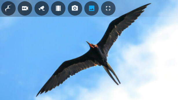 # Frigate Lovelace Card
A full-featured Frigate Lovelace card:
* Live viewing of multiple cameras.
* Clips and snapshot browsing via mini-gallery.
* Automatic updating to continually show latest clip / snapshot.
* Support for filtering events by zone and label.
* Arbitrary entity access via menu (e.g. motion sensor access).
* Fullscreen mode.
* Carousel/Swipeable media, thumbnails and cameras.
* Direct media downloads.
* Lovelace visual editing support.
* Full [Picture Elements](https://www.home-assistant.io/lovelace/picture-elements/) support.
* Theme friendly.
## Screenshots Below!
See more [screenshots](#screenshots) below.
## Supported Browsers
Modern Safari, Firefox and Chrome-based browsers are supported, as well as the Home Assistant App on Android and iOS. Other/older browsers may work, but are unsupported.
## Installation
* [HACS](https://hacs.xyz/) is **highly** recommended to install the card -- it works for all Home Assistant variants. If you don't have [HACS](https://hacs.xyz/) installed, start there -- then come back to these instructions.
* Find the card in HACS:
```
Home Assistant > HACS > Frontend > "Explore & Add Integrations" > Frigate Card
```
* Click `Download this repository with HACS`.
That's it!
### Manual Resource Management
For most users, HACS should automatically add the necessary resources. Should this auto-registration not work you will need to complete one additional step.
#### Lovelace in "Storage mode" (default)
* Navigate:
```
Three dots menu -> "Edit Dashboard" -> Three dots menu -> "Manage resources" -> "Add Resource"
```
* URL: `/hacsfiles/frigate-hass-card/frigate-hass-card.js`
* Resource type: `JavaScript Module`
#### Lovelace in "YAML mode" (rare)
You would see`mode: yaml` under `lovelace:` in your `configuration.yaml` if this applies to you.
* Add the following to `configuration.yaml`:
```yaml
lovelace:
resources:
- url: /hacsfiles/frigate-hass-card/frigate-hass-card.js
type: module
```
* Restart Home Assistant.
### Advanced Users: Manual Installation
**Note:** This is very rarely needed -- please consider HACS (above)!
* Download the `frigate-hass-card.zip` attachment of the desired [release](https://github.com/dermotduffy/frigate-hass-card/releases) to a location accessible by Home Assistant. Note that the release will have a series of `.js` files (for HACS users) **and** a `frigate-hass-card.zip` for the convenience of manual installers.
* Unzip the file and move the contents of the `dist/` folder to any subfolder name you'd like, e.g. `frigate-card` is used in the below example.
* Add the location as a Lovelace resource via the UI, or via [YAML configuration](https://www.home-assistant.io/lovelace/dashboards/#resources) such as:
```yaml
lovelace:
mode: yaml
resources:
- url: /local/frigate-card/frigate-hass-card.js
type: module
```
### Advanced Users: Installing Unreleased Versions
You can install any unreleased version of the card by leveraging the GitHub Actions artifacts that are generated on every revision. Here is a video walkthrough installing the latest revision of the `release-4.1.0` branch:
# Frigate Lovelace Card
A full-featured Frigate Lovelace card:
* Live viewing of multiple cameras.
* Clips and snapshot browsing via mini-gallery.
* Automatic updating to continually show latest clip / snapshot.
* Support for filtering events by zone and label.
* Arbitrary entity access via menu (e.g. motion sensor access).
* Fullscreen mode.
* Carousel/Swipeable media, thumbnails and cameras.
* Direct media downloads.
* Lovelace visual editing support.
* Full [Picture Elements](https://www.home-assistant.io/lovelace/picture-elements/) support.
* Theme friendly.
## Screenshots Below!
See more [screenshots](#screenshots) below.
## Supported Browsers
Modern Safari, Firefox and Chrome-based browsers are supported, as well as the Home Assistant App on Android and iOS. Other/older browsers may work, but are unsupported.
## Installation
* [HACS](https://hacs.xyz/) is **highly** recommended to install the card -- it works for all Home Assistant variants. If you don't have [HACS](https://hacs.xyz/) installed, start there -- then come back to these instructions.
* Find the card in HACS:
```
Home Assistant > HACS > Frontend > "Explore & Add Integrations" > Frigate Card
```
* Click `Download this repository with HACS`.
That's it!
### Manual Resource Management
For most users, HACS should automatically add the necessary resources. Should this auto-registration not work you will need to complete one additional step.
#### Lovelace in "Storage mode" (default)
* Navigate:
```
Three dots menu -> "Edit Dashboard" -> Three dots menu -> "Manage resources" -> "Add Resource"
```
* URL: `/hacsfiles/frigate-hass-card/frigate-hass-card.js`
* Resource type: `JavaScript Module`
#### Lovelace in "YAML mode" (rare)
You would see`mode: yaml` under `lovelace:` in your `configuration.yaml` if this applies to you.
* Add the following to `configuration.yaml`:
```yaml
lovelace:
resources:
- url: /hacsfiles/frigate-hass-card/frigate-hass-card.js
type: module
```
* Restart Home Assistant.
### Advanced Users: Manual Installation
**Note:** This is very rarely needed -- please consider HACS (above)!
* Download the `frigate-hass-card.zip` attachment of the desired [release](https://github.com/dermotduffy/frigate-hass-card/releases) to a location accessible by Home Assistant. Note that the release will have a series of `.js` files (for HACS users) **and** a `frigate-hass-card.zip` for the convenience of manual installers.
* Unzip the file and move the contents of the `dist/` folder to any subfolder name you'd like, e.g. `frigate-card` is used in the below example.
* Add the location as a Lovelace resource via the UI, or via [YAML configuration](https://www.home-assistant.io/lovelace/dashboards/#resources) such as:
```yaml
lovelace:
mode: yaml
resources:
- url: /local/frigate-card/frigate-hass-card.js
type: module
```
### Advanced Users: Installing Unreleased Versions
You can install any unreleased version of the card by leveraging the GitHub Actions artifacts that are generated on every revision. Here is a video walkthrough installing the latest revision of the `release-4.1.0` branch:
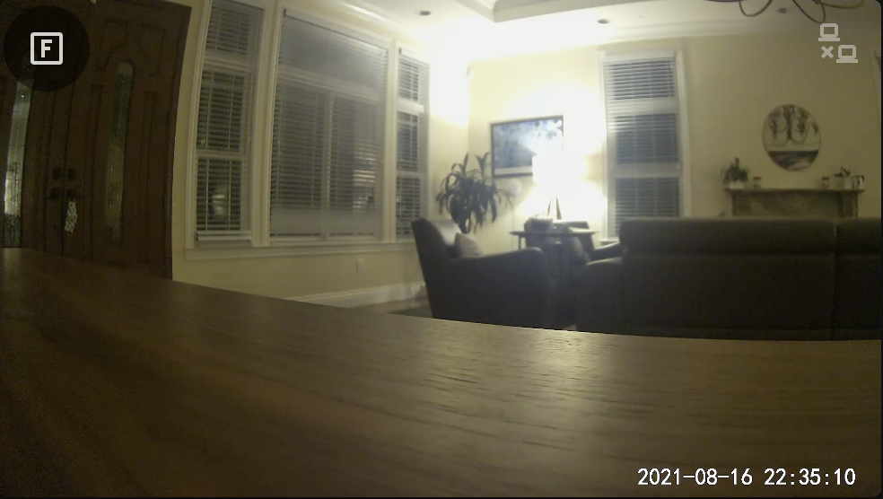 **Note**: AlexxIT's WebRTC Integration/Card must be installed and configured separately (see [details](https://github.com/AlexxIT/WebRTC)) before it can be used with this card.
#### Specifying The WebRTC Card Camera
##### Frigate v0.12 and onwards
If you have used the [recommended go2rtc setup](https://deploy-preview-4055--frigate-docs.netlify.app/guides/configuring_go2rtc/) for Frigate, no additional `webrtc_card` configuration is necessary.
##### Frigate v0.11 and earlier
The WebRTC Card live provider does **not** support use of Frigate-provided
camera entities, as it requires an RTSP stream which Frigate does not currently
provide. There are two ways to specify the WebRTC Card source camera:
* Manual setup of separate RTSP camera entities in Home Assistant ([see
example](https://www.home-assistant.io/integrations/generic/#live-stream)).
These entities will then be available for selection in the GUI card editor for
the camera, or can be manually specified with a `webrtc_card.entity` option under
that particular cameras configuration:
```yaml
cameras:
- webrtc_card:
entity: 'camera.front_door_rstp`
```
* OR manually entering the WebRTC Card camera URL parameter in the GUI card
editor, or configuring the `url` parameter as part of a manual Frigate card
configuration, as illustrated in the following example:
```yaml
cameras:
- webrtc_card:
url: 'rtsp://USERNAME:PASSWORD@CAMERA:554/RTSP_PATH'
```
Other WebRTC Card options may be specified under the `webrtc_card` section, like so:
```yaml
cameras:
- webrtc_card:
ui: true
```
See [the WebRTC Card live configuration](#webrtc-live-configuration) above, and the
[external WebRTC Card configuration
documentation](https://github.com/AlexxIT/WebRTC#configuration) for full
configuration options that can be used here.
## Using 2-Way Audio
This card supports 2-way audio (e.g. transmitting audio from a microphone to a suitably equipped camera). Requirements for 2-way audio to work:
Environmental requirements:
* Must have a camera that supports audio out (otherwise what's the point!)
* Camera must be supported by `go2rtc` for 2-way audio (see [supported cameras](https://github.com/AlexxIT/go2rtc#two-way-audio)).
* Must be accessing your Home Assistant instance over `https`. The browser will enforce this.
Card requirements:
* Only Frigate cameras are supported.
* Only the `go2rtc` live provider is supported.
* Only the `webrtc` mode supports 2-way audio:
```yaml
cameras:
- camera_entity: camera.front_door
live_provider: go2rtc
go2rtc:
modes:
- webrtc
```
* Must have microphone menu button enabled:
```yaml
menu:
buttons:
microphone:
enabled: true
```
Usage:
* The camera will always load without the microphone connected.
* To speak, hold-down the microphone menu button.
* On first press, this will reset the `webrtc` connection to include 2-way audio (unless the `always_connected` microphone option is set to `true`).
* Thereafter hold the microphone button down to unmute/speak, let go to mute.
* The video will automatically reset to remove the microphone after the number of seconds specified by `disconnect_seconds` in the `microphone` configuration have elapsed since the last mute/unmute press.
## Frigate Card Conditions
Conditions are used to apply certain configuration depending on runtime evaluations. Conditions may be used in `elements` configuration (as part of a `custom:frigate-card-conditional` element), or in `overrides` and `automations`.
See the [example below](#frigate-card-conditional-example) for a real-world example of how these conditions can be used.
Conditions is a list of conditions objects following the below schema:
### View Condition
| Parameter | Description |
| - | - |
| `condition` | Must be `view`. |
| `views` | A list of [views](#views) in which this condition is satified (e.g. `clips`). |
### Camera Condition
| Parameter | Description |
| - | - |
| `condition` | Must be `camera`. |
| `cameras` | A list of camera IDs in which this condition is satisfied. See [camera IDs](#camera-ids). |
### Fullscreen Condition
| Parameter | Description |
| - | - |
| `condition` | Must be `fullscreen`. |
| `fullscreen` | If `true` the condition is satisfied if the card is in fullscreen mode. If `false` the condition is satisfied if the card is **NOT** in fullscreen mode. |
### Expand Condition
| Parameter | Description |
| - | - |
| `condition` | Must be `expand`. |
| `fullscreen` | If `true` the condition is satisfied if the card is in expanded mode (in a dialog/popup). If `false` the condition is satisfied if the card is **NOT** in expanded mode (in a dialog/popup). |
### Media Loaded Condition
| Parameter | Description |
| - | - |
| `condition` | Must be `media_loaded`. |
| `media_loaded` | If `true` the condition is satisfied if there is media load**ED** (not load**ING**) in the card (e.g. a clip, snapshot or live view). This may be used to hide controls during media loading or when a message (not media) is being displayed. Note that if `true` this
### Screen Condition
| Parameter | Description |
| - | - |
| `condition` | Must be `screen`. |
| `media_query` | Any valid [media query](https://developer.mozilla.org/en-US/docs/Web/CSS/Media_Queries/Using_media_queries) string. Media queries must start and end with parentheses. This may be used to alter card configuration based on device/media properties (e.g. viewport width, orientation). Please note that `width` and `height` refer to the entire viewport not just the card. See the [media query example](#media-query-example). |
### Interaction Condition
| Parameter | Description |
| - | - |
| `condition` | Must be `screen`. |
| `interaction` | If `true` the condition is satisfied if the card has had human interaction within `view.interaction_seconds` elapsed seconds. If `false` the condition is satisfied if the card has **NOT** had human interaction in that time. |
### Triggered Condition
| Parameter | Description |
| - | - |
| `condition` | Must be `screen`. |
| `triggered` | A list of camera IDs which, if [triggered](#camera-triggers-configuration), satisfy the condition. |
### Microphone Conditions
| Parameter | Description |
| - | - |
| `muted` | Optional: If `true` or `false` the condition is satisfied if the microphone is muted or unmuted respectively. |
| `connected` | Optional: If `true` or `false` the condition is satisfied if the microphone is connected or disconnected respectively. |
### Stock Home Assistant Conditions
The stock `state`, `numeric_state` and `user` condition from Home Assistant can also be used. See [their documentation](https://www.home-assistant.io/dashboards/conditional/#card-conditions).
## Picture Elements / Menu Customizations
This card supports the [Picture Elements configuration
syntax](https://www.home-assistant.io/lovelace/picture-elements/) to seamlessly
allow the user to add custom elements to the card, which may be configured to
perform a variety of actions on interaction (see [actions](#actions) below). The configuration is fairly versatile and can be simple, or very complex depending on the desires of the user.
All configuration is under:
```yaml
elements:
```
See the [fully expanded elements configuration example](#config-expanded-elements) for how these parameters are structured.
**Note**: The Frigate Card allows either a single action (as in stock Home
Assistant) or list of actions to be defined for each class of user interaction
(e.g. `tap`, `double_tap`, `hold`, etc). See [an example of multiple actions](#example-multiple-actions).
### Special Elements
This card supports all [Picture
Elements](https://www.home-assistant.io/lovelace/picture-elements/#icon-element)
using compatible syntax. The card also supports a handful of custom special
elements to add special Frigate card functionality.
| Element name | Description |
| ------------- | --------------------------------------------- |
| `custom:frigate-card-menu-icon` | Add an arbitrary icon to the Frigate Card menu. Configuration is ~identical to that of the [Picture Elements Icon](https://www.home-assistant.io/lovelace/picture-elements/#icon-element) except with a type name of `custom:frigate-card-menu-icon`.|
| `custom:frigate-card-menu-state-icon` | Add a state icon to the Frigate Card menu that represents the state of a Home Assistant entity. Configuration is ~identical to that of the [Picture Elements State Icon](https://www.home-assistant.io/lovelace/picture-elements/#state-icon) except with a type name of `custom:frigate-card-menu-state-icon`.|
| `custom:frigate-card-menu-submenu` | Add a configurable submenu dropdown. See [configuration below](#frigate-card-menu-submenu).|
| `custom:frigate-card-menu-submenu-select` | Add a submenu based on a `select` or `input_select`. See [configuration below](#frigate-card-submenu-select).|
| `custom:frigate-card-conditional` | Restrict a set of elements to only render when the card is showing particular a particular [view](#views). See [configuration below](#frigate-card-conditional).|
**Note**: ℹ️ Manual positioning of custom menu icons or submenus via the `style`
parameter is not supported as the menu buttons displayed are context sensitive
so manual positioning by the user is not feasible.
#### `custom:frigate-card-menu-submenu`
Parameters for the `custom:frigate-card-menu-submenu` element are identical to the parameters of the [stock Home Assistant Icon Element](https://www.home-assistant.io/lovelace/picture-elements/#icon-element) with the exception of these parameters which differ:
| Parameter | Description |
| - | - |
| `type` | Must be `custom:frigate-card-menu-submenu`. |
| `items` | A list of menu items, as described below. |
##### Submenu Items
| Parameter | Default | Description |
| - | - | - |
| `title` | | An optional title to display. |
| `icon` | | An optional item icon to display, e.g. `mdi:car` |
| `entity` | | An optional Home Assistant entity from which title, icon and style can be automatically computed. |
| `state_color` | `true` | Whether or not the title and icon should be stylized based on state. |
| `selected` | `false` | Whether or not to show this item as selected. |
| `enabled` | `true` | Whether or not to show this item as enabled / selectable. |
| `style` | | Position and style the element using CSS. |
| `tap_action`, `double_tap_action`, `hold_action`, `start_tap`, `end_tap` | | [Home Assistant action configuration](https://www.home-assistant.io/lovelace/actions) including the extended functionality described under [actions](#actions). |
See the [Configuring a Submenu example](#configuring-a-submenu-example).
#### `custom:frigate-card-menu-submenu-select`
This element allows you to easily convert a [Home Assistant Select Entity](https://www.home-assistant.io/integrations/select/) or [Home Assistant Input Select Entity](https://www.home-assistant.io/integrations/input_select/) (an entity either starting with `select` or `input_select`) into an overridable submenu. This *could* be done by hand using a regular submenu (above) -- this element is a convenience.
Parameters for the `custom:frigate-card-menu-submenu-select` element are identical to the parameters of the [stock Home Assistant State Icon Element](https://www.home-assistant.io/dashboards/picture-elements/#state-icon) with the exception of these parameters which differ:
| Parameter | Description |
| - | - |
| `type` | Must be `custom:frigate-card-menu-submenu-select`. |
| `options` | An optional dictionary of overrides keyed by the option name that the given select entity supports. These options can be used to set or override submenu item parameters on a per-option basis. The format is as described in [Submenu Items](#frigate-card-submenu-items) above.|
See the [Configuring a Select Submenu example](#configuring-a-select-submenu-example).
#### `custom:frigate-card-conditional`
Parameters for the `custom:frigate-card-conditional` element:
| Parameter | Description |
| ------------- | --------------------------------------------- |
| `type` | Must be `custom:frigate-card-conditional`. |
`elements` | The elements to render. Can be any supported element, include additional condition or custom elements. |
| `conditions` | A list of conditions that must evaluate to true in order for the elements to be rendered. See [Frigate Card Conditions](#frigate-card-conditions). |
### Special Actions
#### `custom:frigate-card-action`
| Parameter | Description |
| - | - |
| `action` | Must be `custom:frigate-card-action`. |
| `frigate_card_action` | Call a Frigate Card action. Acceptable values are `default`, `clip`, `clips`, `image`, `live`, `recording`, `recordings`, `snapshot`, `snapshots`, `download`, `timeline`, `camera_ui`, `fullscreen`, `camera_select`, `menu_toggle`, `media_player`, `live_substream_on`, `live_substream_off`, `live_substream_select`, `expand`, `microphone_mute`, `microphone_unmute`, `mute`, `unmute`, `play`, `pause`, `screenshot`, `show_ptz`, `ptz`|
##### Action descriptions
| Value | Description |
| - | - |
| `default` | Trigger the default view. |
| `clip`, `clips`, `image`, `live`, `recording`, `recordings`, `snapshot`, `snapshots` | Trigger the named [view](#views).|
|`download`|Download the displayed media.|
|`camera_ui`|Open the Frigate UI at the configured URL.|
|`fullscreen`|Toggle fullscreen.|
|`camera_select`|Select a given camera. Takes an additional `camera` parameter with the [camera ID](#camera-ids) of the camera to select. Respects the value of `view.camera_select` to choose the appropriate view on the new camera. If a `triggered` parameter is set to `true` instead of `camera` being specified then a triggered camera (if any) is selected instead. |
|`menu_toggle` | Show/hide the menu (for the `hidden` mode style). |
|`media_player`| Perform a media player action. Takes a `media_player` parameter with the entity ID of the media_player on which to perform the action, and a `media_player_action` parameter which should be either `play` or `stop` to play or stop the media in question. |
|`live_substream_select`| Perform a media player action. Takes a `camera` parameter with the [camera ID](#camera-ids) of the substream camera. |
|`expand`| Expand the card into a dialog/popup. |
|`microphone_mute`, `microphone_unmute`| Mute or unmute the microphone. See [Using 2-way audio](#using-2-way-audio). |
|`mute`, `unmute`| Mute or unmute the loaded media. |
|`play`, `pause`| Play or pause the loaded media. |
|`screenshot`| Take a screenshot of the loaded media (e.g. a still from a video). |
|`show_ptz`| Show or hide the PTZ controls. Takes a `show_ptz` boolean parameter to indicate whether the controls show be shown or not. |
|`ptz`| Execute a native PTZ action (only for native out-of-the-box PTZ camera engines, e.g. Frigate). Takes a required `ptz_action` parameter that is one of `left`, `right`, `up`, `down`, `zoom_in`, `zoom_out` or `preset`. Takes an optional `ptz_phase` parameter that is one of `start` or `stop` to start or stop the movement discretely. Takes an optional `ptz_preset` parameter as the preset to execute when the `ptz_action` parameter is `preset`. |
## Views
This card supports several different views:
| Key | Description |
| ------------- | --------------------------------------------- |
|`live` (default)| Shows the live camera view with the configured live provider.|
|`snapshots`|Shows a gallery of snapshots for this camera.|
|`snapshot`|Shows a viewer for the most recent snapshot for this camera. Can also be accessed by holding down the `snapshots` menu icon.|
|`clips`|Shows a gallery of clips for this camera.|
|`clip`|Shows a viewer for the most recent clip for this camera. Can also be accessed by holding down the `clips` menu icon.|
|`recordings`|Shows a gallery of recent (last day) recordings for this camera and its dependents.|
|`recording`|Shows a viewer for the most recent recording for this camera. Can also be accessed by holding down the `recordings` menu icon.|
|`image`|Shows a static image specified by the `image` parameter, can be used as a discrete default view or a screensaver (via `view.interaction_seconds`).|
|`timeline`|Shows an event timeline.|
### Navigating From A Snapshot To A Clip
Clicking on a snapshot will take the user to a clip that was taken at the ~same
time as the snapshot (if any).
## Actions
### Introduction to Actions
Actions are pre-configured activities that can be triggered in response to a
variety of circumstances (e.g. tapping on a menu icon, double tapping on a
[picture element](#frigate-card-elements) or holding the mouse/tap down on a
particular [view](#views)).
### Configuring Actions
The format for actions is the standard Home Assistant [action
format](https://www.home-assistant.io/lovelace/actions/#tap-action), with the
exception of differences called out below.
### Differences in actions between Frigate Card and Home Assistant
Both the Home Assistant frontend and the Frigate card cooperate to provide
action functionality. In general, the Frigate Card functionality is a superset
of that offered by stock Home Assistant.
Stock action functionality is used for Stock [Home Assistant picture
elements](https://www.home-assistant.io/lovelace/picture-elements/). Extended
Frigate card behavior covers all other interactions on the Frigate card (e.g.
menu icon elements, submenus and actions on the card or views).
#### Custom action types: `start_tap` and `end_tap`
The card has partial support for two special action types `start_tap` and
`end_tap` which occur when a tap is started (e.g. mouse is pressed down /
touch begins), and ended (e.g. mouse released / touch ends) respectively. This
might be useful for PTZ cameras cameras to start/stop movement on touch. Network
latency may introduce unavoidable imprecision between `end_tap` and action
actually occurring.
#### Multiple actions
Extended Frigate card behavior supports a list of actions which will be handled,
in addition to using a singular action. See [an example of multiple
actions](#example-multiple-actions) below.
### Card & View Actions
Actions may be attached to the card itself, to trigger action when the card
experiences a `tap`, `double_tap`, `hold`, `start_tap` or `end_tap` event. These
actions can be specified both for the overall card and for individual groups of
view.
| Configuration path | Views to which it refers |
| - | - |
| `view.actions` | All (may be overriden by the below) |
| `media_gallery.actions` | `clips`, `snapshots`, `recordings` |
| `media_viewer.actions` | `clip`, `snapshot`, `recording` |
| `live.actions` | `live` |
| `image.actions` | `image` |
If an action is configured for both the whole card (`view.actions`) and a more
specific view (e.g. `live.actions`) then the actions are merged, with the more
specific overriding the less specific (see example below).
**Note:** The card itself relies on user interactions to function (e.g. `tap` on
the menu should activate that button, `tap` on a gallery thumbnail should open
that piece of media, etc). Efforts are taken to de-duplicate interactions (e.g.
card-wide actions will not be activated through interaction with menu buttons,
next/previous controls, thumbnails, etc), but in some cases this is not possible
(e.g. embedded WebRTC card controls) -- in these cases duplicate actions may
occur with certain configurations (e.g. `tap`).
**Note:** Card-wide actions are not supported on the timeline view, nor when a
info/error message is being displayed.
## Menu Styles
This card supports several menu styles.
| Key | Description | Screenshot |
| ------------- | --------------------------------------------- | - |
|`hidden`| Hide the menu by default, expandable upon clicking the Frigate button. |
**Note**: AlexxIT's WebRTC Integration/Card must be installed and configured separately (see [details](https://github.com/AlexxIT/WebRTC)) before it can be used with this card.
#### Specifying The WebRTC Card Camera
##### Frigate v0.12 and onwards
If you have used the [recommended go2rtc setup](https://deploy-preview-4055--frigate-docs.netlify.app/guides/configuring_go2rtc/) for Frigate, no additional `webrtc_card` configuration is necessary.
##### Frigate v0.11 and earlier
The WebRTC Card live provider does **not** support use of Frigate-provided
camera entities, as it requires an RTSP stream which Frigate does not currently
provide. There are two ways to specify the WebRTC Card source camera:
* Manual setup of separate RTSP camera entities in Home Assistant ([see
example](https://www.home-assistant.io/integrations/generic/#live-stream)).
These entities will then be available for selection in the GUI card editor for
the camera, or can be manually specified with a `webrtc_card.entity` option under
that particular cameras configuration:
```yaml
cameras:
- webrtc_card:
entity: 'camera.front_door_rstp`
```
* OR manually entering the WebRTC Card camera URL parameter in the GUI card
editor, or configuring the `url` parameter as part of a manual Frigate card
configuration, as illustrated in the following example:
```yaml
cameras:
- webrtc_card:
url: 'rtsp://USERNAME:PASSWORD@CAMERA:554/RTSP_PATH'
```
Other WebRTC Card options may be specified under the `webrtc_card` section, like so:
```yaml
cameras:
- webrtc_card:
ui: true
```
See [the WebRTC Card live configuration](#webrtc-live-configuration) above, and the
[external WebRTC Card configuration
documentation](https://github.com/AlexxIT/WebRTC#configuration) for full
configuration options that can be used here.
## Using 2-Way Audio
This card supports 2-way audio (e.g. transmitting audio from a microphone to a suitably equipped camera). Requirements for 2-way audio to work:
Environmental requirements:
* Must have a camera that supports audio out (otherwise what's the point!)
* Camera must be supported by `go2rtc` for 2-way audio (see [supported cameras](https://github.com/AlexxIT/go2rtc#two-way-audio)).
* Must be accessing your Home Assistant instance over `https`. The browser will enforce this.
Card requirements:
* Only Frigate cameras are supported.
* Only the `go2rtc` live provider is supported.
* Only the `webrtc` mode supports 2-way audio:
```yaml
cameras:
- camera_entity: camera.front_door
live_provider: go2rtc
go2rtc:
modes:
- webrtc
```
* Must have microphone menu button enabled:
```yaml
menu:
buttons:
microphone:
enabled: true
```
Usage:
* The camera will always load without the microphone connected.
* To speak, hold-down the microphone menu button.
* On first press, this will reset the `webrtc` connection to include 2-way audio (unless the `always_connected` microphone option is set to `true`).
* Thereafter hold the microphone button down to unmute/speak, let go to mute.
* The video will automatically reset to remove the microphone after the number of seconds specified by `disconnect_seconds` in the `microphone` configuration have elapsed since the last mute/unmute press.
## Frigate Card Conditions
Conditions are used to apply certain configuration depending on runtime evaluations. Conditions may be used in `elements` configuration (as part of a `custom:frigate-card-conditional` element), or in `overrides` and `automations`.
See the [example below](#frigate-card-conditional-example) for a real-world example of how these conditions can be used.
Conditions is a list of conditions objects following the below schema:
### View Condition
| Parameter | Description |
| - | - |
| `condition` | Must be `view`. |
| `views` | A list of [views](#views) in which this condition is satified (e.g. `clips`). |
### Camera Condition
| Parameter | Description |
| - | - |
| `condition` | Must be `camera`. |
| `cameras` | A list of camera IDs in which this condition is satisfied. See [camera IDs](#camera-ids). |
### Fullscreen Condition
| Parameter | Description |
| - | - |
| `condition` | Must be `fullscreen`. |
| `fullscreen` | If `true` the condition is satisfied if the card is in fullscreen mode. If `false` the condition is satisfied if the card is **NOT** in fullscreen mode. |
### Expand Condition
| Parameter | Description |
| - | - |
| `condition` | Must be `expand`. |
| `fullscreen` | If `true` the condition is satisfied if the card is in expanded mode (in a dialog/popup). If `false` the condition is satisfied if the card is **NOT** in expanded mode (in a dialog/popup). |
### Media Loaded Condition
| Parameter | Description |
| - | - |
| `condition` | Must be `media_loaded`. |
| `media_loaded` | If `true` the condition is satisfied if there is media load**ED** (not load**ING**) in the card (e.g. a clip, snapshot or live view). This may be used to hide controls during media loading or when a message (not media) is being displayed. Note that if `true` this
### Screen Condition
| Parameter | Description |
| - | - |
| `condition` | Must be `screen`. |
| `media_query` | Any valid [media query](https://developer.mozilla.org/en-US/docs/Web/CSS/Media_Queries/Using_media_queries) string. Media queries must start and end with parentheses. This may be used to alter card configuration based on device/media properties (e.g. viewport width, orientation). Please note that `width` and `height` refer to the entire viewport not just the card. See the [media query example](#media-query-example). |
### Interaction Condition
| Parameter | Description |
| - | - |
| `condition` | Must be `screen`. |
| `interaction` | If `true` the condition is satisfied if the card has had human interaction within `view.interaction_seconds` elapsed seconds. If `false` the condition is satisfied if the card has **NOT** had human interaction in that time. |
### Triggered Condition
| Parameter | Description |
| - | - |
| `condition` | Must be `screen`. |
| `triggered` | A list of camera IDs which, if [triggered](#camera-triggers-configuration), satisfy the condition. |
### Microphone Conditions
| Parameter | Description |
| - | - |
| `muted` | Optional: If `true` or `false` the condition is satisfied if the microphone is muted or unmuted respectively. |
| `connected` | Optional: If `true` or `false` the condition is satisfied if the microphone is connected or disconnected respectively. |
### Stock Home Assistant Conditions
The stock `state`, `numeric_state` and `user` condition from Home Assistant can also be used. See [their documentation](https://www.home-assistant.io/dashboards/conditional/#card-conditions).
## Picture Elements / Menu Customizations
This card supports the [Picture Elements configuration
syntax](https://www.home-assistant.io/lovelace/picture-elements/) to seamlessly
allow the user to add custom elements to the card, which may be configured to
perform a variety of actions on interaction (see [actions](#actions) below). The configuration is fairly versatile and can be simple, or very complex depending on the desires of the user.
All configuration is under:
```yaml
elements:
```
See the [fully expanded elements configuration example](#config-expanded-elements) for how these parameters are structured.
**Note**: The Frigate Card allows either a single action (as in stock Home
Assistant) or list of actions to be defined for each class of user interaction
(e.g. `tap`, `double_tap`, `hold`, etc). See [an example of multiple actions](#example-multiple-actions).
### Special Elements
This card supports all [Picture
Elements](https://www.home-assistant.io/lovelace/picture-elements/#icon-element)
using compatible syntax. The card also supports a handful of custom special
elements to add special Frigate card functionality.
| Element name | Description |
| ------------- | --------------------------------------------- |
| `custom:frigate-card-menu-icon` | Add an arbitrary icon to the Frigate Card menu. Configuration is ~identical to that of the [Picture Elements Icon](https://www.home-assistant.io/lovelace/picture-elements/#icon-element) except with a type name of `custom:frigate-card-menu-icon`.|
| `custom:frigate-card-menu-state-icon` | Add a state icon to the Frigate Card menu that represents the state of a Home Assistant entity. Configuration is ~identical to that of the [Picture Elements State Icon](https://www.home-assistant.io/lovelace/picture-elements/#state-icon) except with a type name of `custom:frigate-card-menu-state-icon`.|
| `custom:frigate-card-menu-submenu` | Add a configurable submenu dropdown. See [configuration below](#frigate-card-menu-submenu).|
| `custom:frigate-card-menu-submenu-select` | Add a submenu based on a `select` or `input_select`. See [configuration below](#frigate-card-submenu-select).|
| `custom:frigate-card-conditional` | Restrict a set of elements to only render when the card is showing particular a particular [view](#views). See [configuration below](#frigate-card-conditional).|
**Note**: ℹ️ Manual positioning of custom menu icons or submenus via the `style`
parameter is not supported as the menu buttons displayed are context sensitive
so manual positioning by the user is not feasible.
#### `custom:frigate-card-menu-submenu`
Parameters for the `custom:frigate-card-menu-submenu` element are identical to the parameters of the [stock Home Assistant Icon Element](https://www.home-assistant.io/lovelace/picture-elements/#icon-element) with the exception of these parameters which differ:
| Parameter | Description |
| - | - |
| `type` | Must be `custom:frigate-card-menu-submenu`. |
| `items` | A list of menu items, as described below. |
##### Submenu Items
| Parameter | Default | Description |
| - | - | - |
| `title` | | An optional title to display. |
| `icon` | | An optional item icon to display, e.g. `mdi:car` |
| `entity` | | An optional Home Assistant entity from which title, icon and style can be automatically computed. |
| `state_color` | `true` | Whether or not the title and icon should be stylized based on state. |
| `selected` | `false` | Whether or not to show this item as selected. |
| `enabled` | `true` | Whether or not to show this item as enabled / selectable. |
| `style` | | Position and style the element using CSS. |
| `tap_action`, `double_tap_action`, `hold_action`, `start_tap`, `end_tap` | | [Home Assistant action configuration](https://www.home-assistant.io/lovelace/actions) including the extended functionality described under [actions](#actions). |
See the [Configuring a Submenu example](#configuring-a-submenu-example).
#### `custom:frigate-card-menu-submenu-select`
This element allows you to easily convert a [Home Assistant Select Entity](https://www.home-assistant.io/integrations/select/) or [Home Assistant Input Select Entity](https://www.home-assistant.io/integrations/input_select/) (an entity either starting with `select` or `input_select`) into an overridable submenu. This *could* be done by hand using a regular submenu (above) -- this element is a convenience.
Parameters for the `custom:frigate-card-menu-submenu-select` element are identical to the parameters of the [stock Home Assistant State Icon Element](https://www.home-assistant.io/dashboards/picture-elements/#state-icon) with the exception of these parameters which differ:
| Parameter | Description |
| - | - |
| `type` | Must be `custom:frigate-card-menu-submenu-select`. |
| `options` | An optional dictionary of overrides keyed by the option name that the given select entity supports. These options can be used to set or override submenu item parameters on a per-option basis. The format is as described in [Submenu Items](#frigate-card-submenu-items) above.|
See the [Configuring a Select Submenu example](#configuring-a-select-submenu-example).
#### `custom:frigate-card-conditional`
Parameters for the `custom:frigate-card-conditional` element:
| Parameter | Description |
| ------------- | --------------------------------------------- |
| `type` | Must be `custom:frigate-card-conditional`. |
`elements` | The elements to render. Can be any supported element, include additional condition or custom elements. |
| `conditions` | A list of conditions that must evaluate to true in order for the elements to be rendered. See [Frigate Card Conditions](#frigate-card-conditions). |
### Special Actions
#### `custom:frigate-card-action`
| Parameter | Description |
| - | - |
| `action` | Must be `custom:frigate-card-action`. |
| `frigate_card_action` | Call a Frigate Card action. Acceptable values are `default`, `clip`, `clips`, `image`, `live`, `recording`, `recordings`, `snapshot`, `snapshots`, `download`, `timeline`, `camera_ui`, `fullscreen`, `camera_select`, `menu_toggle`, `media_player`, `live_substream_on`, `live_substream_off`, `live_substream_select`, `expand`, `microphone_mute`, `microphone_unmute`, `mute`, `unmute`, `play`, `pause`, `screenshot`, `show_ptz`, `ptz`|
##### Action descriptions
| Value | Description |
| - | - |
| `default` | Trigger the default view. |
| `clip`, `clips`, `image`, `live`, `recording`, `recordings`, `snapshot`, `snapshots` | Trigger the named [view](#views).|
|`download`|Download the displayed media.|
|`camera_ui`|Open the Frigate UI at the configured URL.|
|`fullscreen`|Toggle fullscreen.|
|`camera_select`|Select a given camera. Takes an additional `camera` parameter with the [camera ID](#camera-ids) of the camera to select. Respects the value of `view.camera_select` to choose the appropriate view on the new camera. If a `triggered` parameter is set to `true` instead of `camera` being specified then a triggered camera (if any) is selected instead. |
|`menu_toggle` | Show/hide the menu (for the `hidden` mode style). |
|`media_player`| Perform a media player action. Takes a `media_player` parameter with the entity ID of the media_player on which to perform the action, and a `media_player_action` parameter which should be either `play` or `stop` to play or stop the media in question. |
|`live_substream_select`| Perform a media player action. Takes a `camera` parameter with the [camera ID](#camera-ids) of the substream camera. |
|`expand`| Expand the card into a dialog/popup. |
|`microphone_mute`, `microphone_unmute`| Mute or unmute the microphone. See [Using 2-way audio](#using-2-way-audio). |
|`mute`, `unmute`| Mute or unmute the loaded media. |
|`play`, `pause`| Play or pause the loaded media. |
|`screenshot`| Take a screenshot of the loaded media (e.g. a still from a video). |
|`show_ptz`| Show or hide the PTZ controls. Takes a `show_ptz` boolean parameter to indicate whether the controls show be shown or not. |
|`ptz`| Execute a native PTZ action (only for native out-of-the-box PTZ camera engines, e.g. Frigate). Takes a required `ptz_action` parameter that is one of `left`, `right`, `up`, `down`, `zoom_in`, `zoom_out` or `preset`. Takes an optional `ptz_phase` parameter that is one of `start` or `stop` to start or stop the movement discretely. Takes an optional `ptz_preset` parameter as the preset to execute when the `ptz_action` parameter is `preset`. |
## Views
This card supports several different views:
| Key | Description |
| ------------- | --------------------------------------------- |
|`live` (default)| Shows the live camera view with the configured live provider.|
|`snapshots`|Shows a gallery of snapshots for this camera.|
|`snapshot`|Shows a viewer for the most recent snapshot for this camera. Can also be accessed by holding down the `snapshots` menu icon.|
|`clips`|Shows a gallery of clips for this camera.|
|`clip`|Shows a viewer for the most recent clip for this camera. Can also be accessed by holding down the `clips` menu icon.|
|`recordings`|Shows a gallery of recent (last day) recordings for this camera and its dependents.|
|`recording`|Shows a viewer for the most recent recording for this camera. Can also be accessed by holding down the `recordings` menu icon.|
|`image`|Shows a static image specified by the `image` parameter, can be used as a discrete default view or a screensaver (via `view.interaction_seconds`).|
|`timeline`|Shows an event timeline.|
### Navigating From A Snapshot To A Clip
Clicking on a snapshot will take the user to a clip that was taken at the ~same
time as the snapshot (if any).
## Actions
### Introduction to Actions
Actions are pre-configured activities that can be triggered in response to a
variety of circumstances (e.g. tapping on a menu icon, double tapping on a
[picture element](#frigate-card-elements) or holding the mouse/tap down on a
particular [view](#views)).
### Configuring Actions
The format for actions is the standard Home Assistant [action
format](https://www.home-assistant.io/lovelace/actions/#tap-action), with the
exception of differences called out below.
### Differences in actions between Frigate Card and Home Assistant
Both the Home Assistant frontend and the Frigate card cooperate to provide
action functionality. In general, the Frigate Card functionality is a superset
of that offered by stock Home Assistant.
Stock action functionality is used for Stock [Home Assistant picture
elements](https://www.home-assistant.io/lovelace/picture-elements/). Extended
Frigate card behavior covers all other interactions on the Frigate card (e.g.
menu icon elements, submenus and actions on the card or views).
#### Custom action types: `start_tap` and `end_tap`
The card has partial support for two special action types `start_tap` and
`end_tap` which occur when a tap is started (e.g. mouse is pressed down /
touch begins), and ended (e.g. mouse released / touch ends) respectively. This
might be useful for PTZ cameras cameras to start/stop movement on touch. Network
latency may introduce unavoidable imprecision between `end_tap` and action
actually occurring.
#### Multiple actions
Extended Frigate card behavior supports a list of actions which will be handled,
in addition to using a singular action. See [an example of multiple
actions](#example-multiple-actions) below.
### Card & View Actions
Actions may be attached to the card itself, to trigger action when the card
experiences a `tap`, `double_tap`, `hold`, `start_tap` or `end_tap` event. These
actions can be specified both for the overall card and for individual groups of
view.
| Configuration path | Views to which it refers |
| - | - |
| `view.actions` | All (may be overriden by the below) |
| `media_gallery.actions` | `clips`, `snapshots`, `recordings` |
| `media_viewer.actions` | `clip`, `snapshot`, `recording` |
| `live.actions` | `live` |
| `image.actions` | `image` |
If an action is configured for both the whole card (`view.actions`) and a more
specific view (e.g. `live.actions`) then the actions are merged, with the more
specific overriding the less specific (see example below).
**Note:** The card itself relies on user interactions to function (e.g. `tap` on
the menu should activate that button, `tap` on a gallery thumbnail should open
that piece of media, etc). Efforts are taken to de-duplicate interactions (e.g.
card-wide actions will not be activated through interaction with menu buttons,
next/previous controls, thumbnails, etc), but in some cases this is not possible
(e.g. embedded WebRTC card controls) -- in these cases duplicate actions may
occur with certain configurations (e.g. `tap`).
**Note:** Card-wide actions are not supported on the timeline view, nor when a
info/error message is being displayed.
## Menu Styles
This card supports several menu styles.
| Key | Description | Screenshot |
| ------------- | --------------------------------------------- | - |
|`hidden`| Hide the menu by default, expandable upon clicking the Frigate button. |  |
|`overlay`| Overlay the menu over the card contents. The Frigate button shows the default view. |
|
|`overlay`| Overlay the menu over the card contents. The Frigate button shows the default view. |  |
|`hover`| Overlay the menu over the card contents when the mouse is over the **menu**, otherwise it is not shown. The Frigate button shows the default view. |
|
|`hover`| Overlay the menu over the card contents when the mouse is over the **menu**, otherwise it is not shown. The Frigate button shows the default view. |  |
|`none`| No menu is shown. |
|
|`none`| No menu is shown. |  |
## Screenshots
### Live Viewing of Multiple Cameras
Scroll through your live cameras, or choose from a menu. Seamlessly supports
cameras of different dimensions, and custom submenus per camera.
|
## Screenshots
### Live Viewing of Multiple Cameras
Scroll through your live cameras, or choose from a menu. Seamlessly supports
cameras of different dimensions, and custom submenus per camera.
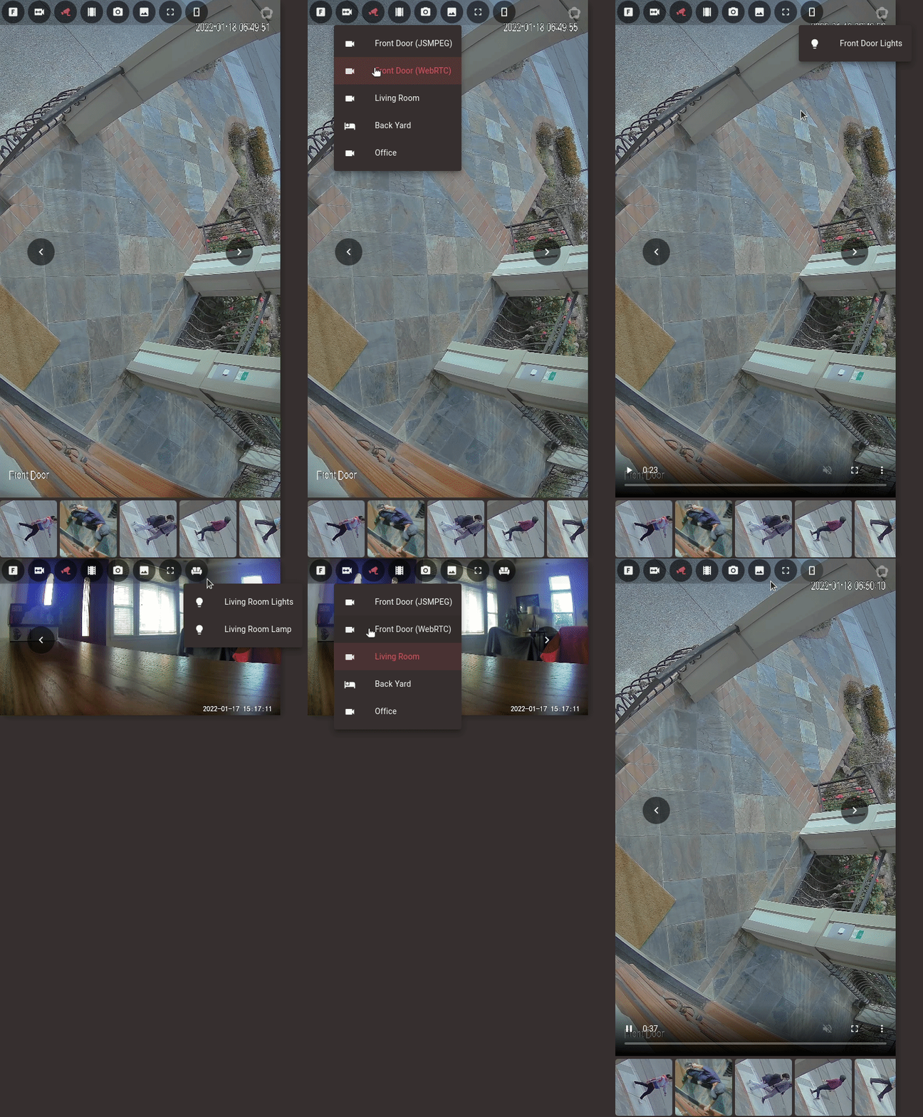 ### Full Viewing Of Events
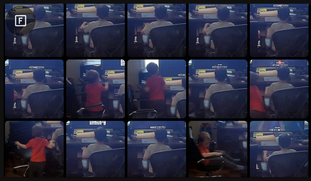 ### Live Viewing With Thumbnail Carousel
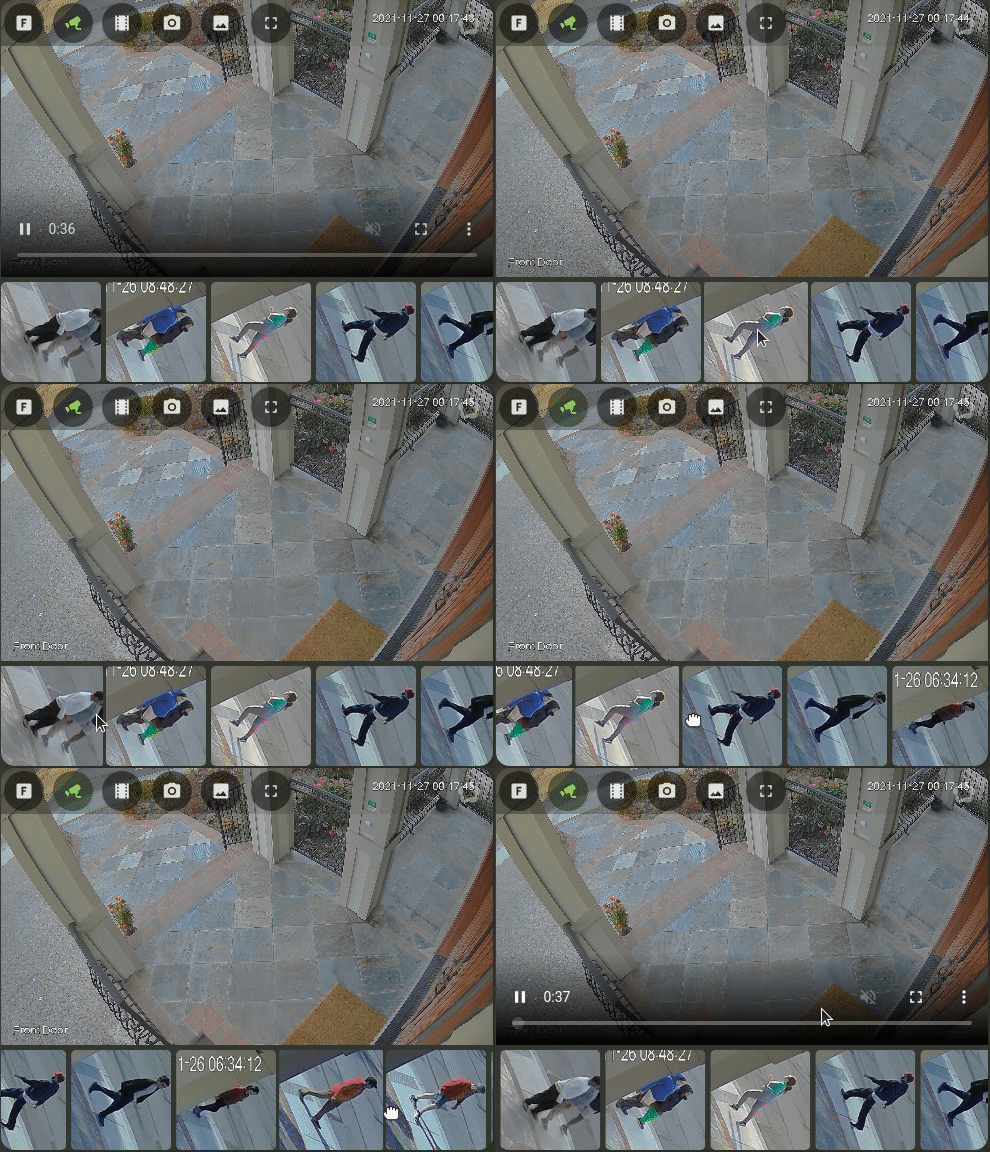 ### Clip Viewing With Thumbnail Carousel
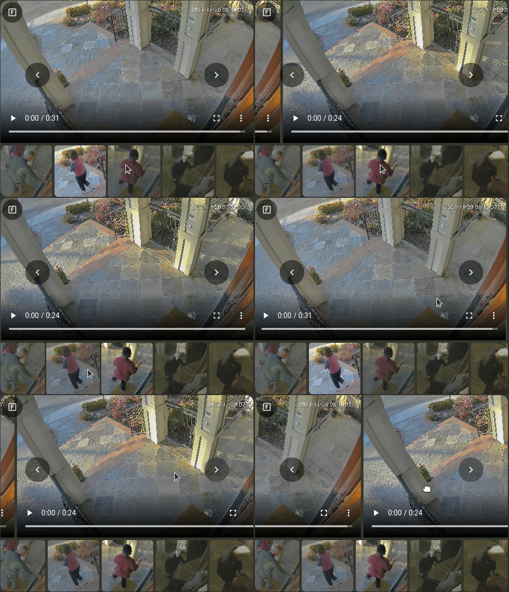 ### Hover Menu / Thumbnail Next & Previous Controls
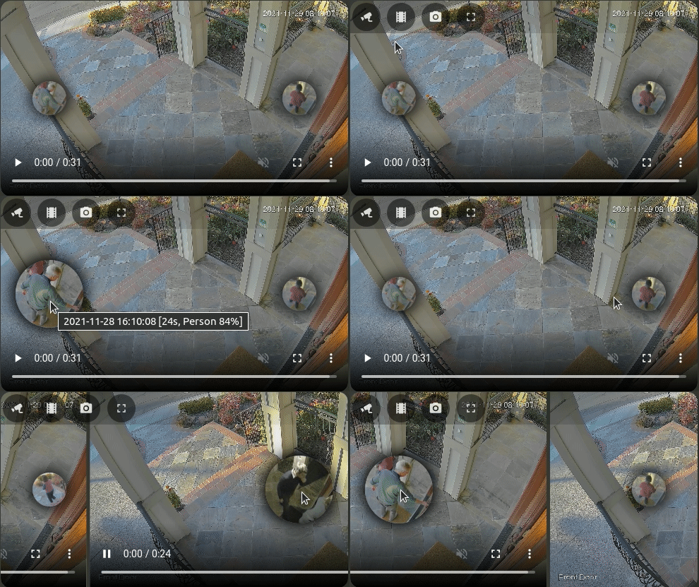 ### Card Editing
This card supports full editing via the Lovelace card editor. Additional arbitrary configuration for WebRTC Card may be specified in YAML mode.
### Card Editing
This card supports full editing via the Lovelace card editor. Additional arbitrary configuration for WebRTC Card may be specified in YAML mode.
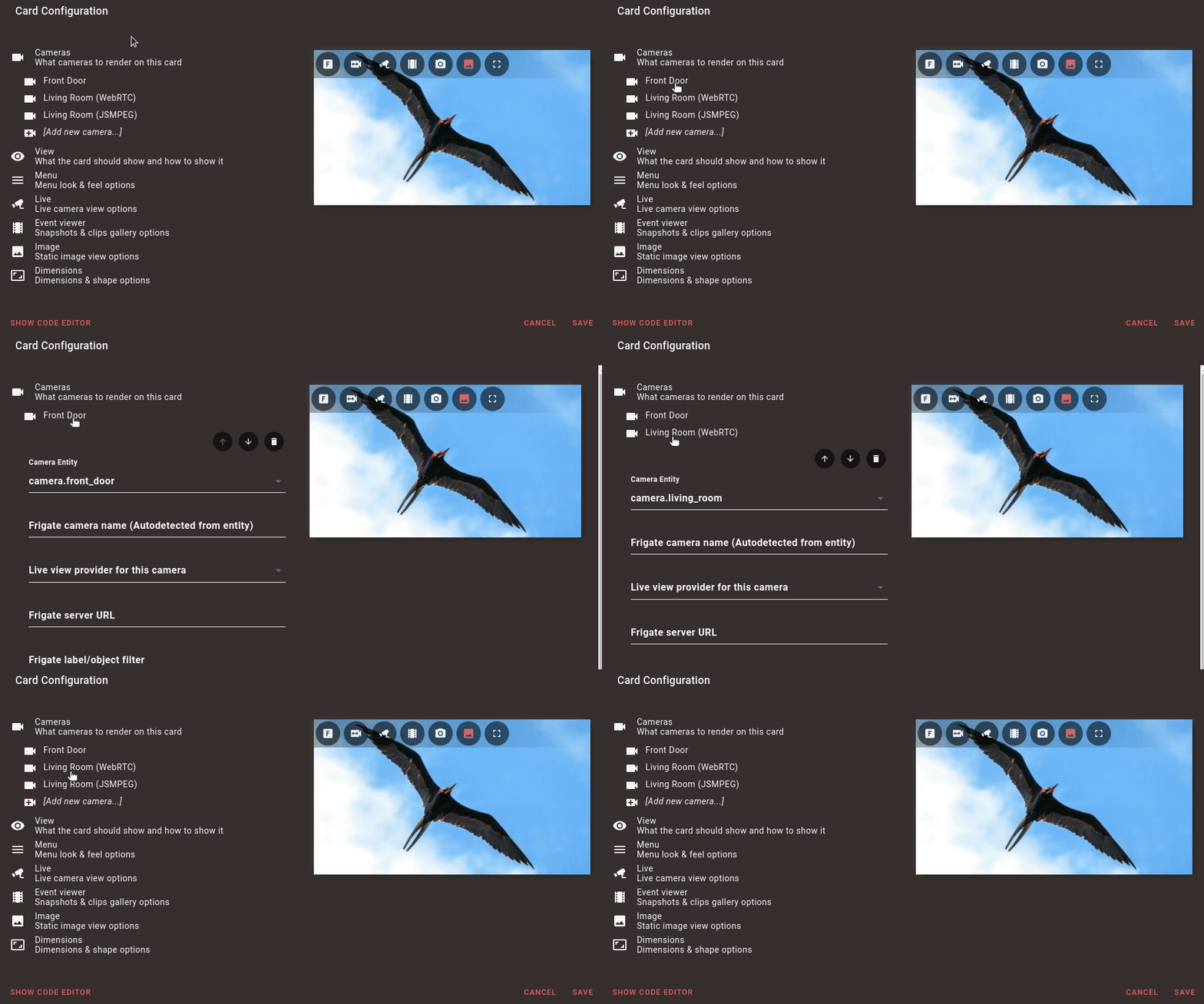 ### Configurable Submenus
This card supports fully configurable submenus.
### Configurable Submenus
This card supports fully configurable submenus.
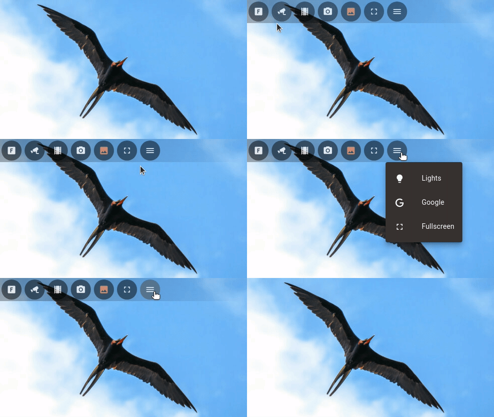 ### Select Entity Submenus
Automatically generate submenus from `select` entities.
### Select Entity Submenus
Automatically generate submenus from `select` entities.
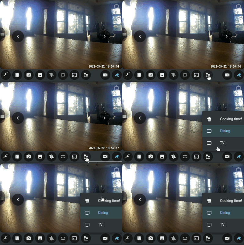 ### Cast media from the card
Cast media from the card to a local player.
### Cast media from the card
Cast media from the card to a local player.
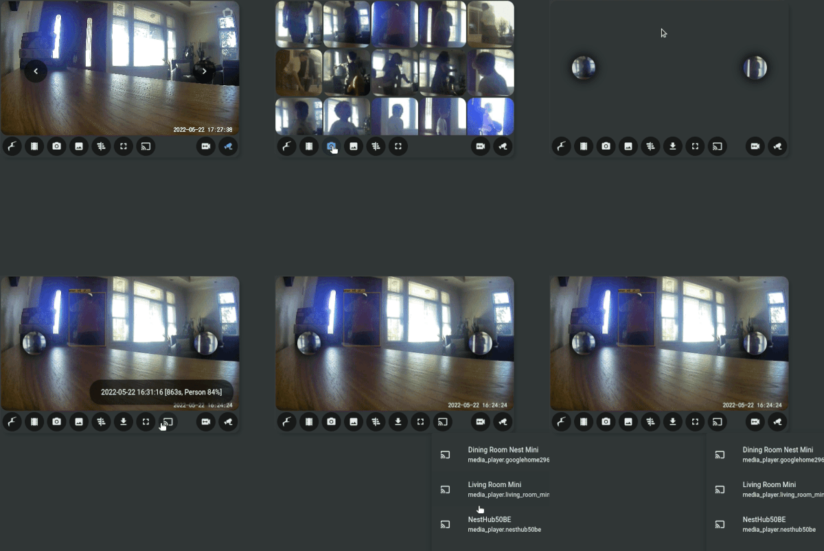 ### Triggered!
Automatically choose the camera with the action!
### Triggered!
Automatically choose the camera with the action!
 ### Thumbnail Drawers
View thumbnails in side-drawers.
### Thumbnail Drawers
View thumbnails in side-drawers.
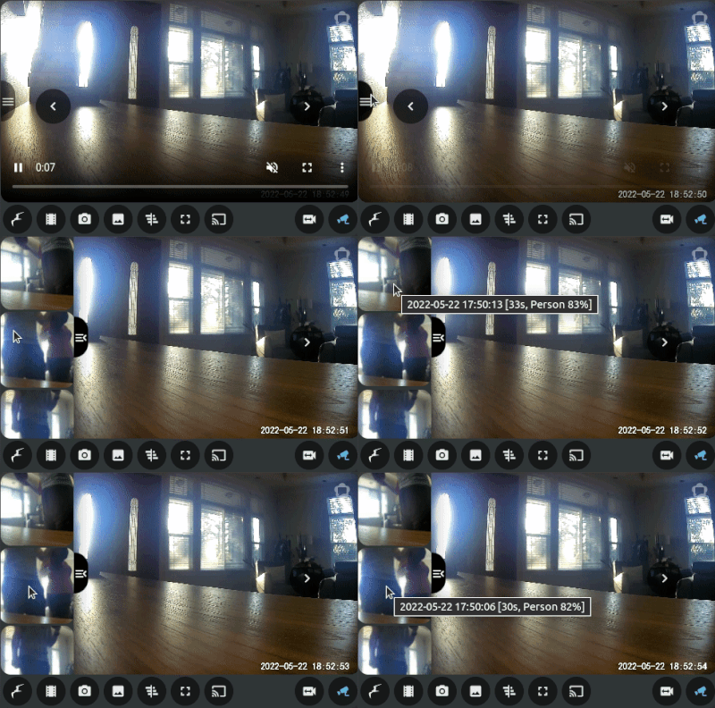 ### Event Timeline
View events in the timeline.
### Event Timeline
View events in the timeline.
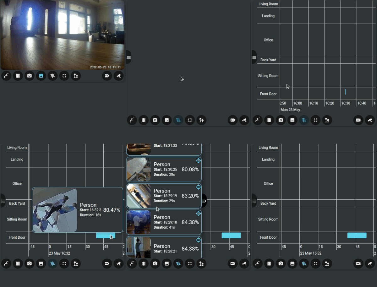 ### Single Camera Recordings
View recordings for a camera across time:
### Single Camera Recordings
View recordings for a camera across time:
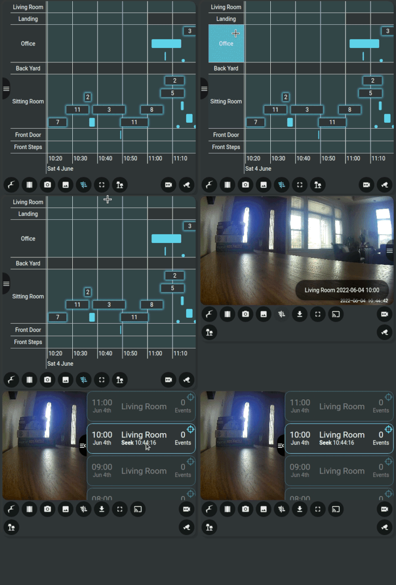 ### Multiple Camera Recordings
View recordings for multiple cameras at a given time:
### Multiple Camera Recordings
View recordings for multiple cameras at a given time:
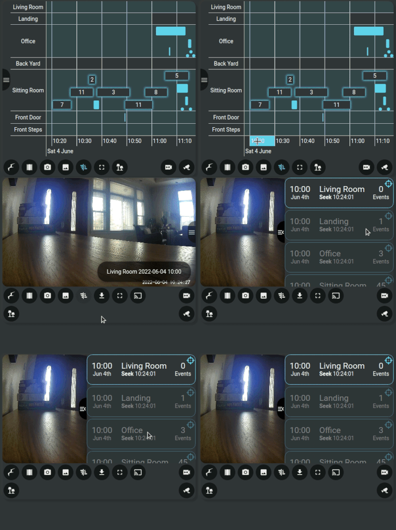 ### Dark Mode
Dim the card when not used.
### Dark Mode
Dim the card when not used.
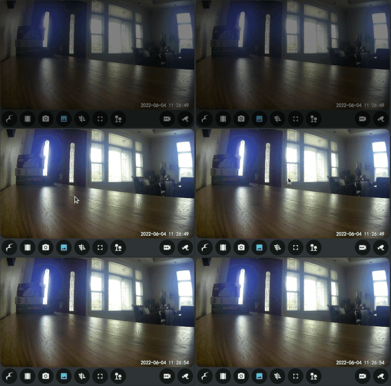 ### Card Casting
A dashboard with the card can be cast onto a suitable device (such as the Nest Hub shown below).
### Card Casting
A dashboard with the card can be cast onto a suitable device (such as the Nest Hub shown below).
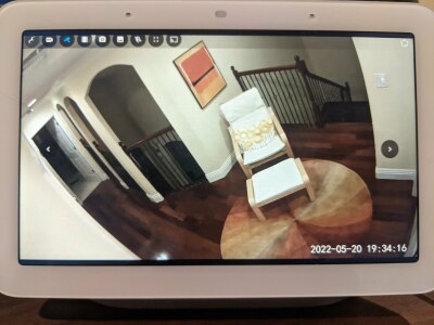 ### Event starring
Retain interesting Frigate events forever:
### Event starring
Retain interesting Frigate events forever:
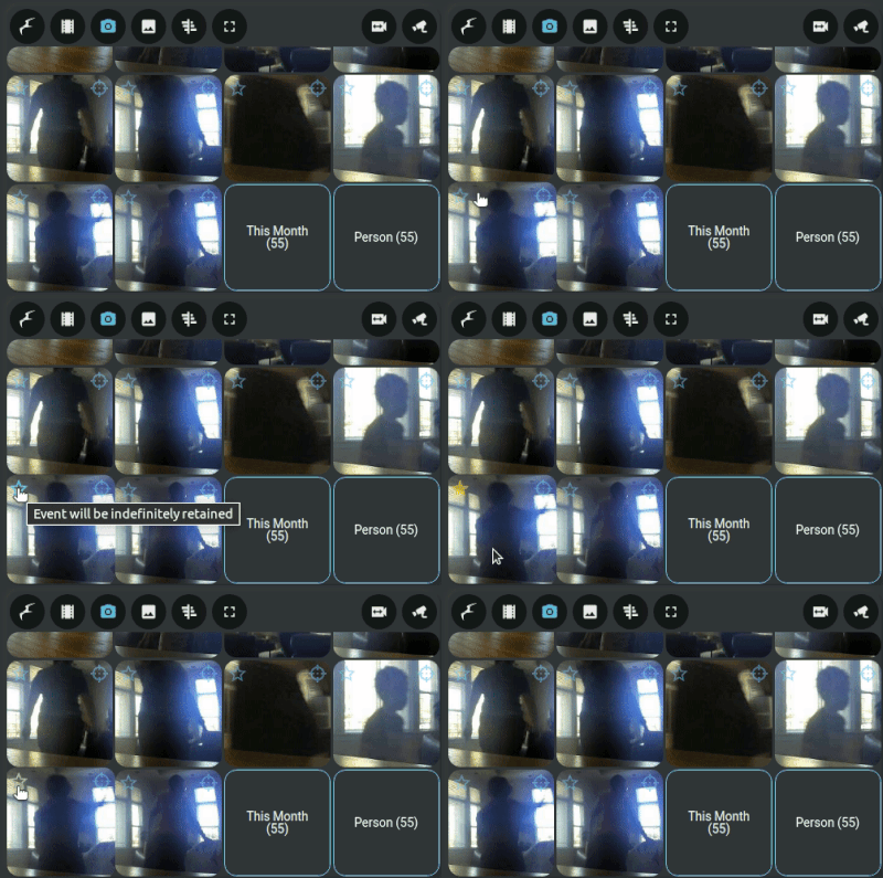 ### PTZ Control
Control a PTZ camera:
### PTZ Control
Control a PTZ camera:
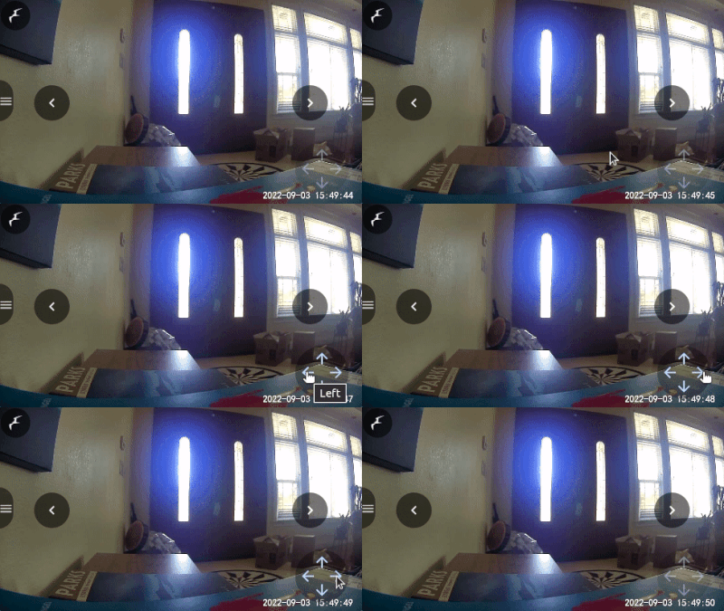 ### Media Layout
Pan around a large camera view to only show part of the video feed in the card at a different aspect ratio:
#### Before
### Media Layout
Pan around a large camera view to only show part of the video feed in the card at a different aspect ratio:
#### Before
 #### After
 ### Video Scrubbing
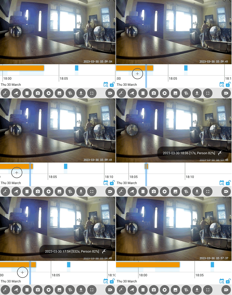 ### Media filtering
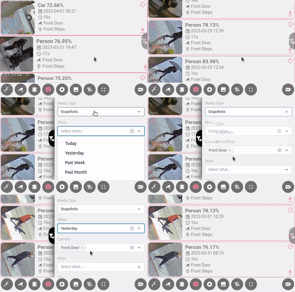 ### Seamless integration of different camera sources/engines
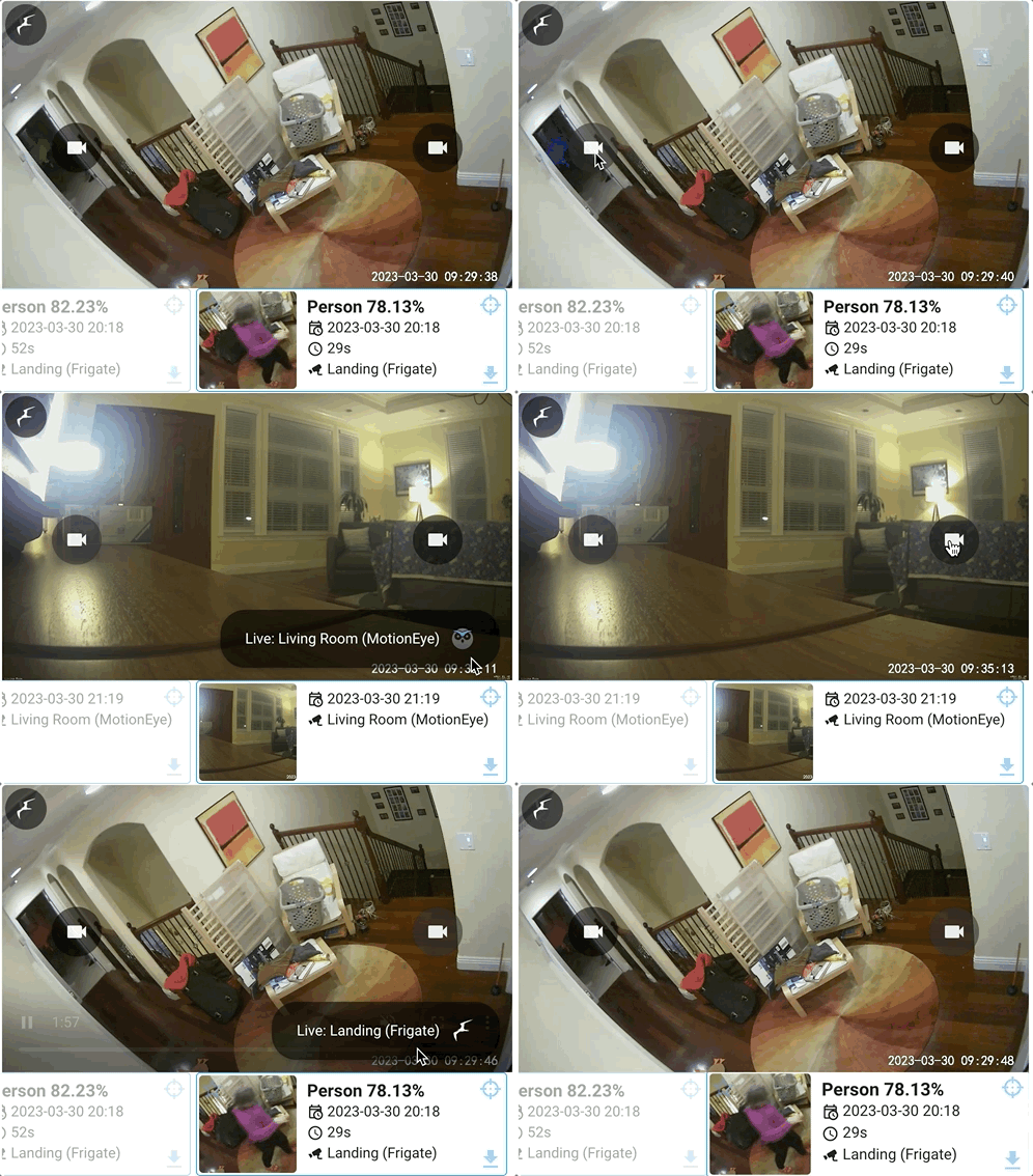 ### Expanded mode
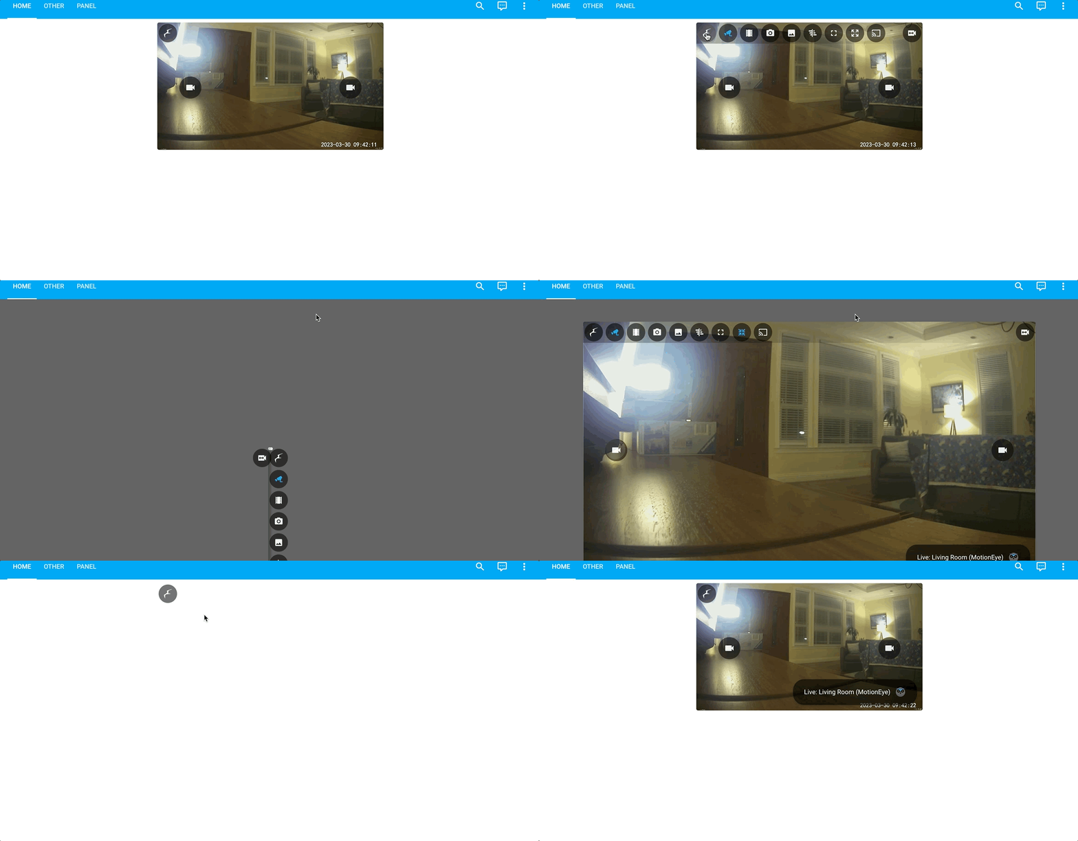 ### Substream Support
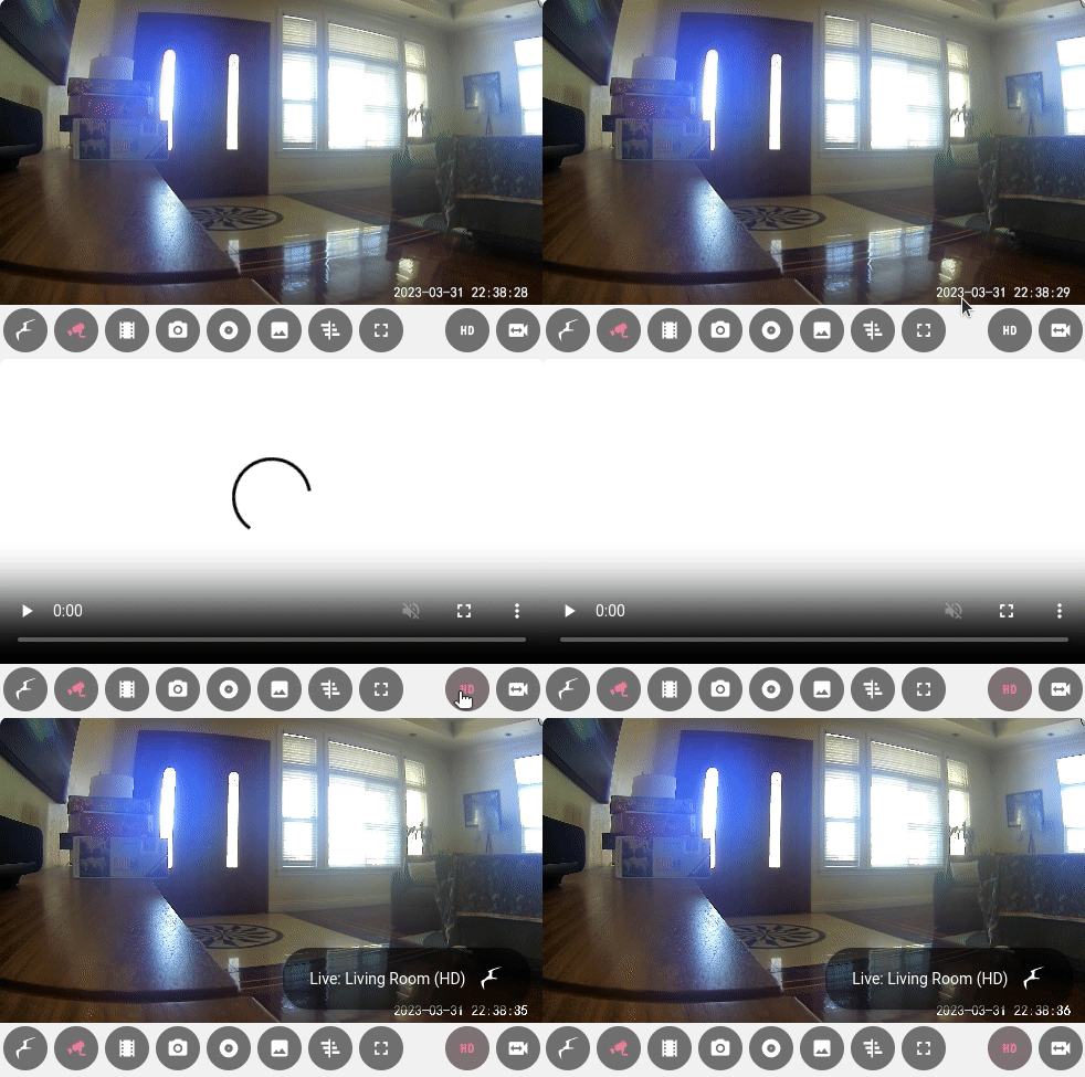 ### Timeline Date Picking
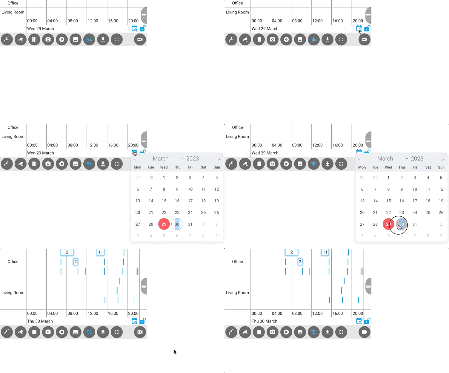 ### Low performance mode
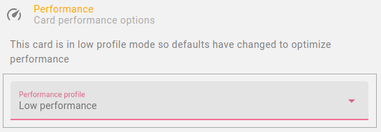 ### Ribbon timeline
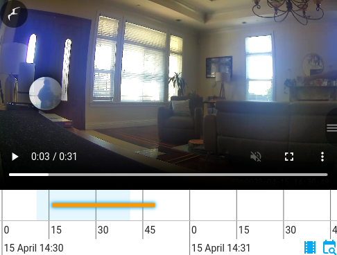 ### In-menu media / mute control
 ### 2-way Audio Support
 ### Zoom Support
 ### Taking card actions via the URL
 ### Interacting with a camera grid
 ## Examples
### Illustrative Expanded Configuration Reference
**Caution**: 🚩 Just copying this full reference into your configuration will cause you a significant maintenance burden. Don't do it! Please only specify what you need as defaults can / do change continually as this card develops. Almost all the values shown here are the defaults (except in cases where is no default, parameters are added here for illustrative purposes).
## Examples
### Illustrative Expanded Configuration Reference
**Caution**: 🚩 Just copying this full reference into your configuration will cause you a significant maintenance burden. Don't do it! Please only specify what you need as defaults can / do change continually as this card develops. Almost all the values shown here are the defaults (except in cases where is no default, parameters are added here for illustrative purposes).